

Name Hasan Shehta AbuAfash
Address Gaza – Gaza Strip – Palestine
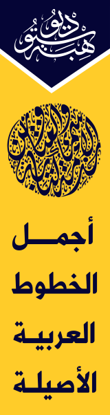
Website www.hibastudio.com
Email hasan@hibastudio.com, hibastudio@gmail.com
Telegram 00972598929290
About Hasan AbuAfash
Hasan AbuAfash, Arabic type designer and typographer, is the founder of HibaStudio, a bilingual website (Arabic and English) featuring Arabic calligraphy, Arabic type design and typography launched in 2007 from Gaza, Palestine.
After his cooperation with Dr. Mamoun Sakkal, which started in 2004, and production of the OpenType font Hasan Al Quds licensed for sale through the Bitstream type library, Hasan was involved in an impressive array of new Arabic type design projects. He has created contemporary Arabic fonts and collaborated with several designers and companies around the world.
In 2010, DIN Text Arabic and DIN Text Universal were released in collaboration with Panos Vassiliou of Parachute. This has been certainly one of the most comprehensive typeface design projects in the world today.
Other projects he participated in include the development of the OpenType layout features needed for the Arabic script system for many international typefaces of many type designers around the world.
His type design work ranges from creating custom Arabic fonts, programming Arabic fonts to OpenType, converting fonts from Mac to PC and expanding fonts to cover all languages that use the Arabic script such as Arabic, Persian, Urdu, Kurdish, Pashto … etc.
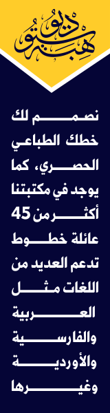
Services of HibaStudio
* Custom Arabic Font Design: We create unique and customized Arabic fonts to meet your specific requirements.
* Vector to OpenType Font Conversion: Transform your vector font designs from programs like Illustrator or CorelDraw into high-quality OpenType fonts.
* Unicode and OpenType Conversion: We convert fonts to Unicode and OpenType formats, ensuring compatibility and flexibility.
* Multilingual Font Expansion: Expand your fonts to support a wide range of languages that utilize the Arabic script, including Arabic, Persian, Urdu, and more.
* Retail Font Sales: Explore and purchase our collection of retail fonts crafted by HibaStudio, offering a diverse range of typographic styles.
* Kufi Clipart Sales: Enhance your designs with our extensive selection of Kufi cliparts, available for purchase.
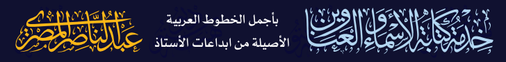
* Personalized Arabic Calligraphy: Experience the exquisite art of Arabic calligraphy with personalized name and title writing services provided by the renowned calligrapher, Abdel Nasser Al-Masry.
Education
From 1990 to 1995 Graduated with B.A. in Chemical Engineering in Al Baath University in Syria- Homs
Positions Held
- Worked as a designer at Al Quds Corporation for Advertising from 1997 to 2005, contributing to various creative projects.
– Served as a type designer at Sakkal Design (www.sakkal.com) from 2002 to 2008, collaborating on notable type design ventures.
– Currently engaged in freelance work, undertaking diverse type design projects and delivering exceptional results.
Skills
– Proficient in utilizing a wide range of design programs, including CorelDraw, Photoshop, Illustrator, and InDesign, to create visually captivating designs.
– Well-versed in type design programs such as FontLab and MS VOLT, enabling precise and professional font development.
– Extensive experience in developing OpenType projects specifically tailored for Arabic script fonts, ensuring optimal functionality and typographic excellence.
– With a wealth of experience, we specialize in creating captivating designs for names, titles, and logos using the artistry of Fatmic Kufi and Square Kufi calligraphy. Our expertise in these unique calligraphic styles enables us to craft visually stunning and culturally rich designs that leave a lasting impression.
Awards
5th place award in Linotype’s first Arabic Type Design Competition in Germany with a classic Kufi font named Hasan Hiba.
Professional Experience
I have had the privilege to design numerous fonts and develop OpenType features for a wide range of international typefaces created by esteemed designers from around the world. These collaborations have allowed me to contribute to the global typography community and showcase my skills in font design and OpenType development. Here are a few examples of the collaborations:
Year 2023
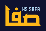
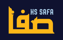
July, 2023 Released HS Safa which it is an elegant Arabic display typeface carefully crafted for book titles, creative graphic projects, and modern logos. Categorized under “titles,” it draws inspiration from the rules of Fatmic Kufi calligraphy, infusing a beautiful idea and special dimensions that preserve the allure of the Arabic font and its fixed rates. HS Safa is built upon the foundation of HS Sama font, but with a fresh and stunning molding (ornament) for the vertical strokes, adding a new dimension to its charm. This intricate detail enhances the overall visual appeal, making HS Safa a captivating choice for any design project. With comprehensive support for Arabic, Persian, and English languages, this typeface is versatile and accommodating. Available in two weights, Regular and Bold, it effortlessly integrates into the collection of contemporary Arabic Kufic fonts, catering to diverse design preferences. Whether seeking a modern Arabic font with a touch of uniqueness, HS Safa is a perfect addition to elevate any creative endeavor.
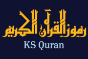
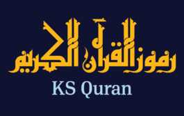
July, 2023 Released KS Quran which it is a symbol font specifically designed for publishing the Qur’an. It encompasses a comprehensive collection of the most significant symbols, including the names of the surahs of the Holy Qur’an and various symbols commonly used in Qur’anic printing (a total of 172 symbols). Created using the elegant Fatimic Kufic style, this font represents a unique and exceptional addition to the field. The symbols within KS Quran font are well-suited for diverse design applications, particularly within the realm of Holy Quran computer programs, Quranic publishing programs on websites, and various forms and uses of Holy Quran applications. To ensure widespread usability, this font is based on the Latin font mapping, enabling easy integration into different operating systems. The seamless substitution of Latin letters with their corresponding symbols allows individuals from all linguistic backgrounds to utilize the font effectively.
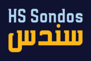
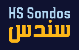
June, 2023 Released HS Sondos which it is an Arabic display typeface designed specifically for titles and graphic projects. Drawing inspiration from Modern Kufi calligraphy, the font features a harmonious fusion of sharp and curved lines, resulting in a visually captivating and innovative take on square shapes and geometric structures. The distinctive sharp endings at the bottom of each character add an extra touch of aesthetic appeal. With three available weights -regular, bold, and black- HS Sondos offers versatility and variety. The black weight introduces a novel concept by maintaining the same horizontal dimensions as the regular weight but expanding the vertical dimensions, creating a uniquely bold appearance. Supporting Arabic, Persian, and English languages, HS Sondos opens up a world of possibilities for designers looking to enhance their Arabic typography. Its visually striking and flexible nature makes it an excellent choice for projects that demand attention and creativity. Overall, HS Sondos stands as a testament to the beauty and adaptability of Arabic typography, empowering designers to bring their visions to life with a captivating and versatile typeface.
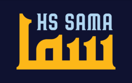
May, 2023 Released HS Sama which it is an Arabic display typeface designed for book titles, creative graphic projects, and modern logos. It falls under the “titles” category and is based on the rules of Fatmic Kufi calligraphy, featuring a beautiful idea and special dimensions that maintain the beauty of the Arabic font and its fixed rates. With support for Arabic, Persian, and English, this font comes in two weights (Regular and Bold) that can be added to the library of contemporary Arabic Kufic fonts, meeting the needs of various designs for all tastes. Its versatile design makes it a great addition for those looking for a modern Arabic font with a unique touch.
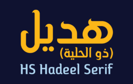
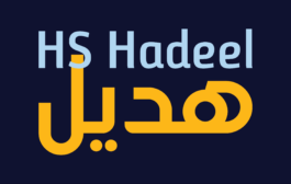
April, 2023 Released HS Hadeel Serif which it is a versatile display typeface designed for use in titles and graphic projects that support Arabic, Persian and English. It draws inspiration from the modern kufi style and features a unique blend of sharp and curved lines that lend a beautiful and geometric structure to each character. Based on the original HS Hadeel typeface, HS Hadeel Serif includes a serif on some of its characters to provide a more traditional look. Two weights are available for this typeface: Regular and Bold. HS Hadeel Serif represents a valuable addition to Arabic typography, offering designers a visually striking and flexible option for their projects.
April, 2023 Released HS Hadeel which it is a versatile display typeface designed for use in titles and graphic projects that require both Arabic, Persian and English characters. It draws inspiration from the modern kufi style and boasts a unique blend of sharp and curved lines that lend a beautiful and geometric structure to each character. The sharp endings at the bottom of each character add an additional aesthetic touch. With five weights available, ranging from Light to Black, HS Hadeel offers a diverse range of options for designers seeking to elevate their Arabic typography. Overall, HS Hadeel is a great choice for those seeking a visually striking and flexible typeface for their projects.
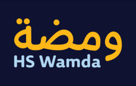
March, 2023 Released HS Wamda which it is based on some modern style of Naskh calligraphy which supports Arabic, Persian and Latin with a Sans Serif with subtle round on stems and corners. It features a small number of ligatures. Its proportions allow high impact on the tightly set lines of big and small text alike. The typeface has been optimized for corporate identity work, editorial design, book (Especially children’s textbooks), magazine and modern projects when a contemporary and simple look with a similarity between Arabic and Latin is requested.This font consists of five weights (Thin, Light, Regular, Mediums and bold). It can constitute a striking addition to the library of Arabic and Latin contemporary fonts models that meet the purposes of various designs for all tastes and purposes.
Year 2022
December, 2022 Developed the OpenType features of custom font for The Saudi Entertainment Ventures Company (SEVEN), Saudi Arabia, designed by Hasan Abu Afash and Afra Alsammahi for Zan Agency.
Year 2021
December, 2021 Developed the OpenType features of custom font for ThePNU, Saudi Arabia, designed by Afra Alsammahi for Zan Agency.
Jan, 2021 Developed the OpenType features of custom font for The Ministry of Human resources and Social Development, Saudi Arabia, designed by Afra Alsammahi for Zan Agency.
Year 2020
August, 2020 Developed the OpenType features of costum font NAUSS for NAIF ARAB UNIVERSITY FOR SECURITY SCIENCES, Saudi Arabia, designed by Ammar Al Nasser and Hasan Abu Afash for ROOH Agency.
March, 2020 Developed the OpenType features for the weight Headline of typeface British Council Arabic for Evibes design studio.
Year 2019
November, 2019 some of HibaStudio fonts were licensed for use in Canva (www.canva.com).
August, 2019 Developed the OpenType features for (Smiley Q) Typeface family (Regular, Dashed, Trace) along with unique subscripts for an English literacy program that focuses on phonics and reading, which was designed by PenguinCube.
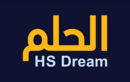
April, 2019 Released HS Dream which it is based on some modern lines of Kufi calligraphy which supports Arabic, Persian. The typeface has been optimized for corporate identity work and modern projects when a contemporary and simple look is requested. It features four stylistic sets. This font consists of four weights (light, regular, medium and bold) which can constitute a striking addition to the library of Arabic fonts models that meet the purposes of various designs for all tastes.
Year 2018
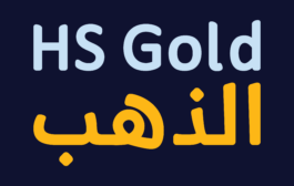
November, 2018 Released HS Gold which it is based on some modern lines of Naskh calligraphy which supports Arabic, Persian and Latin with a Sans Serif with subtle round on stems and corners. The typeface has been optimized for corporate identity work, editorial design and modern projects when a contemporary and simple look with a similarity between Arabic and Latin is requested. It features swash, ligatures and swash ligatures. Its proportions allow high impact on the tightly set lines of big and small text alike. This font consists of two weights (regular and bold) which can constitute a striking addition to the library of Arabic and Latin contemporary fonts models that meet the purposes of various designs for all tastes.
May, 2018 Released HS Almisk Serif which is a display typeface. It can be used for titles and graphic projects, which support Arabic and. It has been created based on modern kufi style. It enjoys flexibility between sharp and curved lines in the structure of characters. This supports with a beautiful appearance and wonderful geometric structure. It based on HS Almisk typeface with a serif on some of its characters. (5) Weights has been created for this typeface between the Light weight and Black weight. This typeface with its diversity of (5) weights is intended to be an attempt for a good addition to Arabic typography.
May, 2018 Released HS Almisk which it is a display typeface. It can be used for titles and graphic projects, which support Arabic and. It has been created based on modern kufi style. It enjoys flexibility between sharp and curved lines in the structure of characters. This supports with a beautiful appearance and wonderful geometric structure. The sharp endings in the bottom of character also give an aesthetic addition to the character. (8) Weights has been created for this typeface between the Light weight and Black weight. Besides, those three additional weights which can be used in headline, has baseline parts are thicker than the vertical parts. One has a regular form and the others has a stencil form in the middle using various styles. This typeface with its diversity of (8) weights is intended to be an attempt for a good addition to Arabic typography.
April, 2018 Released HS Aleman which it is a modern OpenType Arabic Typeface. It is a modern Kufi / Naskh hybrid and keeps the balance between its construction and its flexibility in the transition between the thick and thin parts and it also contains a harmonious smooth curve at its parts in all characters, numbers and marks. This font contains some extended characters (swash), some variants of some characters (Stylistic Set), which gives the user some flexibility in using some characters. The font weights are refined with enhanced legibility and are ideally suited to advertising, extended texts in magazines, newspapers, book and publishing, and creative industries, meeting the purposes of various designs. This typeface supports Arabic, Persian, Pashtu, Kurdish Sorani, Kurdish Kirmanji and Urdu variants and it is available in five weights: light, regular, medium, bold and black.
February, 2018 Released HS Alhoson is based on the font HS Alnasma font that is an Arabic display typeface, under “titles” category. It is useful for book titles, creative designs and modern logos. Also, it is used when a contemporary and simple look is desired that can fit with the characteristics of Latin fonts where horizontal parts are thinner than vertical ones for use in technical and engineering company. The font is based on some modern lines of Kufi calligraphy along with some derived ideas of Latin fonts, maintaining the beauty of the Arabic font and its fixed rates. This font supports Arabic, Persian, Urdu, Kurdish and Pashto and also includes Basic Latin and consisting of two weights (regular and bold) which can add to the library of Arabic and Latin fonts contemporary models that meet with the purposes of various designs for all tastes.
Year 2017
November, 2017 Released PF Din Serif Arabic as a collaboration between Parachute® and myself. DIN Serif was originally designed as a low contrast typeface with functional and distinct novelties which set it apart from most classic Romans. Its solid, simple and subtle serif nature directed the development of its Arabic counterpart away from the traditional calligraphic styles, towards a more simplified contemporary design mixing Naskh characteristics with early Kufi style. Its Arabic letterforms carry through the feel of the original design by using attributes of DIN Serif such as the tension and contrast without copying the curves of the Latin script in its entirety. In fact, several basic characters originated on paper after many tedious trials with a traditional calligraphic bamboo pen. This provided a deeper understanding of its structure and visual rhythm, before converting the letterforms into a digital form and applying additional adjustments. The descenders of DIN Serif Arabic are short to match the proportions of the Latin version. The contrast between the thick and thin is maintained although inverted. Finally, it has carefully designed open counters that match the color of the original. DIN Serif Arabic is fresh, clean, reliable and quite legible. Therefore, it is highly recommended for newspapers, magazines and other printed matter. This version takes into consideration the new Unicode standard and supports additional languages such as Persian, Tajik, Kurdish Sorani, Kurdish Kirmanji, Pashtu, Baluchi, Urdu, Punjabi, Azeri, Kazakh, Tatar, Uighur. Furthermore, each font style includes several Arabic practical symbols as well as swashes. All weights from Regular to Extra Black were meticulously hinted for excellent display performance on the web.
October, 2017 Developed the OpenType features for "Thamra" font (Regular only) which was designed by Samir Shoujah from Morocco.
Year 2016
November, 2016 Released HS Alnasma which it is an Arabic display typeface, under “titles” category. It is useful for book titles, creative designs and modern logos. Also, it is used when a contemporary and simple look is desired that can fit with the characteristics of Latin fonts where horizontal parts are thinner than vertical ones for use in technical and engineering company. The font is based on some modern lines of Kufi calligraphy along with some derived ideas of Latin fonts, maintaining the beauty of the Arabic font and its fixed rates. This font supports Arabic, Persian, Urdu, Kurdish and Pashto and also includes Basic Latin and consisting of two weights (regular and bold) which can add to the library of Arabic and Latin fonts contemporary models that meet with the purposes of various designs for all tastes.
November, 2016 Participated at the “FiraGO” project driven by bBoxType.com Berlin (before: Carrois Corporate GbR). I designed drafts and sketches for the basic style of FiraGO Arabic with Ralph du Carrois and Titus Nemeth. The “Fira Family” is still one of the largest Free Font family's worldwide. Today it covers Arabic, Devanagari, Georgian, Hebrew, Thai and IPA in addition to Latin, Greek and Cyrillic. FiraGO was commissioned by Here Technologies. The earlier Fira Sans was commissioned by Mozilla and supported by EdenSpiekermann in close cooperation with Erik Spiekermann.
June, 2016 Released HS Alwajd which it is an Arabic display typeface, under “titles” category. It is useful for book titles, creative designs and modern logos. Also, it is used when a contemporary and simple look is desired that can fit with the characteristics of Kufi Fatmic where horizontal parts are equal than vertical ones. It is a new style based on “HS Almajd” but without swirling round forms terminating in ball. The font is based on Kufi Fatmic calligraphy along with some derived ideas of decorative fonts, maintaining the beauty of the Arabic font and its fixed rates. Undoubtedly, the insertion of curved ornament in some parts adds more beauty and fascinating diversity in the flow line between sharp, soft and curved parts. This font supports Arabic, Persian, Pashtu, Kurdish Sorani, Kurdish Kirmanji and Urdu, consisting only one weight which can add to the library of Arabic Kufic fonts contemporary models that meet with the purposes of various designs for all tastes.
June, 2016 Released HS Almajd which it is an Arabic display typeface, under “titles” category. It is useful for book titles, creative designs and modern logos. Also, it is used when a contemporary and simple look is desired that can fit with the characteristics of Kufi Fatmic where horizontal parts are equal than vertical ones. The font is based on Kufi Fatmic calligraphy along with some derived ideas of decorative fonts, maintaining the beauty of the Arabic font and its fixed rates. Undoubtedly, the insertion of curved ornament in some parts adds more beauty and fascinating diversity in the flow line between sharp, soft and curved parts. This font supports Arabic, Persian, Pashtu, Kurdish Sorani, Kurdish Kirmanji and Urdu, consisting only one weight which can add to the library of Arabic Kufic fonts contemporary models that meet with the purposes of various designs for all tastes.
April, 2016 Developed the OpenType features for typeface British Council Arabic family (Light, light Italic, regular, Italic, bold, bold italic and Black) for Evibes design studio. The British Council Arabic font are designed by Lebanese designers Rana Shehabeddine and Patil H. Gaboudigian as a companion to the Latin British Council font. The font is based on the Naskh script which is the most appropriate Arabic calligraphic style that can be in successful harmony with the British Council Latin font. Naskh, which literally mean "to copy", is highly legible, neat and balanced. The challenge was to combine the fluidity of the recognizable Arabic handwriting usually present in Naskh with the structure of the geometric Kufi. The final design is a clean hybrid of Naskh skin on Kufi skeleton. Our team has been focusing mainly on three major characteristics inspired from the Latin counterpart: legibility, versatility and modernity. To mirror the ability that the Latin British Council font has in functioning on different platforms, mainly text and display settings, the Arabic font needed to have 2 separate styles belonging to the same font family:
- The BCA for text: It is used for type setting which consists of 3 weights (light, regular and bold).
- The BCA for display: It is used for displaying headers or titles which is designed to work strictly with the black weight of the Latin font in cap script (1 weight).
The font includes the basic Latin part of the Latin British Council font and support for Persian, and Urdu and all Arabic languages according to Unicode 8. It also includes proportional and tabular numerals for the supported languages. The British Council Arabic font is a trademark of the British Council in the U.K. Patent and Trademark Office and may be registered in certain other jurisdictions in the name of the British Council. This typeface is original artwork of Rana Shehabeddine and Patil H. Gaboudigian. The design may be protected in certain jurisdictions.Year 2015
December, 2015 Released HS Rahaf which it is an Arabic display and text typeface. It is useful for headlines, books cover and other graphic projects. It gives the feeling and impression of hand-lettering. So, it can be used for text when hand writing is needed, like in caricature texts and children books. HS Rahaf is characterized by simplicity, clarity of reading and beautiful flaunt. It contains many ligatures which increase and modify its beauty. The font supports Arabic, Persian, Urdu, Kurdish and Pashto languages.
June, 2015 Released HS Alhuda which it is a display typeface. It can be used for titles and graphic projects, which support Arabic, Persian Urdu and Kurdish. It has been created based on modern kufi style. It enjoys flexibility between sharp and curved lines in the structure of characters. This supports with a beautiful appearance and wonderful geometric structure. The sharp endings in the bottom of character also give an aesthetic addition to the character. (8) Weights has been created for this typeface between the heariline weight and heavy weight. Besides, those six additional weights which can be used in headline, has baseline parts are more thicker than the vertical parts. One has a regular form and the others has a stencil form in the middle using various styles. This typeface with its diversity of (14) weights is intended to be an attempt for a good addition to Arabic typography.
May, 2015 extended Hasan Hiba and HS Amal to support Pashto beside Arabic, Persian and Urdu for Michael Everson of Evertype, Ireland..
April, 2015 Released HS Headline which it is a new extended design in a range of Arabic fonts. HS Headline allows the user to set text in most Arabic and Western European languages with a single OpenType font. It includes tabular and proportional Arabic, Persian, and Urdu numerals, as well as a set of swash letters for Arabic and some stylistic variations of the letter meem. It is a bold, modern display typeface by Hasan Abu Afash. It contains the full range of Arabic Unicode and the extended MILE 2.0 Latin character set by Gunnlaugur SE Briem. The compact, distinctive look of HS Headline is based on the simple lines of Naskh calligraphy. It is ideally suited to advertising, newspapers headlines, packaging, book titles and publishing, logo, branding and creative industries.
March, 2015 Released HS Alnada which it is a modern OpenType Arabic Typeface. It is a modern Kufi / Naskh hybrid and keeps the balance between its construction and calligraphic angular cuts. This typeface supports Arabic, Persian, Urdu and Kurdish variants and it is available in five weights: light, regular, medium, bold and black. They are refined with enhanced legibility and are ideally suited to advertising, extended texts in magazines, newspapers, book and publishing, and creative industries, meeting the purposes of various designs.
February, 2015 Released HS Ali which was designed in memoriam of my brother – Ali Abu Afash who was was martyred during the last aggression on Gaza in summer 2014. HS Ali introduced a modern OpenType Arabic typeface, which had the characterstic, features of Kufi style with noticeable both curvy and sharp segments; beside the refinements of its letters that made it more readable. HS Ali is a display font that has been designed to be used in titles in modern graphic and publication projects. It supports Arabic, Persian, Urdu and Kurdish languages and contains four weights: Light, regular, medium and bold which can be condsiderd as an elaboration to the library of Arabic fonts contemporary models that meet the variant purposes of designs for all tastes.
Year 2014
June, 2014 Released HS Almaha which is a modern OpenType Arabic Typeface. It combines the features of linear Naskh and modern Kufi. Segments of its letters are curvy and sharp. They are refinement more readable and present in extended texts in magazines, newspapers, books and other publications. This typeface supports Arabic, Persian, Urdu and Kurdish languages and it contains four weights; light, regular, medium and bold which can add to the library of Arabic fonts contemporary models that meet with the purposes of various designs for all tastes.
June, 2014 Developed the OpenType features for typeface British Council Arabic family (Light, light Italic, regular, Italic, bold, bold italic and Black) for Evibes design studio. Typeface family designed by Rana Shehabeddine and Patil H. Gaboudigian.
April, 2014 Developed the OpenType features for LetterPressArabic Typeface family (Printed, Dry and Inked) which is designed by PenguinCube.
April, 2014 revised and developed the OpenType features for Aramco (Saudi Arabia) font (Light, Regular and Bold) which designed by Aramco advertising stuff. This custom version was revised and developed under supervisor of Ahmed Alabdullatif, corporate identity representative of the Aramco.
Mar, 2014 Developed the OpenType features for a copy of bilingual Arabic and Latin type-family Bukra (Light, Regular, Medium, Bold and Black) which is designed by Pascal Zoghbi (29 Letters / 29LT) for Orient TV.
March, 2014 Released PF Aljamal which is a contemporary Arabic rounded typeface with a large set of variations, quite possibly the first of its kind. Its soft rounded terminals create a strong impression in heavy weights, whilst running text becomes subtle and friendly when set in small sizes. It is rather casual in nature and at the same time, its strong geometric structure makes it robust and solid. PF Aljamal has a well balanced weight contrast and it is very legible in small sizes because of its clear and simple construction. All together, it consists of 17 variations which may be used in a vast array of applications. PF Aljamal supports Arabic, Persian, Urdu and Kurdish languages and comes with 10 advanced opentype features.
March, 2014 Released HS Almidad which has been started in coincidence with my designing logotypes consisting of triangle geometric, looking shape and overall structure. After designing several words, I thought of using the design concept of this logo to develop a geometric Kufi font. All letters of this typeface family were conceived with suitable and coordinated dimensions to create five weights: Thin, Light, Regular, Medium and Bold: They support Arabic, Persian, Urdu and Kurdish languages. With a triangle look, this font is a simple and creative addition, which can be useful for book titles and variety of other geometrical constructions projects. It brings new design concept to enhance beauty and harmony and enrich our previous geometrical font contributions, which started with the release of HS Alhandasi, HS Almohandis and HS Alfaris from HibaStuido.
January, 2014 Worked with Nikola Djurek (www.typonine.com) in designing Arebica OpenType font, which is a section of Identitet.
Year 2013
September, 2013 Released HS Ishraq which has introduced modern Open Type Arabic Typeface that combines the features of Kufi and Naskh Style with noticeable both curvy and sharp segments beside the refinements of its letters that made it more readable. HS Ishraq is used in both titles and text in modern graphic and publication projects. It supports Arabic, Persian, Urdu and Kurdish languages and contains five weights: Thin, light, regular, Medium and bold which can add to the library of Arabic fonts contemporary models that meet with the purposes of various designs for all tastes.
September, 2013 Developed the OpenType features for 29LT Azer fonts family (Thin, Light, Regular, bold and Blach) which is designed by Pascal Zoghbi (29 Letters / 29LT).
June, 2013 Released HS Albadr which is an Arabic display typeface. It is useful for book titles and graphic projects where a contemporary, geometrical and streamlined look is desired. The font is based on the simple lines of modern and simplified Kufi calligraphy that support Arabic, Persian and Urdu. It has one weight only which is similar to the bold weight. This typeface is created for being used in technical and engineering companies under strict geometric conditions . The company desires to follow the geometrical shape with uniform and equal dimensions in both vertical and horizontal storks; where some parts of the letters are to be cut at a slanting angle of 45 degree to give the impression of a coherent geometrical nature for this font. The typeface HS Albadr is considered as a chain of geometric fonts series designed for engineering companies after HS Almohandis and HS Alhandasi were designed. We really hope that we could give additions to the geometric typefaces field.
June, 2013 Developed the OpenType features for 29LT UA Neo B fonts family (Light, Regular and Bold) and 29LT UA Neo N fonts family (Light, Regular and Bold) which is designed by Pascal Zoghbi (29 Letters / 29LT).
June, 2013 Released HS Alkitab which is an Arabic display typeface, under “titles” category. It is useful for book titles, creative designs and modern logos. Also, it is used when a contemporary and simple look is desired that can fit with the characteristics of Latin fonts where horizontal parts are thinner than vertical ones. The font is based on some modern lines of Kufi calligraphy along with some derived ideas of Latin fonts, maintaining the beauty of the Arabic font and its fixed rates. Undoubtedly, the insertion of curved ornament in the vertical parts adds more beauty and fascinating diversity in the flow line between sharp, soft and curved parts.This font supports Arabic, Persian, Urdu and Kurdish, consisting of two weights (regular and bold) which can add to the library of Arabic fonts contemporary models that meet with the purposes of various designs for all tastes.
May, 2013 Developed the OpenType features for bilingual Arabic and Latin type-family MIA (Light, Regular, Medium and Bold) which is designed by Pascal Zoghbi (29 Letters / 29LT) for the Museum of Islamic Art.
May, 2013 Released HS Alwafa which is an Arabic display typeface. It is useful for book titles and creative graphic projects where a contemporary, streamlined look is desired for digital purposes. The font is based on the simple lines of sequre Kufi calligraphy, that support Arabic, Persian, Urdu and Kurdish. This font was created in the beginning as a digital weight in 2012 for use by an engineering digital company. The company tends to follow the geometrical united and equal shape in both vertical and horizontal dimensions and with a tendency for digital strokes showing digital numbers under the name of base. I followed that with three styles: first, the digital with a solid base, second is a stencil and the third is the regular solid font. By producing this font, we provided the Arabic fonts library with various styles which grant many design purposes.
March, 2013 Developed the OpenType features for Al-Quds Newspaper. It is based on AlRouiya font which is designed by Pascal Zoghbi (29 Letters / 29LT).
March, 2013 Released HS Masrawy which is an Arabic display typeface. It is useful for titles and graphic projects where a contemporary, streamlined look is desired. The font is based on the simple lines of Kufi calligraphy. The font has a new modern idea where the vertical strokes have a constant value in all of its five weights. It has (5) weights and supported Arabic, Persian and Urdu compatible with Unicode (6.2). HS Masrawy is the first released typeface of collaboration between Hasan Abu Afash and Egyptian designer Abdulsamie Rajab.
January, 2013 Developed the Open Type features for 29LT Masira fonts family (Pen, Tippex, Lipstick and Spray) which is designed by Pascal Zoghbi (29 Letters / 29LT).
Year 2012
September, 2012 Developed HS Amal of "Tasmeem" to create a new opentype family of (7) weights was produced to support Arabic, Persian and Urdu. It contains many various alternatives and good additions.
August, 2012 Released HS Albasim B which is an Arabic display typeface. It is useful for headlines, books covers and other graphic projects. The font is based on HS Albasim A but it is considered as a different which is characterized by the letters that are similar in thickness. The font contains only two weights: regular and bold. Both of them support the OpenType features of Arabic, Persian, Urdu and Kurdish.
August, 2012 Released HS Albasim A which is an Arabic display typeface. It is useful for headlines, books covers and other graphic projects. It is a collaborative effort, as HS Albasim A first letters were designed and drawn by Basim Salem Al Mahdi from Iraq and then developed and digitalized as a typeface by Hasan Abu Afash from Palestine. The font is based on the simple lines of Fatmic Kufi but was it distinguished by two main ideas: First, it contains a nice serf in the vertical strokes of its letters. The second, some of storks in its letter differ in the thickness instead of being similar, as it is in the Fatmic Kufi style. The font contains only two weights: regular and bold. Both of them support the OpenType features of Arabic, Persian, Urdu and Kurdish.
July, 2012 Released HS Alfaris, which its idea started while designing a logotype for a company named (Mazarat), consisting of 3D geometric looking shapes and overall structure. After designing several words, I thought of using the design concept of this logo to develop a geometric Kufi font for headline category. All letters of this typeface family were conceived with suitable coordinates and dimensions to create the first weight, bold, before finishing the rest of the letters to support Arabic, Persian, Urdu and Kurdish languages. Another weight was conceived, regular, which was designed closer to light to support applications that require variations in thickness. With a 3D look, this font is a simple and creative addition which can be useful for book titles in addition to a variety of other geometrical constructions projects. It brings new design concept for ends of Jeem, Ayn, Reh and Waw to enhance beauty and harmony and to enrich our previous geometrical font contributions which started with the release of HS Alhandasi and HS Almohandis from HibaStuido.
June, 2012 Developed the OpenType features for Bukra bold and black fonts which is designed by Pascal Zoghbi (29 Letters / 29LT) to support Kurdish beside Latin, Arabic, Persian and Urdu. And created Web Open Type font (Woff).
June, 2012 Released HS Elham which is a modern Kufi font with a new idea with round shapes. It is a decorative font with mathematical proportions. It is based on Hasan Elham font with a new idea for connecting letters one another. It also includes new shapes for many letters. It may be considered a new modification version of Hasan Elham. It is useful for titles and graphic projects and supports Arabic, Persian and Urdu.
May, 2012 Released Hasan Amal which has been programmed under a new name HS Amal for "Tasmeem" of "Winsoft International" by working with Mirjam Somers an award-winning Arabic type designer to the DecoType font format for use in "Winsoft International" "Tasmeem" which is now bundled with InDesign. It now contains rich variations, alternative glyphs and new ligatures. Besides, its weights have extended to be (7) weights. It varies between Extra Thin to Extra Bold weights. So, this typeface family is fantastic for users and will be a real boon for "Tasmeem".
February, 2012 My fonts are available on Linotype-store.
February, 2012 My fonts are available on Fonts E-store: http://www.fonts.com/font/hiba-studio
February, 2012 Revised the letters of Hasan Manal a lot to make it more beautiful then produced additional weights to become 7 weights of each family
January, 2012 Revised the letters of Hasan Ghada and Hasan Ghada Rectangle a lot to make it more beautiful then produced additional weights to become (7) weights of each family.
January, 2012 Developed Hasan Aya which has two families Tall and short in 2012 to make it one family between tall and short. Then revised its letters a lot to make it more beautiful and produced additional weights to become 8 weights.
Year 2011
December, 2011 Developed the OpenType features for Bukra and Baseet fonts family which is designed by Pascal Zoghbi (29 Letters / 29LT).
November, 2011 Released HS Alhandasi and HS Almohandis fonts which are Arabic display typefaces. They are useful for book titles and graphic projects where a contemporary, streamlined look is desired. The font is based on the simple lines of modern and simplified Kufi calligraphy that support Arabic, Persian and Urdu. These fonts were created in the beginning as regular weight in 2007 for use in technical and engineering company. The company tends to follow the geometrical shape with equal dimensions in both vertical and horizontal storks. There is also a tendency to make all characters to be similar to oval shape with the impression that they are all geometrical and clear. I followed that with two other weights in 2011, thin and bold
October, 2011 Released HS Future which it is the second version of the font FS Future which was designed by the type designer Abdulsamiea Rajab Salem and this font was in a group of Future Soft company fonts. Those fonts appeared between 1998 and 2000. In this version there were a lot of adjustments to keep the font in its spirit and uniformity between the various characters, also were added some new characters, which gave him another beautiful addition to the beauty of his modern idea. It has a serif in the shape of an arrow. Two new weights (Regular and Bold) have been created. After it was limited to a single weight which was similar to thin weight in order to give the eager user additional possibilities for creativity. Then the font was converted to OpenType to support Arabic, Persian and Urdu to be compatible with the various operation systems and modern software.
August, 2011 My fonts are available on Myfonts E-store
Year 2010
October, 2010 Developed a custom fonts for Albagdadiya Arabic Satellite channel as a collaboration between Parachute® and myself. DIN Text Arabic is the basic Arabic version which includes the letters of Latin fonts PFSquareSans of Panos Vassiliou and supports Arabic, Persian, and Kurdish. It took about a three months to complete a family which consists of three weights regular, medium and bold.
August, 2010 Developed the OpenType features for Mathaf Standard font which is designed by Pascal Zoghbi (29 Letters / 29LT) for Mathaf, Arab Museum of Modern Art, Doha, Qatar.
July, 2010 Din Text Universal and Din Text Arabic were released as a collaboration between Parachute® and myself. DIN Text Arabic is the basic Arabic version which includes Latin and supports all variations of the Arabic script such as Persian, Urdu and Pashto. The second version DIN Text Universal is the most advanced DIN super family ever. It combines the powerful DIN Text Pro with DIN Text Arabic. All together it supports hundreds of languages, proving to be an essential tool for corporations which operate internationally. It took about a year to complete the whole family which consists of eight weights from extra black to hairline.
February, 2010 Developed the OpenType layout features that are needed for the Arabic script system in Chams fonts family (Regular, Bold, Black and Titling) which is designed by Al Mohtaraf Assaudi for the re-vamp of Shams Newspaper, Saudi Arabia.
Year 2009
August, 2009 My fonts are available on: FontShop E- store: http://www.fontshop.com/fonts/foundry/hibastudio/
January, 2009 Developed the OpenType layout features that are needed for the Arabic script system in Seria Arabic fonts family (Light, Regular, Bold and Black) which is designed by Pascal Zoghbi (29LT) for FSI FontShop International GmbH, Germany. This custom version was reviewed and supervised by Andreas Eigendorf, Technical Consultant of the FSI FontShop International GmbH.
Year 2008
December, 2008 Developed the OpenType features for Jumeirah Arabic font (Semi Bold) which is designed by Pascal Zoghbi (29 Letters / 29LT) & Huda AbiFares (Khatt) for Jumeirah International, UAE.
November, 2008 Two of my fonts Hasan Hiba and Hasan Noor were upgraded to the DecoType font format for use in "Winsoft International" "Tasmeem" which is now bundled with InDesign CS4, by working with Mirjam Somers an award-winning Arabic type designer. "Tasmeem" is a user interface based on the Arabic Calligraphic Engine (ACE) technology which has won the prestigious Dr Peter Karow Award. I have also upgraded the Basim Marah font for "Tasmeem" with Mirjam Somers’ assistance. Basim Marah was drawn by Basim Salem Al Mahdi from Iraq and then digitized by myself. Basim Marah is an Arabic display typeface. It is useful for titles and graphic projects. The font is based on the simple lines of free style calligraphy.
May, 2008 Released Hasan Amal, an Arabic display typeface. It is useful for titles and graphic projects. This font is based on the simple lines of Kufi calligraphy. It supports Arabic, Persian and Urdu. It has many weights: Light, Regular and Bold. It supports Unicode 5.1 and works on most programs and Platform (Windows 95/98/Me/NT/2000/XP/Vista).
April, 2008 Released Hasan Noor which is an Arabic display typeface. This font is useful for titles and graphic projects. The font is based on the simple lines of Square Kufi calligraphy. It supports Arabic, Persian and Urdu. Hasan Noor supports Unicode 5.1 and works on most programs and Platform (Windows 95/98/Me/NT/2000/XP/Vista).
February, 2008 Developed the OpenType project for Alinma TheSans fonts (Regular and Bold) which is based on TheMix Arabic, designed by Luc(as) de Groot and Mouneer ElShaarani for Al Inma Bank, Saudi Arabia. This custom version was revised and supervised by Fawaz Al-Otaibi, corporate identity representative of the Al Inma Bank.
Year 2007
September, 2007 Released Hasan Ghada font in five weights which is an Arabic display typeface. It is useful for titles and graphic projects. The font is based on the simple lines of Modern Kufi calligraphy with new ideas for square and rectangle shapes and geometric feel. It supports Arabic, Persian and Urdu. It has many weights: Thin, Light, Regular, Medium and Bold. Hasan Ghada supports Unicode 5.1 and works on most programs and Platform (Windows 95/98/Me/NT/2000/XP/Vista). In 2008, I created several styles of this font:
- Hasan Ghada: Is an improved version of KacstTitle typeface which was converted to OpenType. It supports Arabic, Persian and Urdu. It supports Unicode 5.1.
- Hasan Ghada Square: Is a version of Hasan Ghada with a square look.July, 2007 Developed the OpenType project of Arajhi fonts (Light, Regular and Bold) for Alrajhi Bank of Saudi Arabia.
April, 2007 Released Hasan Enas Family which is an Arabic text typeface. This font is designed for text setting of extended texts in magazines, newspapers, books, and other publications. The font is based on the simple lines of Naskh calligraphy. It supports Arabic, Persian and Urdu. It has many weights: Light, Regular, Medium and Extra Bold. Hasan Enas supports Unicode 5.1 and works on most programs and Platform (Windows 95/98/Me/NT/2000/XP/Vista).
March 2007 Released Hasan Aya families which are an Arabic display typeface. It is useful for titles and graphic projects. The font is based on the simple lines of Kufi calligraphy. It was created based on the Latin font Bedrock which was designed by Corel Corporation in 1992. It supports Arabic, Persian and Urdu. Hasan Aya has many weights: Light, Thin, Regular, Medium, Bold and Extra Bold. It supports Unicode 5.1 and works on most programs and Platform (Windows 95/98/Me/NT/2000/XP/Vista). I designed two styles of this font: Normal and Short.
January 2007 Launched a bilingual website (Arabic, English) dedicated to Arabic calligraphy and computerized font design. The site title is Hiba Studio (www.hibastudio.com).This site gives many services including: - Custom Arabic fonts design. - Converting fonts to Unicode and OpenType. - Converting fonts from Mac to the PC. - Expanding fonts designed to cover all languages that use the Arabic script: Arabic, Persian, Urdu, Kurdish,Uighur, Sindi... etc., according to the latest Unicode standards. This web site has a number of good Arabic fonts, and I am working on several significant projects that will serve Arabic typography.
Old Years
October, 2006 Assisted Sakkal Design with the font Burj Dubai Shilia designed for the Burj Dubai project.
March, 2006 Released Hasan Elham which is a decorative font. It is useful for titles and graphic projects. The font is based on the simple lines of Kufi calligraphy with new idea of rounded shapes and geometric feel. It is an original OpenType font compatible with Unicode 5.1 and will work on most programs and Platforms (Windows 95/98/Me/NT/2000/XP/Vista). Hasan Elham supports Arabic, Persian and Urdu:
October, 2005 Participated in Linotype’s first Arabic Type Design Competition in Germany with a classic Kufi font named Hasan Hiba and won the 5th place award.
January, 2005 Assisted Sakkal Design in updating OpenType instructions for Microsoft fonts (Tahoma, Microsoft Sans Serif, Arial, Arabic Typesetting, Times New Roman, Segoe, Courier, Time New Roman, Ms Uighur and Sakkal Majalla).
2003 and 2004 Cooperated with Dr. Mamoun Sakkal and produced the OpenType font Hasan Al Quds. It was originally designed in 2000, and was entered in the TDC 2004 type design competition in the United States. Later, it was extended to support all the languages that use the Arabic writing system, supporting all the Arabic characters in the Unicode Standard 5.1. In 2004, it was further extended to five weights: Light, Regular, Medium, Bold and Extra Bold. The Hasan Al Quds fonts are licensed for sale through the Bitstream type library.
March, 2002 Designed Hasan Ghada and the first version was released under name KactTitle in typefaces group of King Abdulaziz City for Science and Technology (KACST). This group of fonts supported Linux operation system.
December, 2001 Started to work with type designer Dr. Mamoun Sakkal and worked on his fonts: Sakkal Seta, Sakkal Maya, Sakkal Majalla, Sakkal Shilia, Sakkal Baseet and other fonts.
2000, Started my first steps as a type designer by designing some fonts using CorelDraw and Fontogrpher3.
Ambitions
For an extensive period of time, my passion has been to create a platform that celebrates the remarkable work of talented Arabic type designers, calligraphers, and other lettering artists who have made significant contributions to our esteemed Islamic heritage and continue to carry its legacy forward. My vision is to establish a website that serves as a comprehensive resource, documenting the evolution of computerized Arabic typography and showcasing the finest creators of digital Arabic fonts. By doing so, we can all glean knowledge and inspiration from their expertise.
Additionally, I aspire to curate a collection of tutorial articles that form a valuable knowledge base for Arabic typography, enabling designers to enhance their skills and understanding in this art form. Furthermore, I endeavor to provide a selection of Kufi clipart, assisting designers in creating stunning publications and designs that truly captivate.
Through this initiative, I aim to promote and preserve the richness of Arabic typography, fostering a community of learning, appreciation, and innovation.
Please feel free to reach out to me if you have any questions or if there's anything I can assist you with. I'm here to provide any information or support you may need. Don't hesitate to ask, and I'll be glad to help.