

الخط الطباعي “الريم” – في كل إنحناءة أناقة
وصف الخط
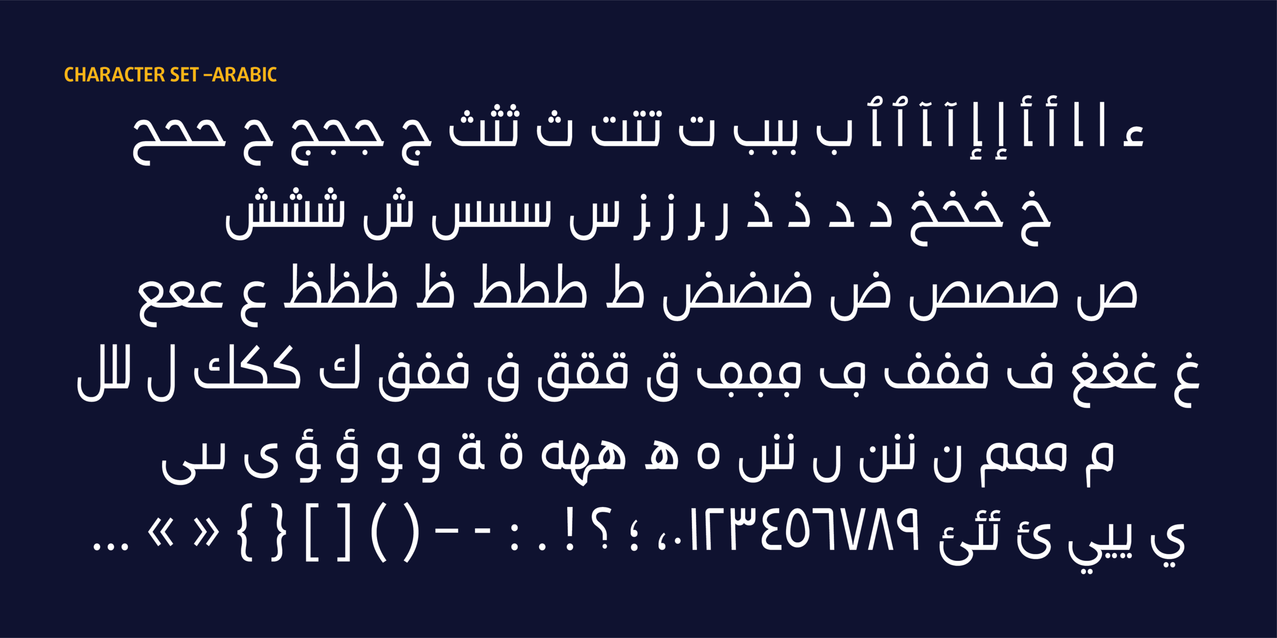
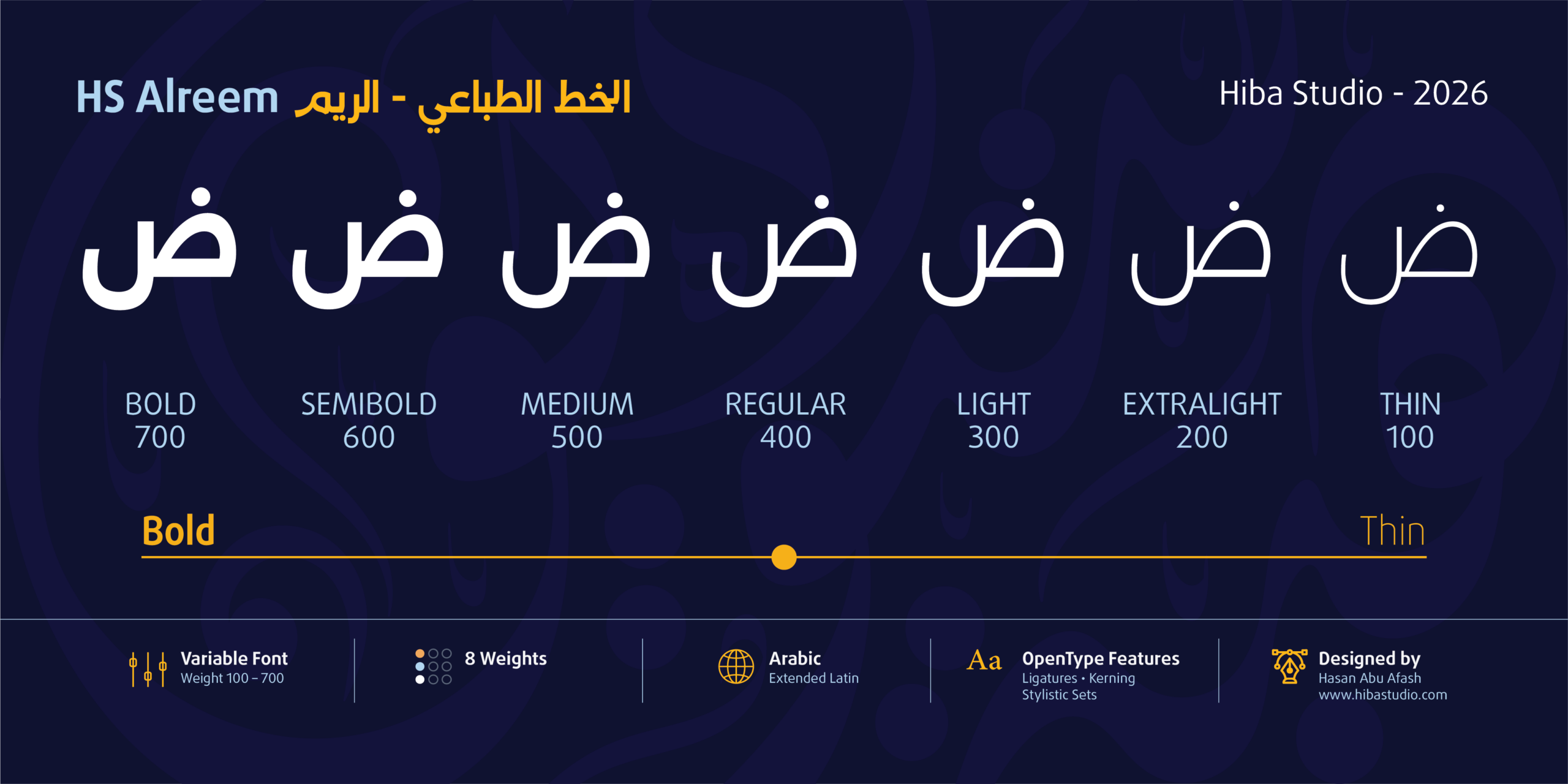
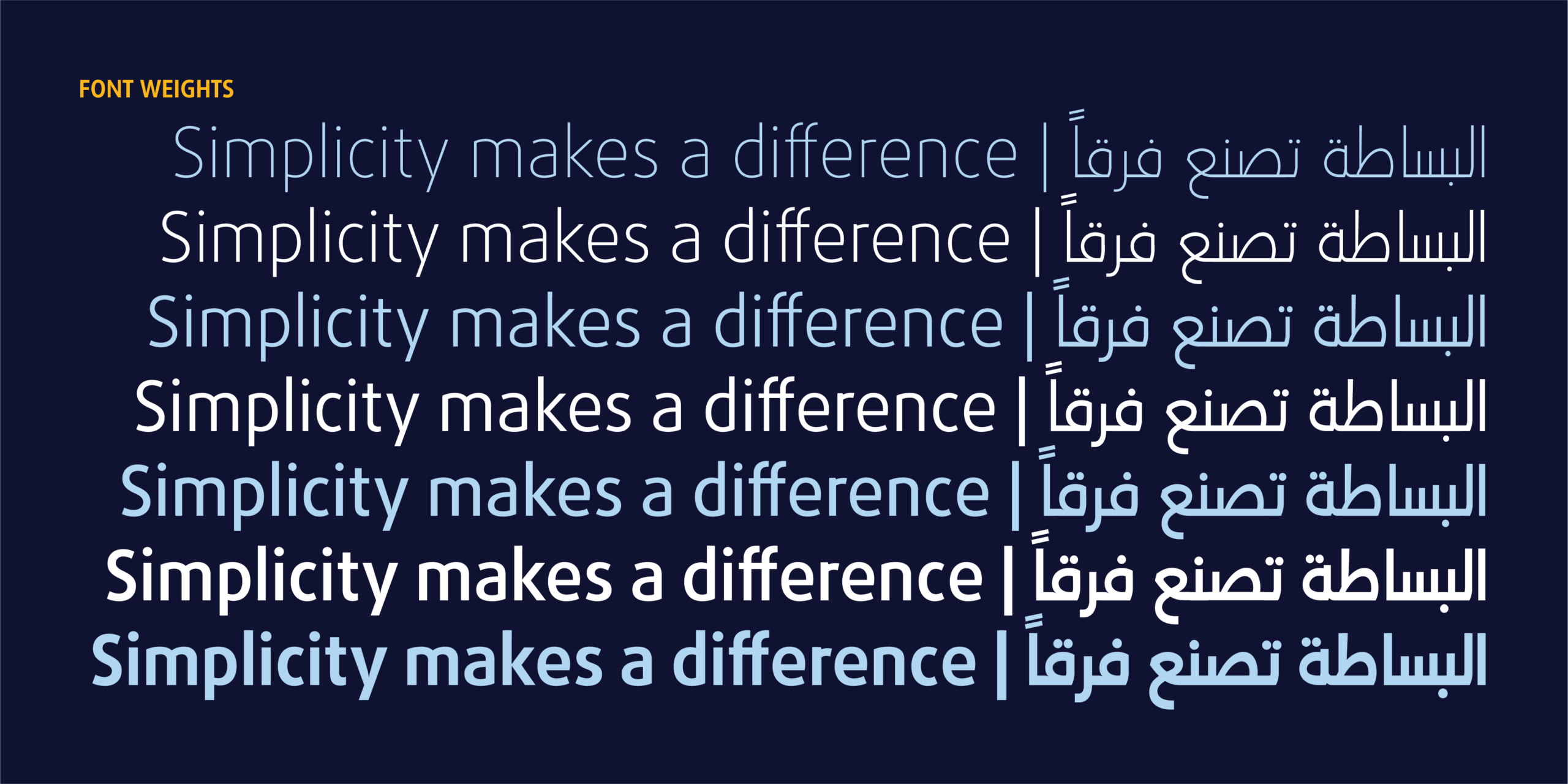
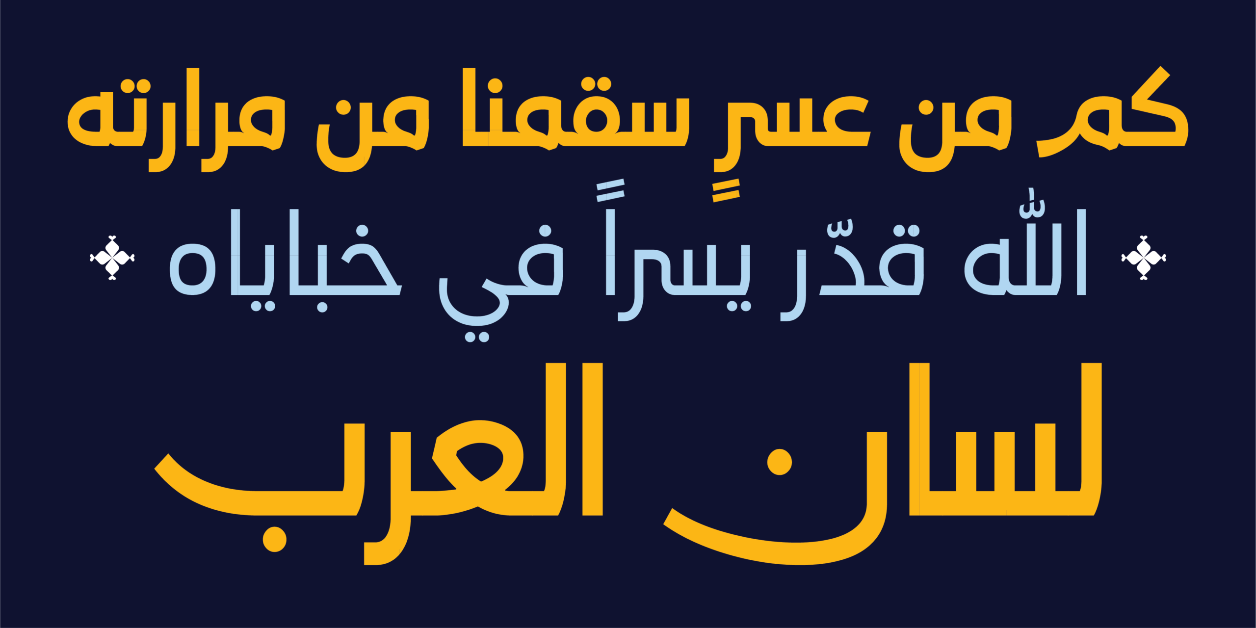
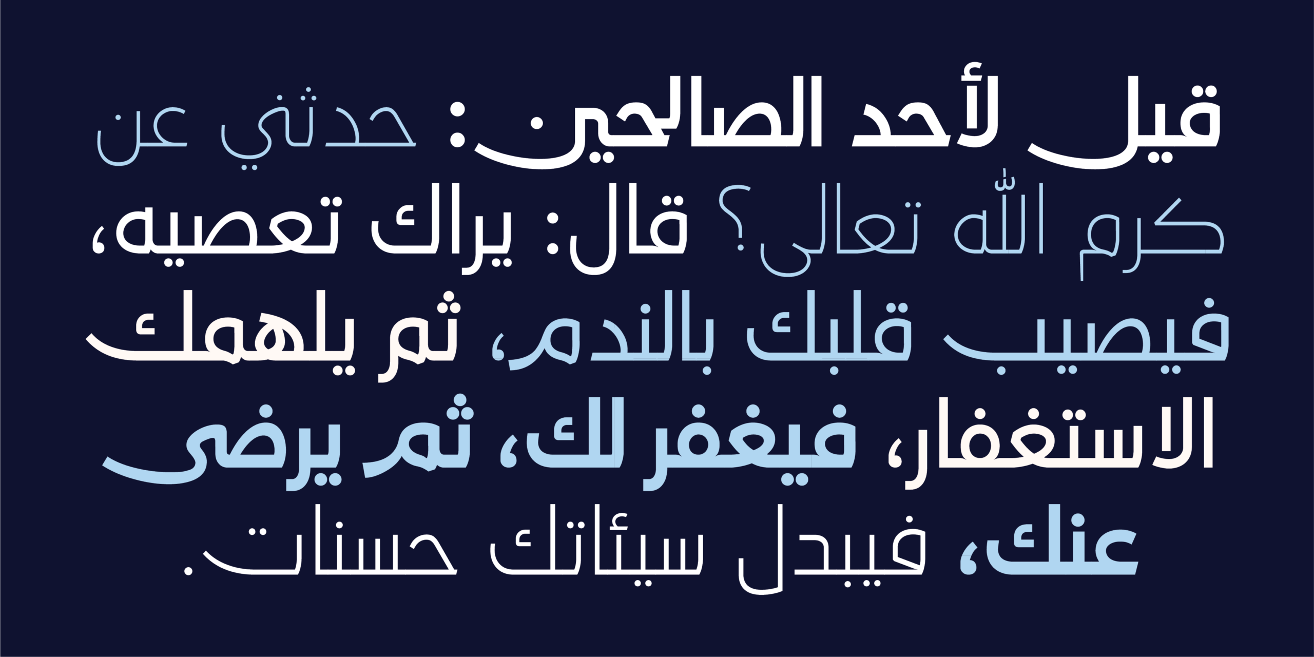
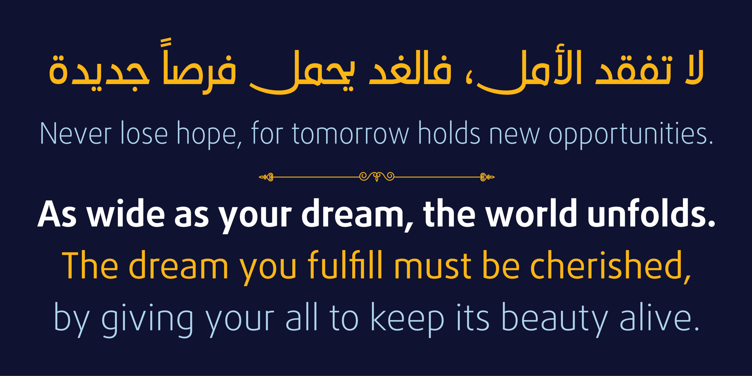
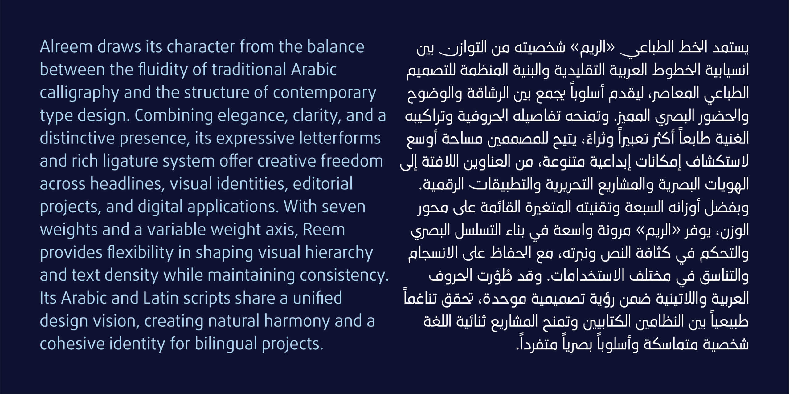
«الريم» خط عربي إنساني معاصر، يقوم عند نقطة التقاء أصالة النسخ ووضوح الكوفي المبسّط. فبدلاً من الميل إلى أحدهما دون الآخر، يجمع بينهما، فيصل انسيابية الأشكال الخطية بانضباط التصميم الحديث في نظام واحد متماسك. تضم العائلة سبعة أوزان من الرفيع (Thin) إلى الثقيل (Bold)، وتتوافر بتقنية الخط المتغير بمحور للوزن، ما يمنح المصممين تحكماً سلساً ودقيقاً في التسلسل البصري وكثافة النص ونبرته في المطبوعات والشاشات. ويضم الخط الحروف العربية إلى جانب اللاتينية الموسعة، وقد رُسمتا في حوار مباشر، فتشتركان في الإيقاع والنسب وعلاقات الأوزان. والنتيجة خط ثنائي اللغة حقاً، يبدو فيه النظامان تعبيرين عن صوت واحد.
فلسفة الخط
ينطلق «الريم» من قناعة بسيطة: الأناقة تولد من حسن إدارة المنحنى قبل أن تولد من الزخرفة. ففي النسخ يتجلى المنحنى في دورة الحرف وتدرّج حركته، وفي الكوفي المبسّط يتجلى في صفاء البناء ووضوح الشكل. وقد سعى التصميم إلى أن يجمع بين الحسّين، فيبقى الحرف دافئاً من غير أن يفقد انضباطه، وواضحاً من غير أن يفقد روحه الخطية. ولأن الحرف العربي يتصل بجاره، جاء الاهتمام بالربط بين الحروف في صلب التصميم لا في هامشه. فكل وصلة محسوبة لتُقرأ بسلاسة، وكل تركيب يضيف إلى النص ثراءً بصرياً دون أن يثقله.
استخدامات الخط
يناسب «الريم» المشاريع التي تحتاج إلى حضور أنيق وقراءة مريحة معاً:
▪ الهويات البصرية والعلامات التجارية ثنائية اللغة
▪ العناوين الرئيسية في الصحف والمجلات والمواد التحريرية
▪ أغلفة الكتب والمطبوعات الثقافية
▪ الإعلانات والحملات التسويقية
▪ واجهات التطبيقات والمواقع والمنتجات الرقمية
▪ العروض التقديمية والتقارير المؤسسية
الخصائص التقنية
▪ سبعة أوزان من Thin إلى Bold ضمن عائلة واحدة
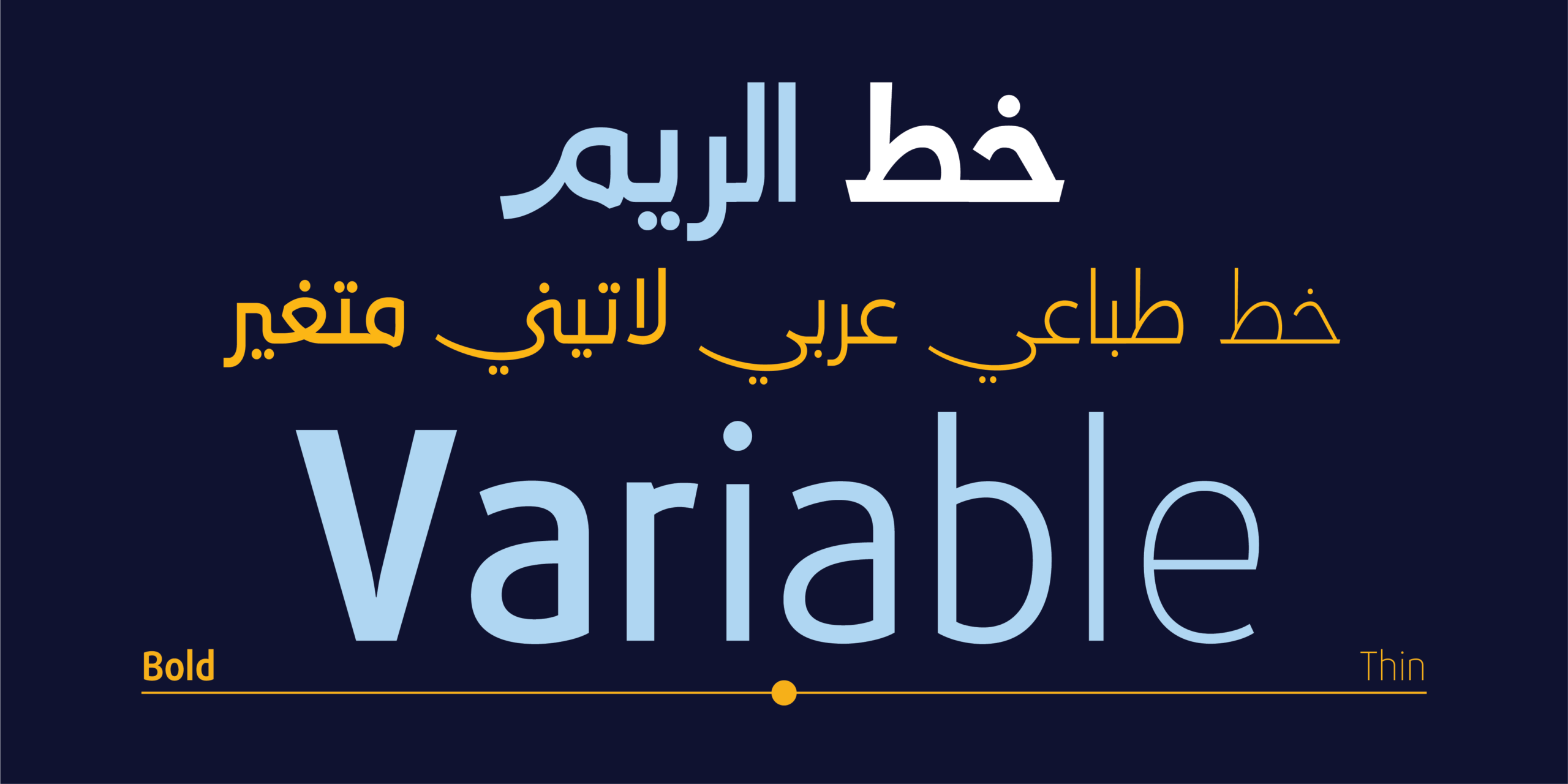
▪ تقنية الخط المتغير (Variable Font) بمحور للوزن
▪ دعم اللغة العربية واللاتينية الموسعة
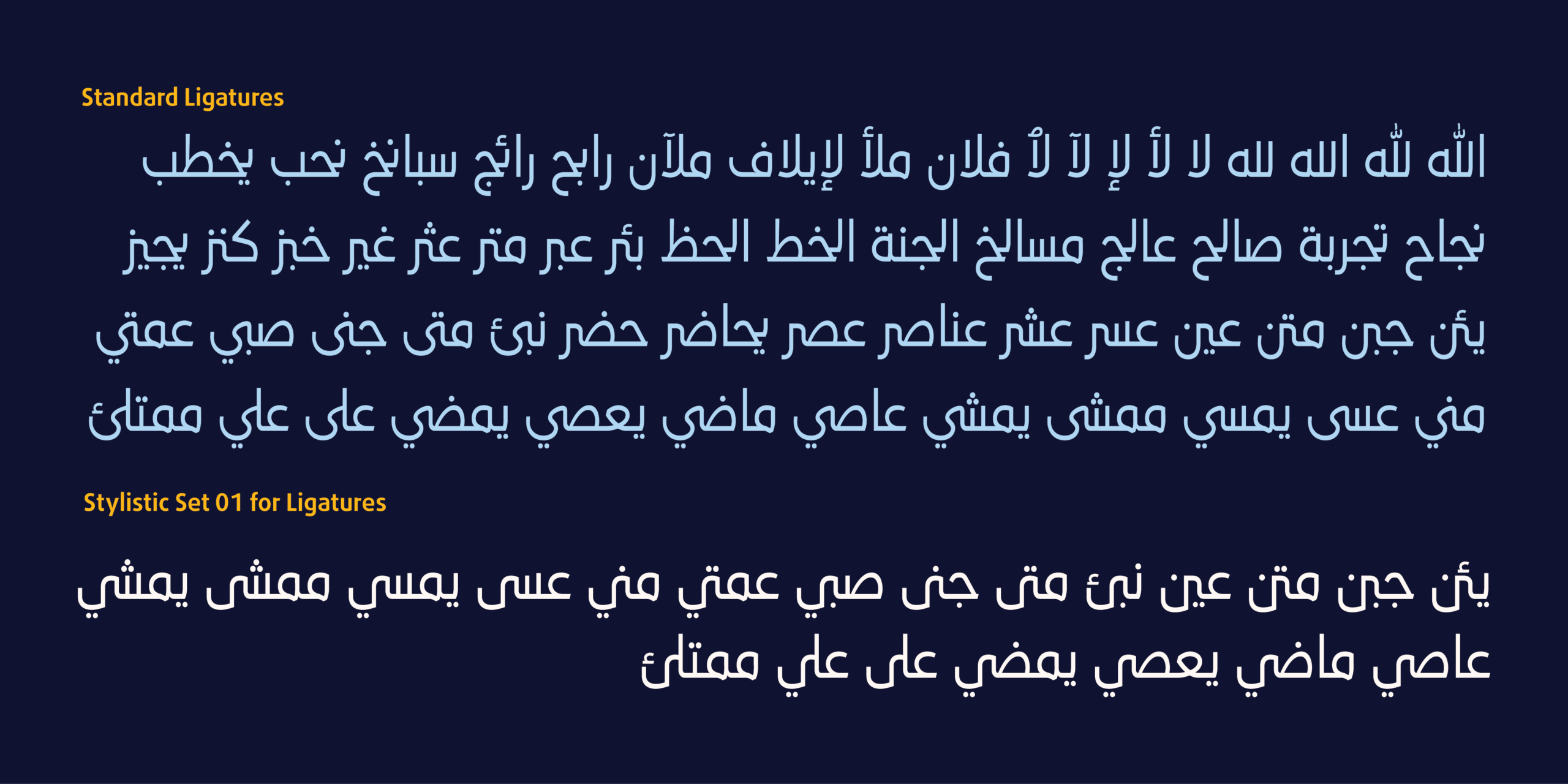
▪ مجموعة جيدة من التراكيب الحروفية (Ligatures)
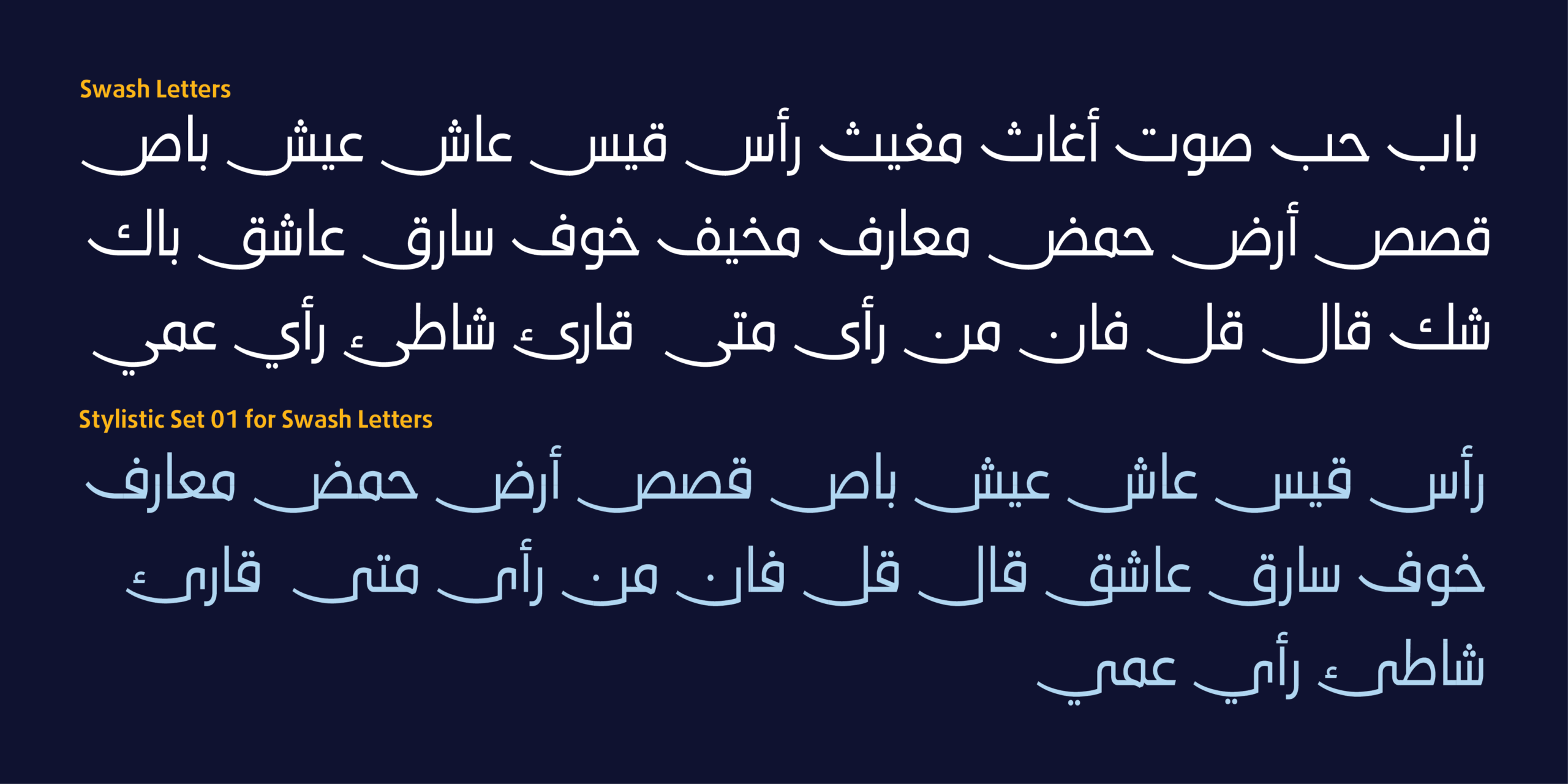
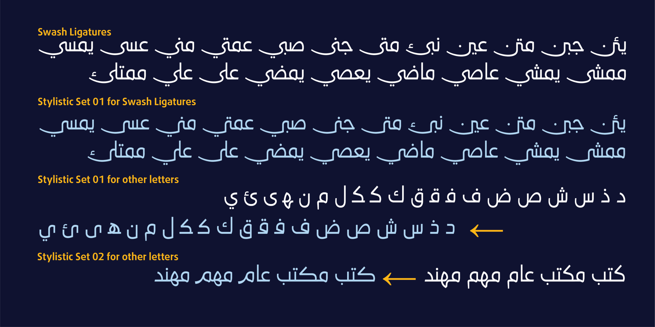
▪ حروف وتراكيب السواش (Swash)، ولبعضها بدائل أسلوبية عبر ss01
▪ بدائل أسلوبية للحروف والتراكيب تُفعَّل عبر ss01 وss02
▪ بدائل سياقية (Contextual Alternates) وأشكال موضعية (Positional Forms)
▪ ضبط دقيق للتقارب بين الحروف (Kerning)
HS Alreem – Elegance in Every Curve
About the Typeface
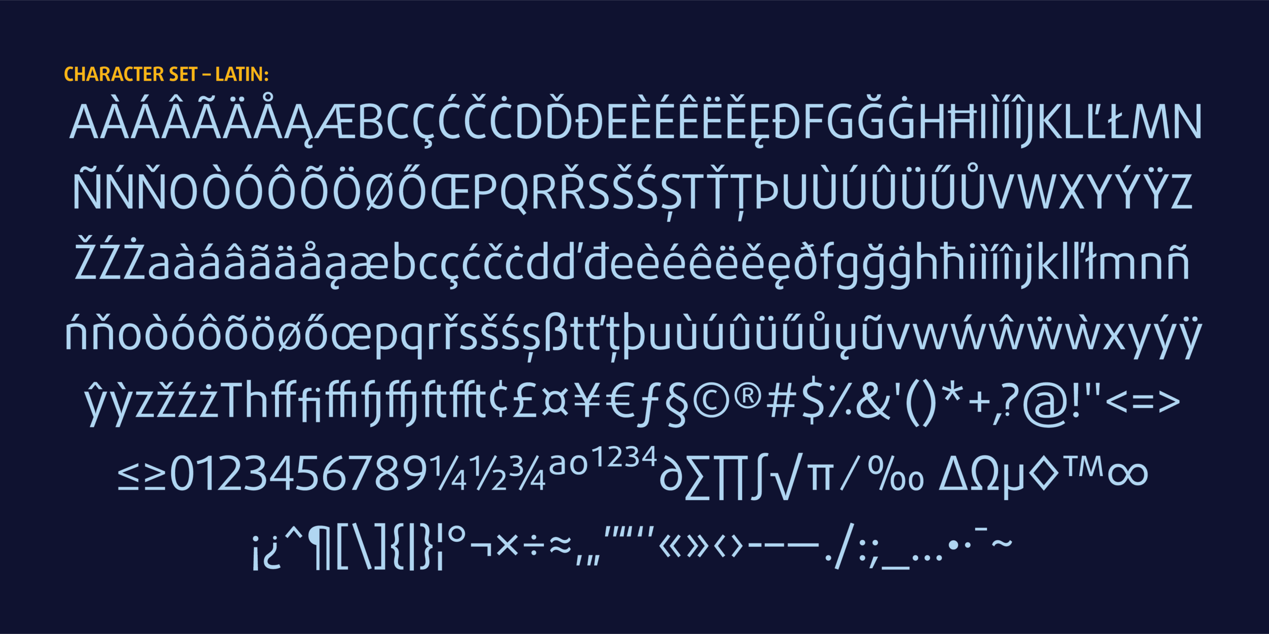
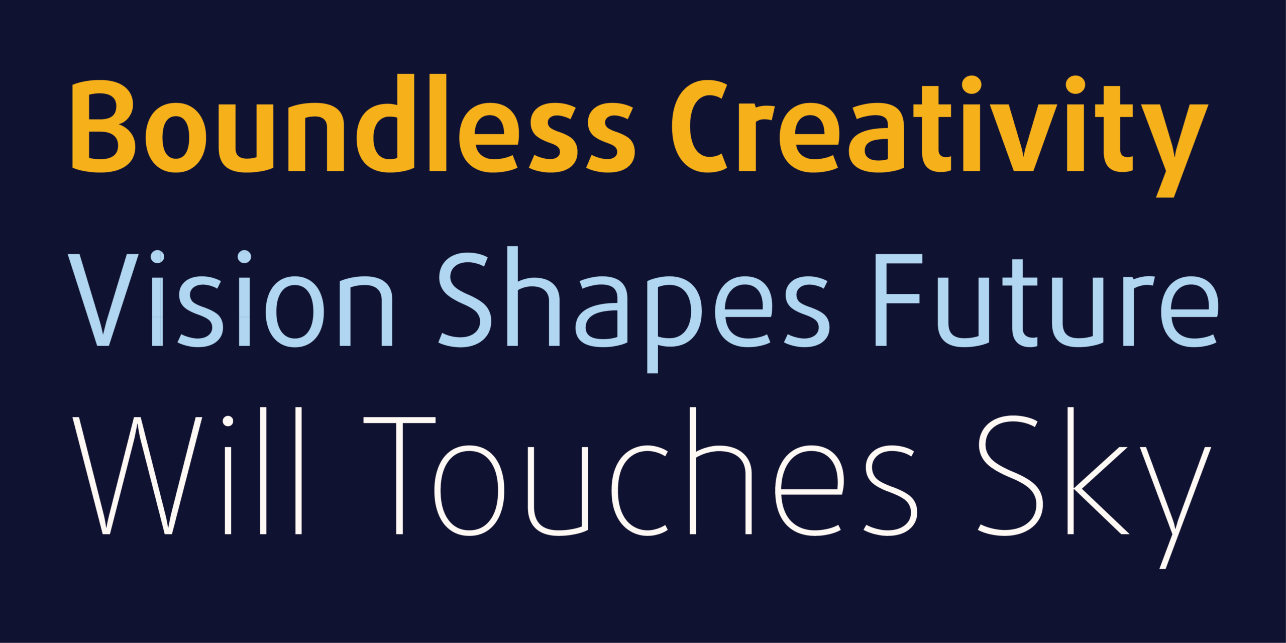
HS Alreem is a contemporary humanist Arabic typeface, set where Naskh tradition meets the clarity of simplified Kufi. Rather than leaning toward one or the other, it holds both, joining the fluidity of calligraphic forms with the order of modern design in a single cohesive system. The family spans seven weights from Thin to Bold and is available as a Variable Font with a weight axis, giving designers smooth, precise control over hierarchy, density, and tone across print and screen. The typeface covers Arabic alongside Extended Latin, drawn in direct conversation so that both share the same rhythm, proportions, and weight relationships. The result is a genuinely bilingual typeface where both scripts read as two expressions of one voice.
Design Philosophy
Alreem begins from a simple conviction: elegance comes from how a curve is handled before it comes from ornament. In Naskh, the curve lives in the turn of the letter and the gradual shift of its movement. In simplified Kufi, it lives in the calm of the construction and the clarity of the form. The design sets out to hold both, so the letter stays warm without losing discipline, and stays clear without losing its calligraphic spirit. Because Arabic letters connect to their neighbours, the joins were treated as central to the design rather than an afterthought. Every connection is tuned to read smoothly, and every ligature adds visual richness to the text without weighing it down.
Uses
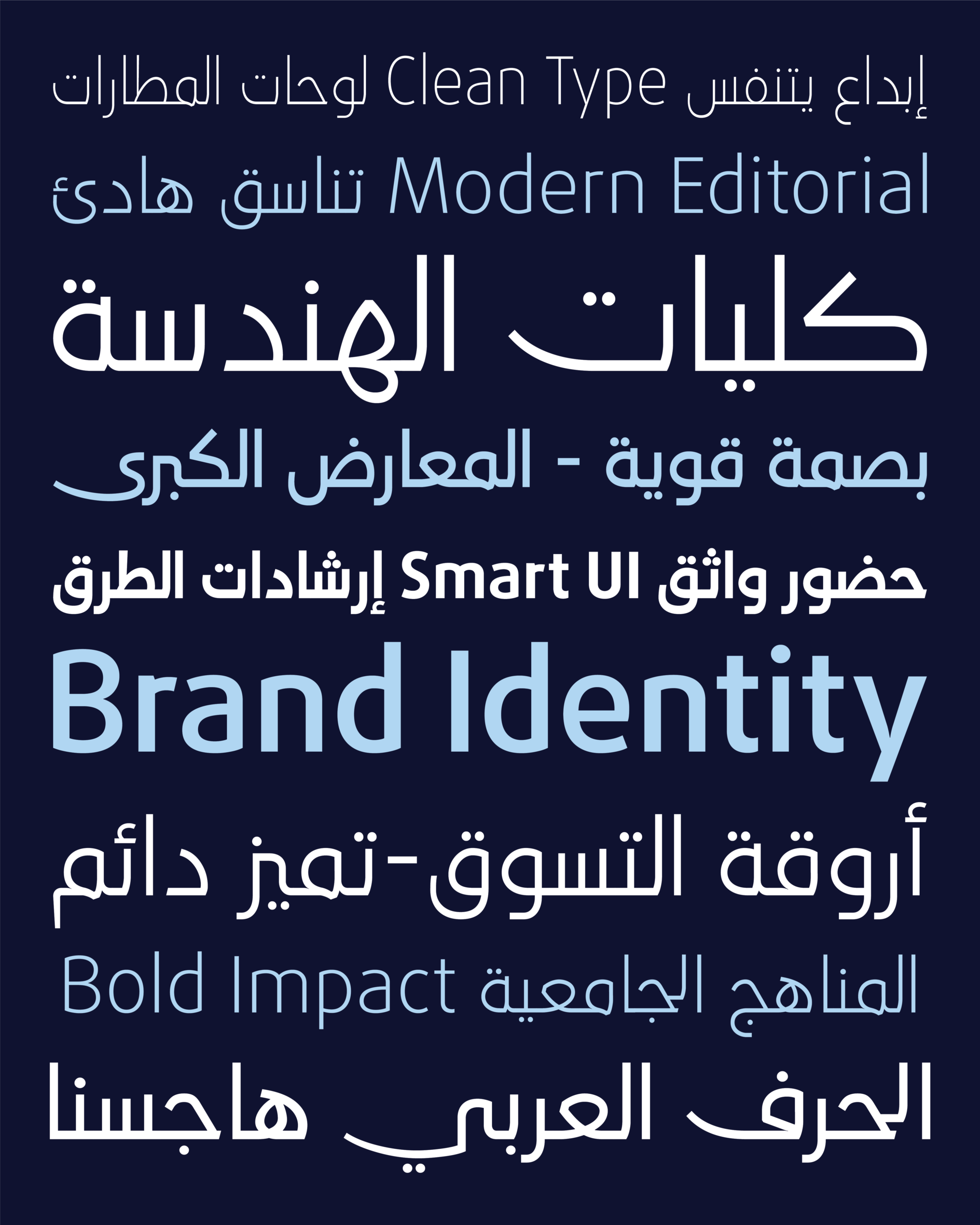
Alreem suits projects that need an elegant presence and comfortable reading in equal measure:
▪ Bilingual brand identities and logotypes
▪ Headlines for newspapers, magazines, and editorial work
▪ Book covers and cultural publications
▪ Advertising and marketing campaigns
▪ App interfaces, websites, and digital products
▪ Presentations and corporate reports
Technical Features
▪ Seven weights from Thin to Bold in a single family
▪ Variable Font technology with a weight axis
▪ Arabic and Extended Latin support
▪ A good set of Ligatures
▪ Swash letters and ligatures, some with stylistic alternates via ss01
▪ Stylistic alternates for letters and ligatures, activated through ss01 and ss02
▪ Contextual Alternates and Positional Forms
▪ Precise Kerning
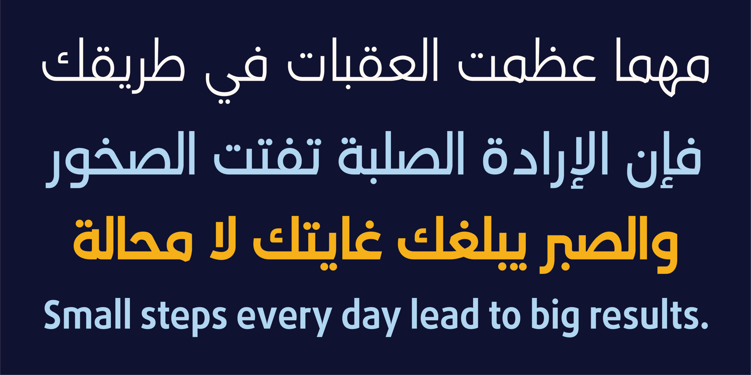
معلومات مختصرة عن الخط الطباعي HS Alreem|
* مصمم الحرف الطباعي |حسن أبو عفش
* تاريخ تصميم الحرف الطباعي| 2026
* الشركة المنتجة للحرف |HibaStudio
* تنسيق الخط الطباعي|OTF, TTT, woff2 and Varible Font
* لغات الخط الطباعي |العربية واللاتينية
* أوزان الخط الطباعي| Thin, ExtraLight, Light, Regular, Medium, SemiBold, Bold
* للمزيد من المعلومات في موقع Behance
** لشراء الخط نأمل الاتصال بنا عبر البريد الإلكتروني| hasan@hibastudio.com