
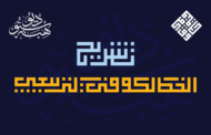
Hasan Hiba| روح الخط الكوفي الفاطمي بأسلوب معاصر
Hasan Hiba هو خط عربي متغيّر (Variable Font) يجمع بين الطابع التراثي والدقة الهندسية، مستلهم من قواعد الخط الكوفي الفاطمي، مع لمسة تصميمية حديثة تعبّر عن التوازن بين الأصالة والحداثة. تم تصميم الخط بواسطة حسن أبوعفش كإعادة تحديث شاملة للخط الطباعي Hasan Hiba، الذي أُطلق لأول مرة عام 2005، وفاز بالمركز الخامس في فئة العناوين ضمن مسابقة نظمتها شركة Linotype.
في نسخته الجديدة، يأتي HS Hiba بخمسة أوزان ثابتة للنمط الرئيسي: Light – Regular – Medium – SemiBold – Bold
إلى جانب نسخة متغيّرة (Variable) تجمع هذه الأوزان ضمن محور وزني واحد. يدعم الخط اللغتين العربية والإنجليزية، ويحتوي على مجموعات زخرفية متعددة (Stylistic Sets ss01–ss05)، ما يتيح للمصمم مرونة فائقة في تشكيل الحروف حسب طبيعة المشروع.
فلسفة التصميم|
- ينطلق تصميم Hasan Hiba من رغبة في الجمع بين التراث البصري للكوفي الفاطمي وتطلعات التصميم الطباعي المعاصر.
- تم الحفاظ على البنية الصارمة والمستقيمة للكوفي، مع إدخال توازنات هندسية ناعمة تمنح الحرف طابعًا إنسانيًا أكثر انسيابية.
- تتجلّى هذه الفلسفة في تقديم خمسة أوزان مما يمنح المصمم خيارات متعدّدة للتعبير البصري.
الخصائص التقنية|
- خط متغيّر (Variable Font) بمحور وزني (Weight Axis)
- 5 أوزان ثابتة للوزن العادي الرئيسي: Light, Regular, Medium, SemiBold, Bold
- دعم للغتين: العربية والإنجليزية
- توافق كامل مع برامج التصميم الاحترافية مثل: Adobe Illustrator، InDesign، CorelDRAW، Affinity Designer وغيرها
- دعم شامل لعلامات التشكيل
- دعم موسّع لميزات OpenType:
– Stylistic Sets (ss01–ss05)
– Ligatures
– Contextual Alternates
– Positional Forms
– Kerning
مجالات الاستخدام| يمتاز خط HS Hiba بمرونته البصرية التي تجعله مناسبًا لمجموعة واسعة من الاستخدامات الطباعية، منها:
- الشعارات والهويات البصرية
- العناوين واللافتات البارزة
- أغلفة الكتب والمجلات
- التصميمات الثقافية والتراثية
- الملصقات والمعارض الفنية
- التصميم التحريري والمنشورات الرقمية
- واجهات المستخدم UI والتطبيقات
تمنح أنماطه الثلاثة وخياراته الزخرفية المصممين حرية عالية في التخصيص حسب طبيعة المشروع، مع الحفاظ على طابع حديث مستوحى من التراث.
HS Hiba – The Spirit of Fatimid Kufi with a Contemporary Touch
Hasan Hiba is a variable Arabic typeface that blends traditional Kufic aesthetics with geometric precision. Inspired by the principles of Fatimid Kufi, the design balances historical heritage with contemporary typographic expression.
Originally designed by Hasan Abu Afash in the early 2000s and first released in 2005, Hasan Hiba has since been completely redesigned and expanded. This new release preserves the core identity of the original typeface while introducing a refined structure, modern proportions, and advanced OpenType capabilities. The original design was recognized internationally, winning 5th place in the Display category of a global competition organized by Linotype.
The current version of Hasan Hiba is available in five static weights: Light, Regular, Medium, SemiBold, and Bold, alongside a Variable Font version that unifies the family along a single weight axis, offering flexible typographic control for modern workflows.
Supporting both Arabic and English scripts, Hasan Hiba includes multiple stylistic sets (ss01–ss05), enabling designers to tailor character appearance for a wide range of editorial, branding, and display applications.
Design Philosophy
- Hasan Hiba emerges from a vision to merge the visual legacy of Fatimid Kufic with the ambitions of contemporary type design.
- While preserving the strict, linear structure of the Kufic script, it introduces soft geometric harmonies to add a more human, fluid character to the letters.
- The design philosophy is embodied in the availability of five weights providing typographers a variety of expressive choices.
Technical Features
- Variable Font with a Weight Axis
- Five static weights for the main style: Light, Regular, Medium, SemiBold, Bold
- Support for Arabic and English
- Full compatibility with professional design software: Adobe Illustrator, InDesign, CorelDRAW, Affinity Designer, and more
- Complete support for Arabic diacritics
- Extensive OpenType features:
– Stylistic Sets (ss01–ss05)
– Ligatures
– Contextual Alternates
– Positional Forms
– Kerning
Use Cases
HS Hiba’s visual flexibility makes it ideal for a wide range of typographic applications, including:
- Logos and branding projects
- Display headlines and signage
- Book and magazine covers
- Cultural and heritage-themed designs
- Posters and exhibition graphics
- Editorial layouts and digital publishing
- UI design and mobile apps
With its three stylistic variations and ornamental options, the typeface offers designers a high degree of customization, while maintaining a modern spirit rooted in tradition.
معلومات مختصرة عن الخط الطباعي HS Hiba|
* مصمم الحرف الطباعي |حسن أبو عفش
* تاريخ تصميم الحرف الطباعي| 2025
* الشركة المنتجة للحرف |HibaStudio
* تنسيق الخط الطباعي|OTF, TTT, woff2 and Varible Font
* لغات الخط الطباعي |العربية والفارسية واللاتينية
* أساليب وأوزان الخط الطباعي| Light, Regular, medium, SimiBold, Bold, Regular A, Regular B
** للمزيد من المعلومات في موقع Behance
")


