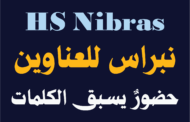


خط نبراس للعناوين – حضورٌ يسبق الكلمات
المقدمة
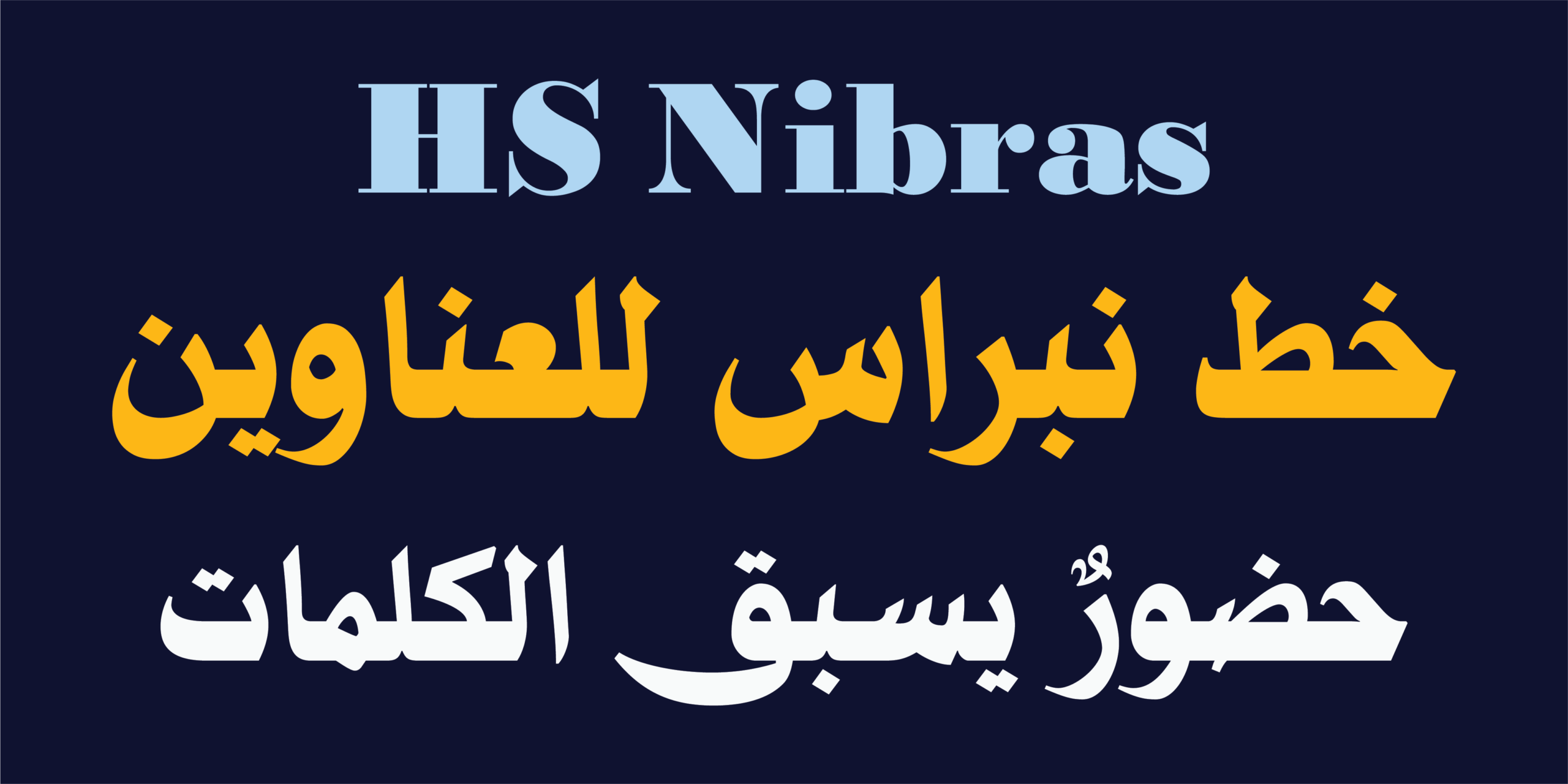
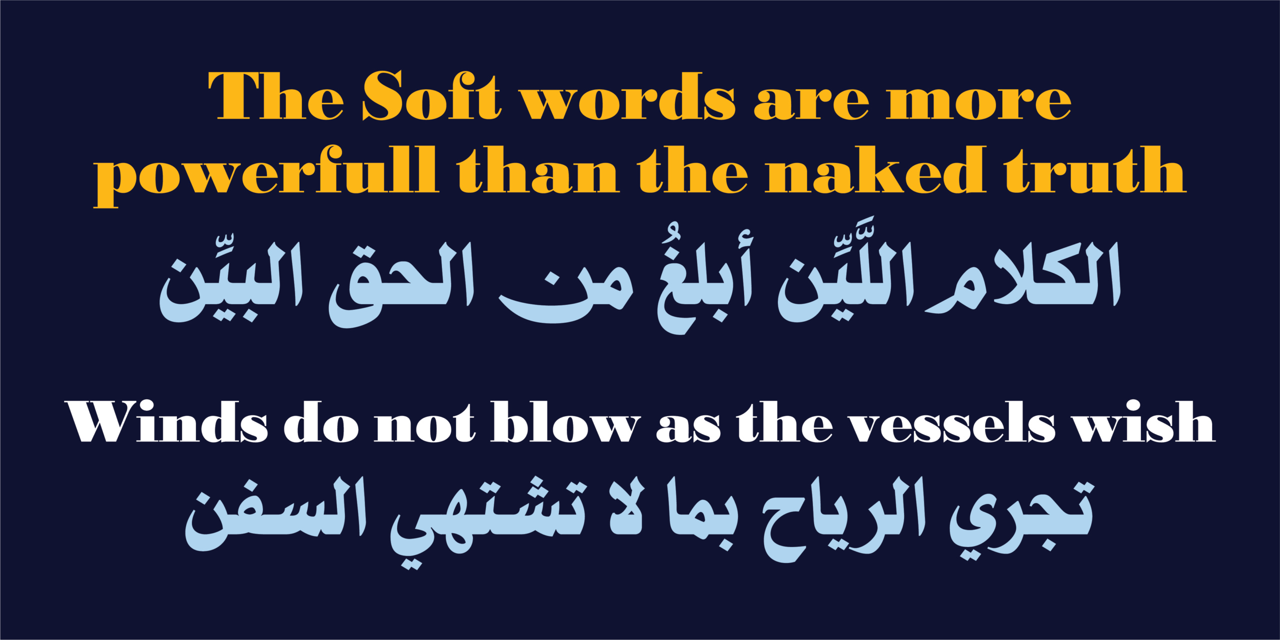
لكل عنوان ناجح لحظةٌ تسبق القراءة… لحظة يفرض فيها حضوره. صُمِّم HS Nibras ليكون خطاً طباعياً عربياً معاصراً لفئة العناوين، يجمع بين أصالة الخط النسخي السطري وروح التصميم الحديث. فهو يستلهم وضوح النسخ وتوازنه، ثم يعيد صياغته بلغة بصرية أكثر قوة وجرأة لتناسب العناوين، والهويات البصرية، وأعمال النشر المعاصرة.
يرتكز الخط على وزن واحد صُمم بعناية ليحقق أكبر أثر بصري ممكن، ويجمع بين العربية وخط لاتيني موسع متناغم ضمن منظومة تصميمية واحدة. كما يدعم اليونيكود العربي دعماً شاملاً، إلى جانب عدد كبير من اللغات المكتوبة بالحرف العربي، مما يجعله خياراً مثالياً للمشروعات متعددة اللغات التي تبحث عن هوية طباعية متماسكة.
فلسفة التصميم
العنوان ليس مجرد كلمات تُقرأ، بل حضور يلفت الانتباه قبل أن يبدأ القارئ بالقراءة. من هذه الفكرة انطلق تصميم HS Nibras.
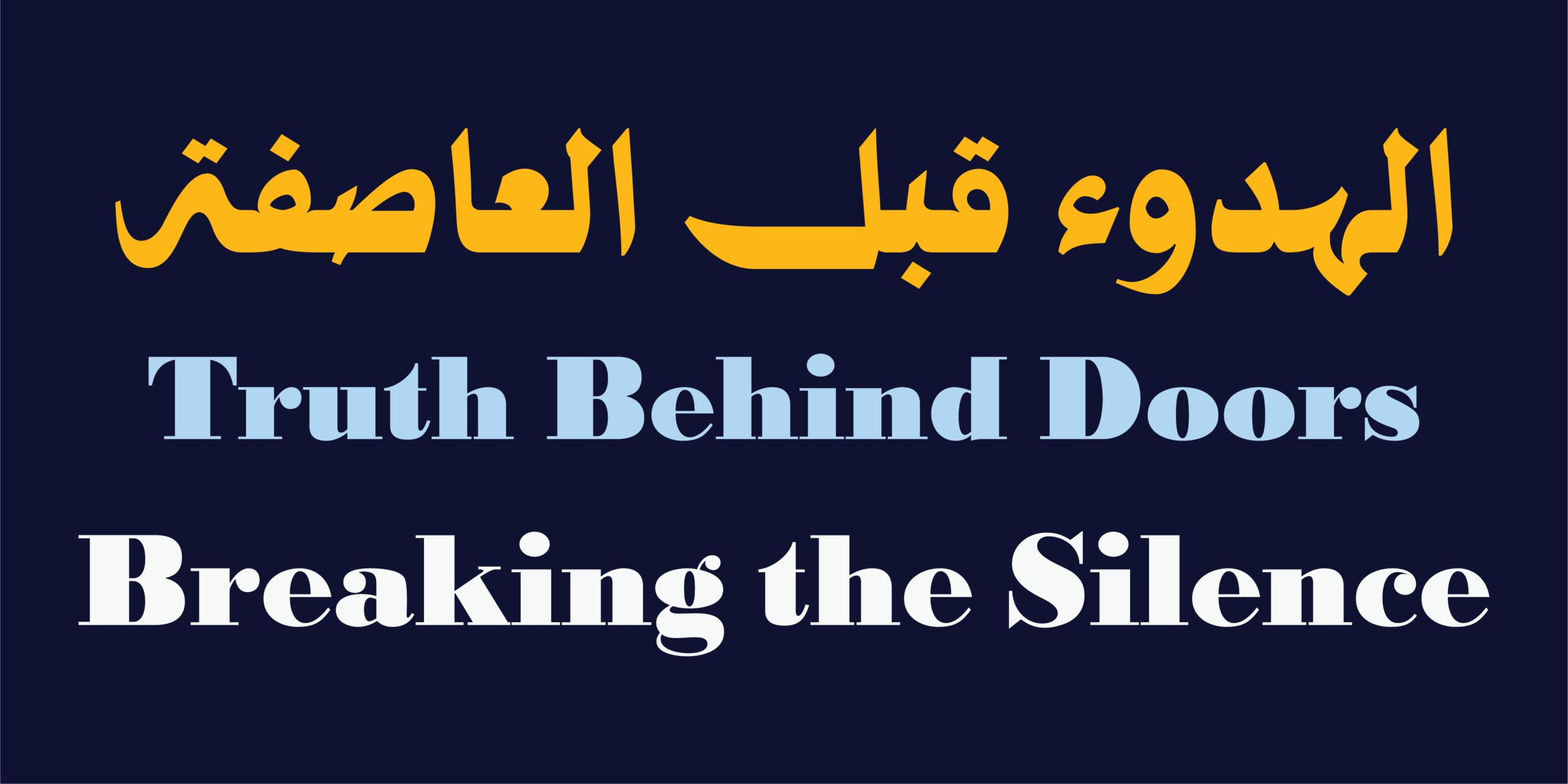
فقد روعي في كل حرف المحافظة على الإيقاع الهادئ والمتوازن للخط النسخي، مع تعزيز الوزن، وإحكام النِّسب، وتبسيط التفاصيل، ليصبح الحرف أكثر قوة ووضوحاً عند الأحجام الكبيرة دون أن يفقد طبيعته العربية الأصيلة. لم يكن الهدف إنتاج خط عريض فحسب، بل بناء شخصية طباعية واحدة تستطيع أن تجمع بين العربية واللاتينية بانسجام كامل، بحيث تبدو العناوين الثنائية اللغة وكأنها كُتبت بخط واحد، لا بخطين مختلفين.
المميزات
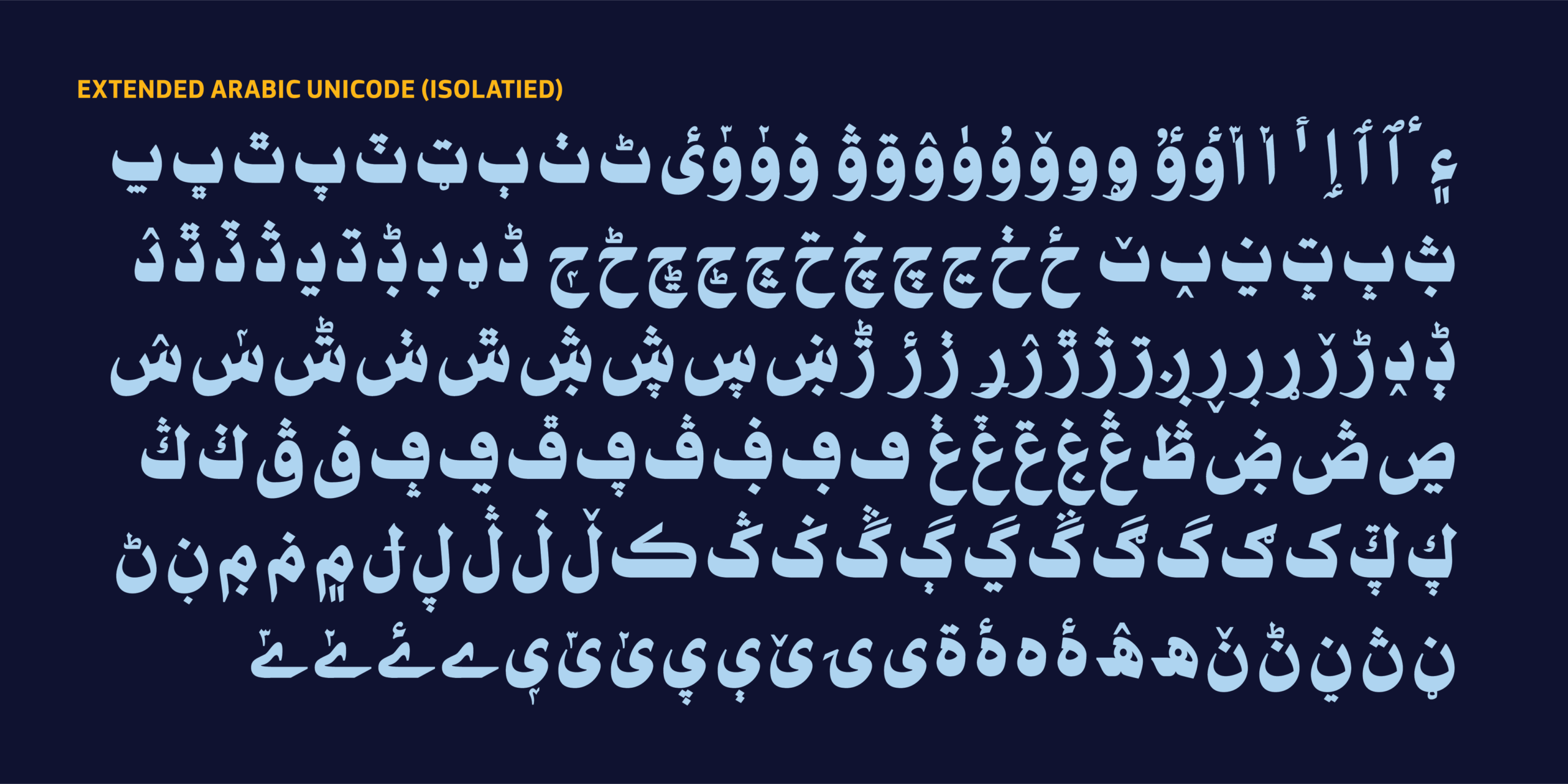
يضم HS Nibras مجموعة متقدمة من الخصائص الطباعية التي تمنح المصمم مرونة أكبر في الاستخدام، من أبرزها:
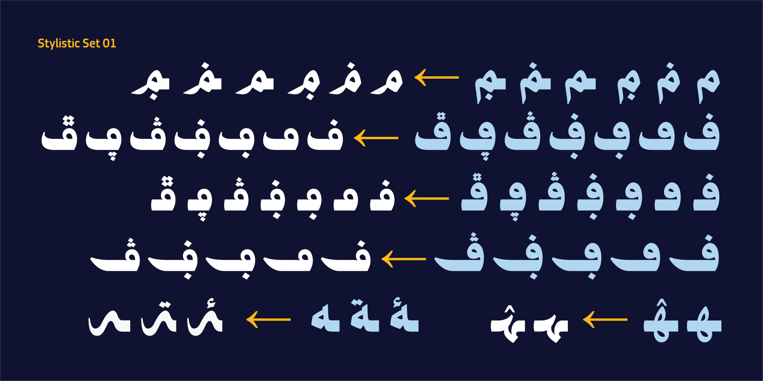
- Stylistic Set 1 لتوفير أشكال بديلة لبعض الحروف.
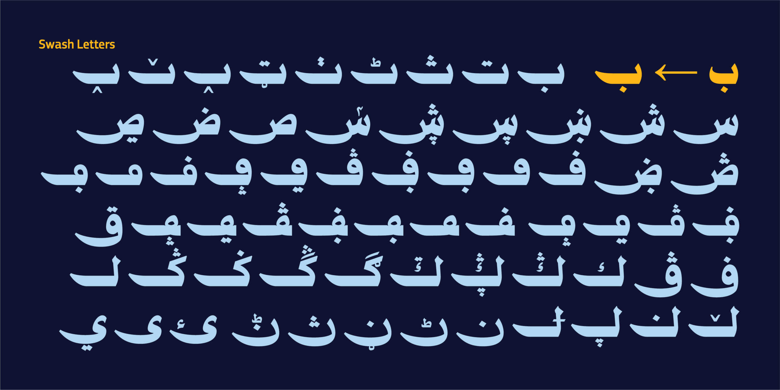
- Swash Letters لإضافة نهايات زخرفية في المواضع المناسبة.
- Stylistic Alternates تتضمن عدة بدائل لحرف الميم وبعض الحروف الأخرى.
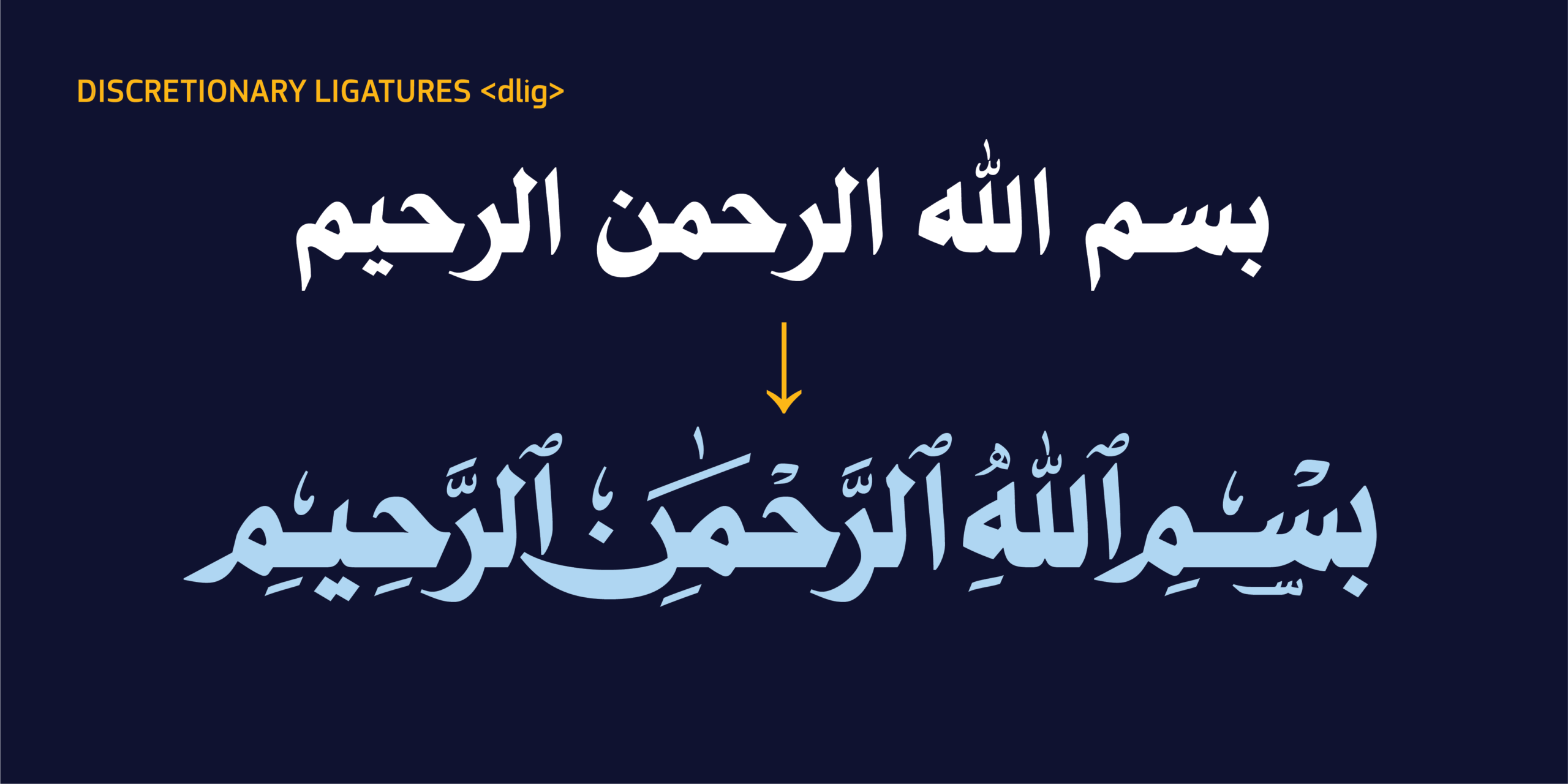
- Discretionary Ligatures (dlig) وتشمل رباطاً خاصاً بالبسملة إلى جانب عدد من التراكيب العربية التقليدية.
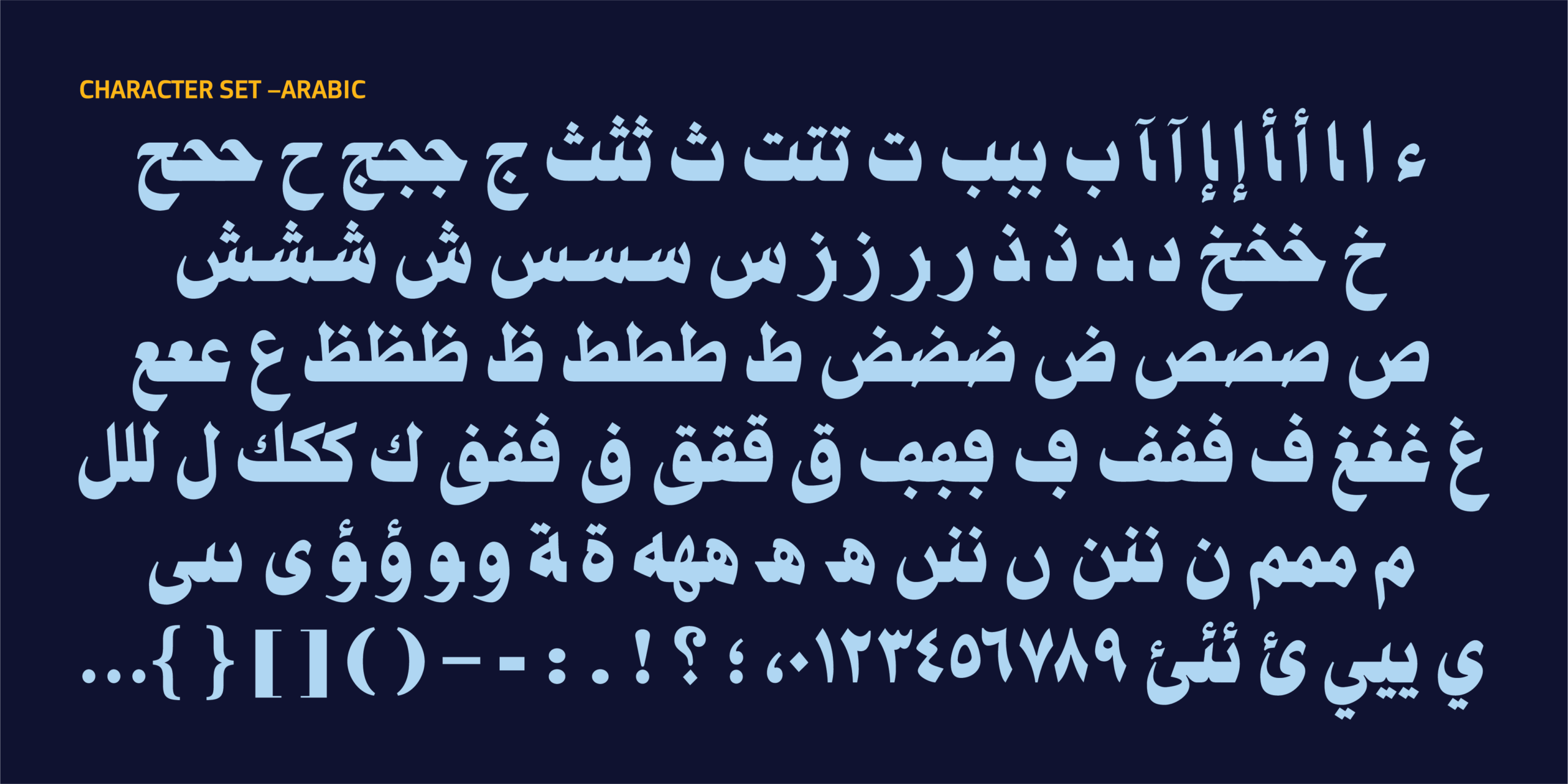
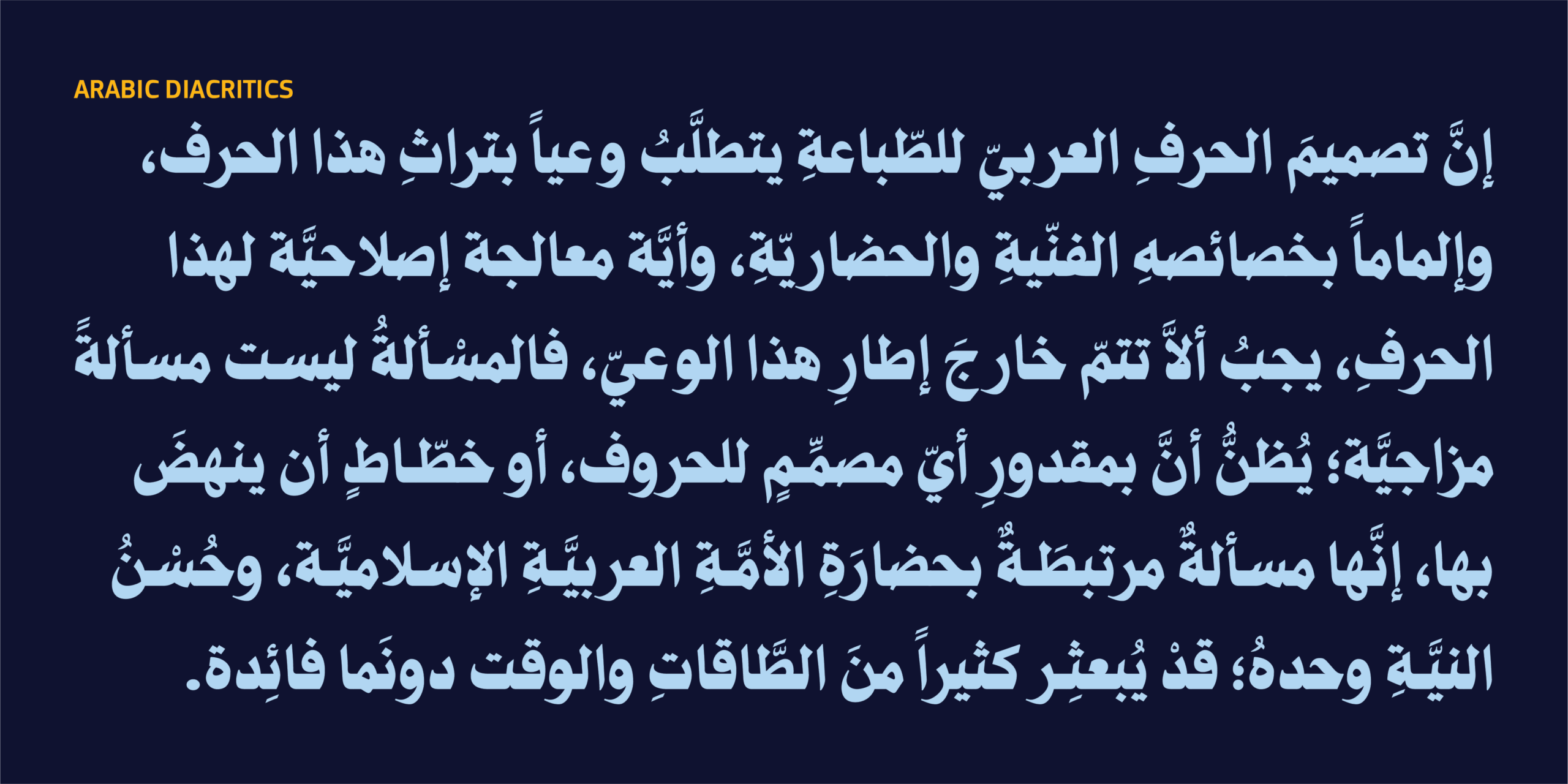
- دعم شامل لليونيكود العربي وعدد كبير من اللغات المكتوبة بالحرف العربي.
- مجموعات أرقام عربية وفارسية وأردية
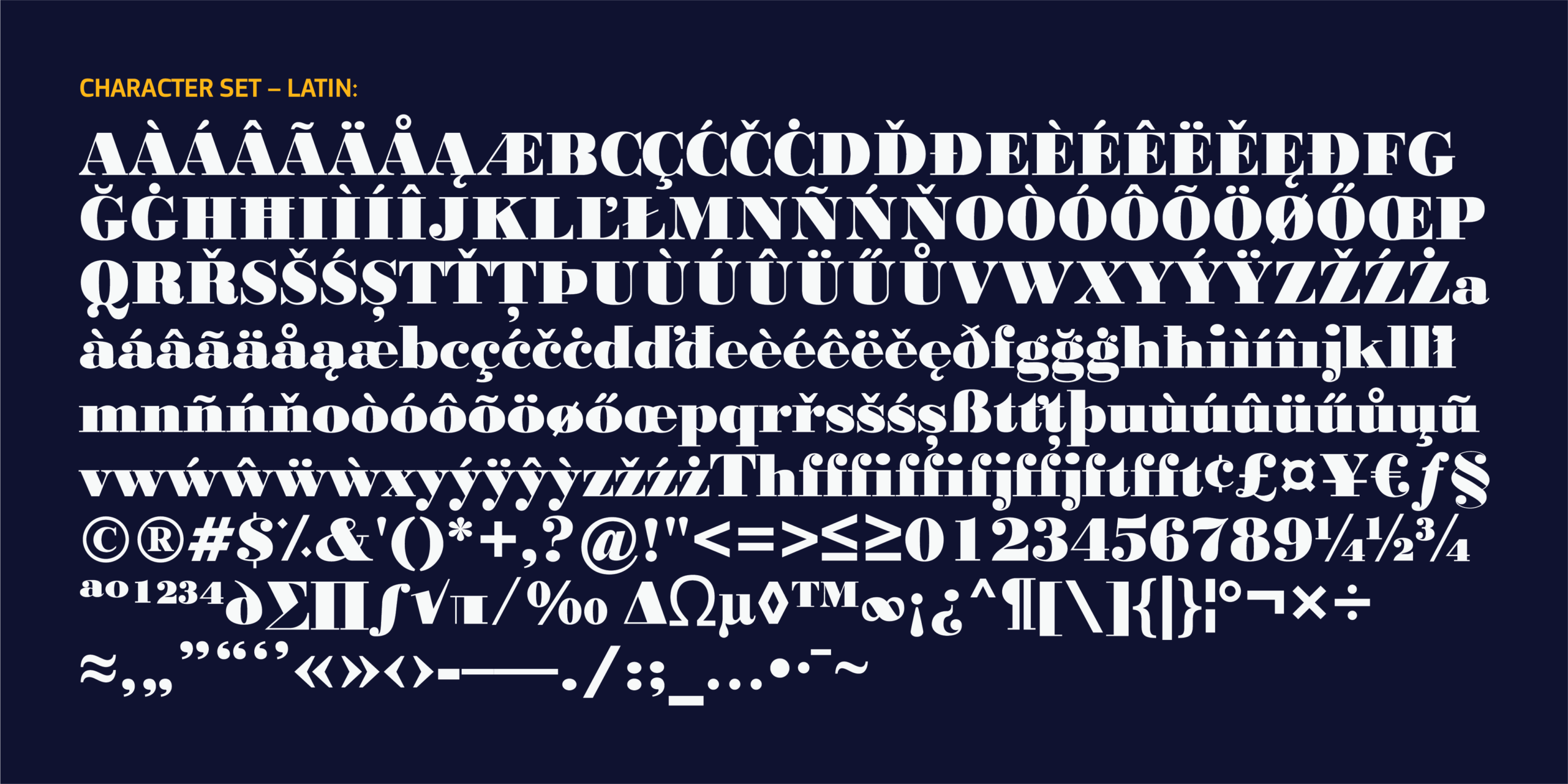
- مجموعة لاتينية موسعة متناغمة مع التصميم العربي.
- ضبط دقيق للمسافات (Spacing) والتباعد (Kerning) لتحقيق أفضل أداء في العناوين.
- ضبط مواضع التشكيل في مواضعها الدقيقة الصحيحيحة ليناسب النصوص القرآنية والأدبية.
مجالات الاستخدام
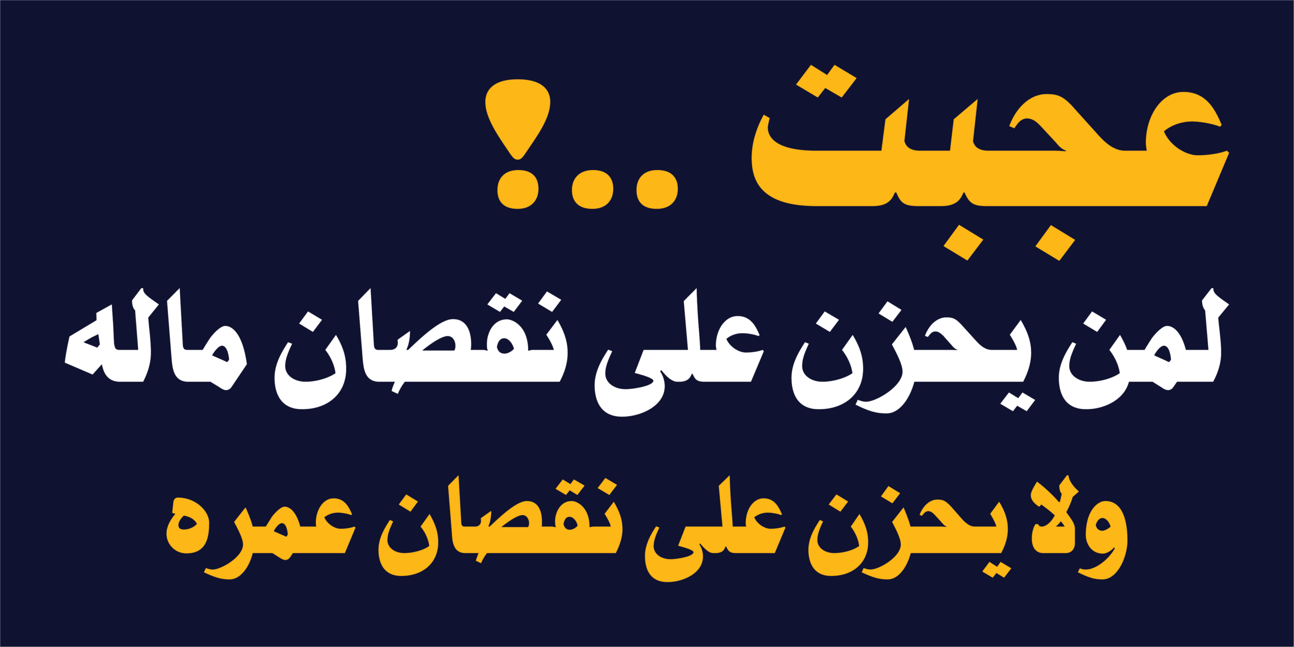
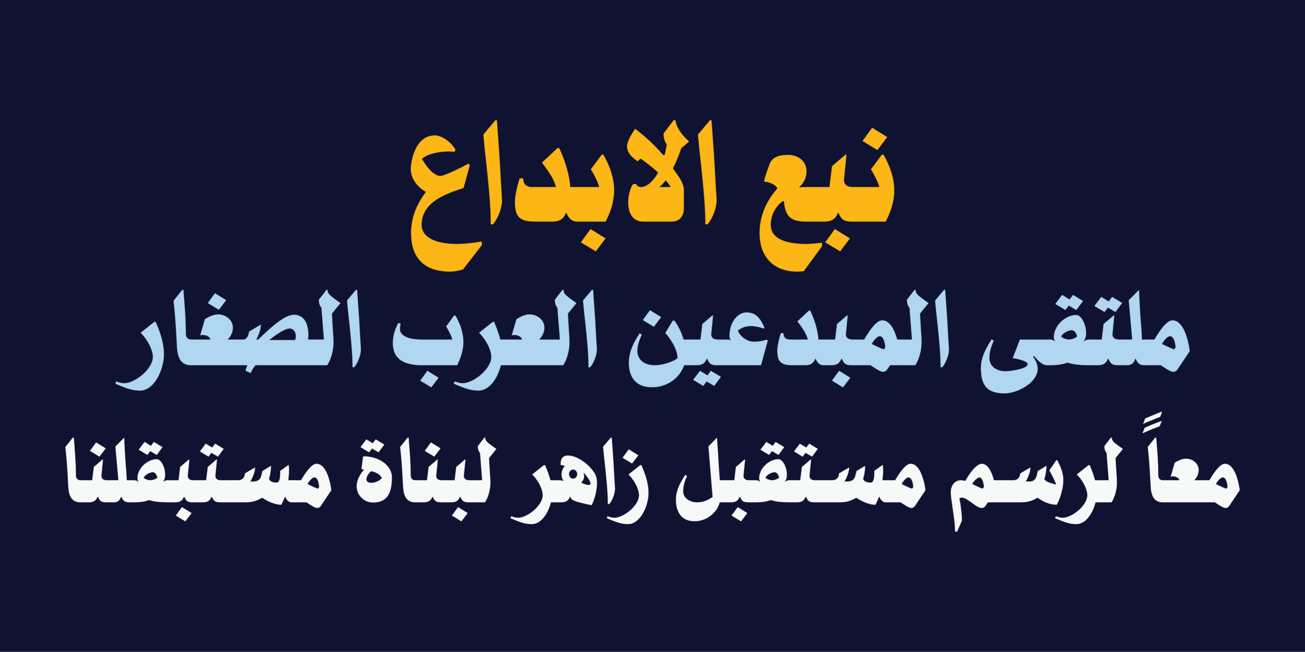
صُمِّم HS Nibras للمشروعات التي يجب أن تُرى قبل أن تُقرأ. لذلك فهو مناسب للعناوين الرئيسة في الصحف والمجلات، وأغلفة الكتب، وأعمال النشر، والملصقات، والإعلانات، والهويات البصرية، والعلامات التجارية، والتغليف، والوسائط الرقمية، وسائر المشروعات الإبداعية التي تعتمد على قوة الحرف في بناء الرسالة البصرية.
HS Nibras – Presence Before Words.
Introduction
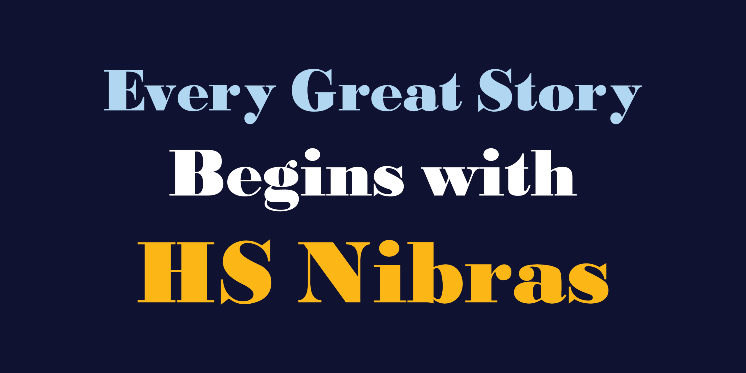
Every memorable headline begins with presence. HS Nibras is a contemporary Arabic display typeface designed for the moment typography becomes the message. Inspired by the enduring clarity of Naskh calligraphy, it transforms its balanced structure into a bold visual voice created for headlines, branding, and editorial design.
Rather than offering multiple weights, HS Nibras focuses on perfecting a single, powerful style. It brings together expressive Arabic and a harmonized extended Latin companion, allowing both scripts to coexist naturally within the same visual language. Supporting the full Arabic Unicode range, extensive Latin coverage, and numerous languages written in the Arabic script, HS Nibras is designed for projects that communicate across cultures without compromising typographic consistency.
Design Philosophy
Headlines are not simply read; they are noticed first. HS Nibras was designed around this belief. Every curve, proportion, and counterform was carefully refined to preserve the familiar rhythm of Naskh while introducing the confidence and visual weight expected from a contemporary display typeface.
The objective was never to imitate traditional calligraphy, nor to create an exaggerated display font. Instead, the aim was to build a typeface that feels equally authentic in Arabic and Latin, allowing both scripts to share the same page with harmony, clarity, and a unified personality. Whether appearing on a newspaper masthead, a book cover, a cultural poster, or a visual identity, HS Nibras is designed to command attention before a single word is read.
Features
Designed for professional editorial and branding environments, HS Nibras includes a carefully developed collection of advanced typographic features:
- Stylistic Set 1 for alternative letterform styles.
- Swash letters that add expressive calligraphic endings where appropriate.
- Stylistic alternates, including multiple forms of the Arabic letter Meem for greater typographic flexibility.
- Discretionary ligatures, including a dedicated Basmala ligature alongside traditional Arabic combinations.
- Comprehensive support for Arabic Unicode and numerous languages written with the Arabic script.
- Arabic, Persian, and Urdu numeral sets.
- A harmonized extended Latin character set for multilingual typography.
- Carefully refined spacing and kerning for balanced display composition.
- Precisely adjusting the placement of Arabic diacritical marks to perfectly align with Quranic and literary text requirements.
Applications
HS Nibras was created for typography that needs to establish presence before conveying information.
It performs naturally across editorial design, newspapers and magazines, book titles, publishing, branding, visual identities, advertising campaigns, packaging, cultural projects, digital media, and any environment where typography becomes the primary visual element.
Its bold personality, multilingual support, and refined balance between Arabic and Latin make it equally suited to local identities and international communication.
لغات الخط Supported Languages
خط طباعي واحد ولغات متعددة
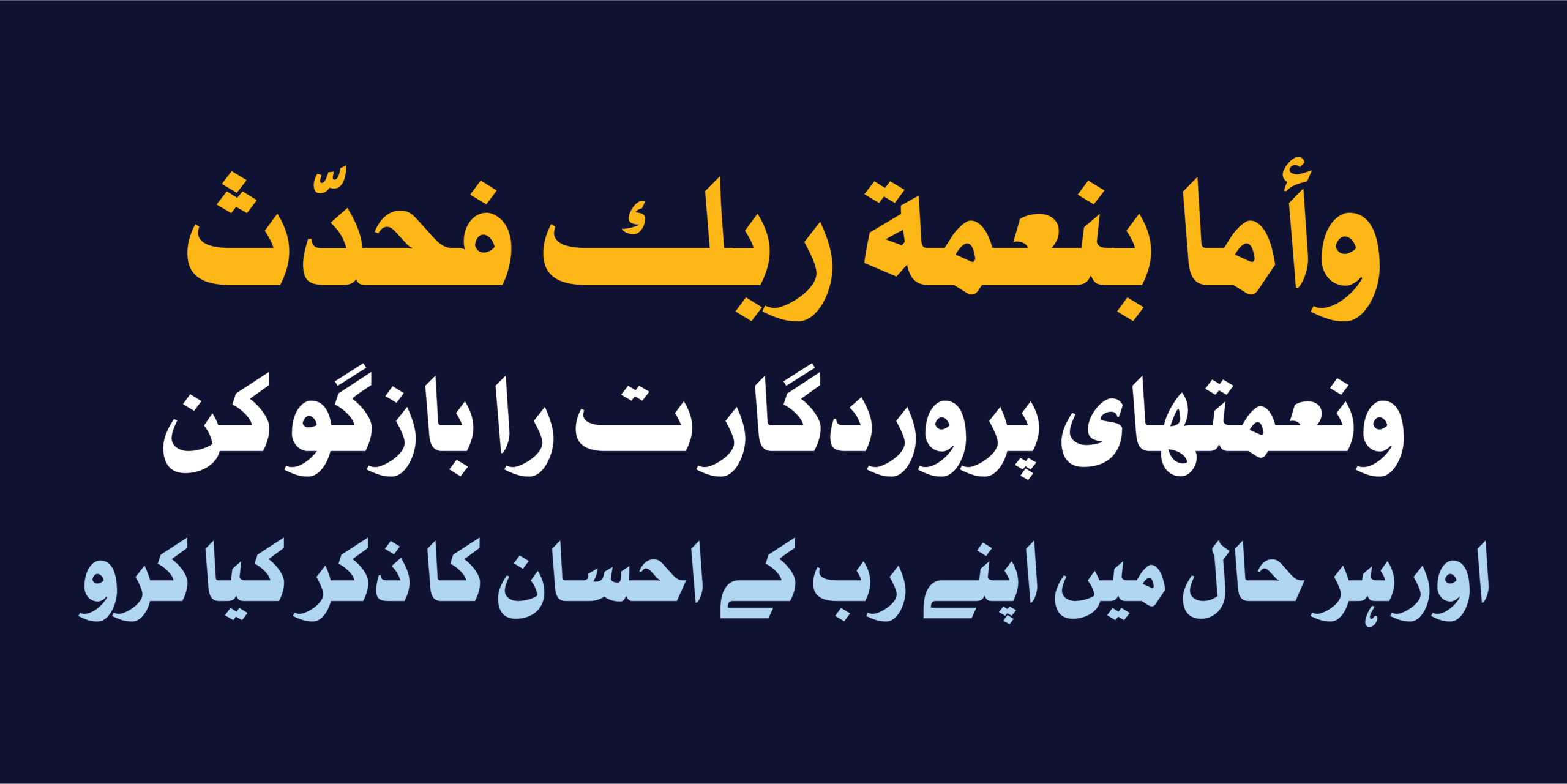
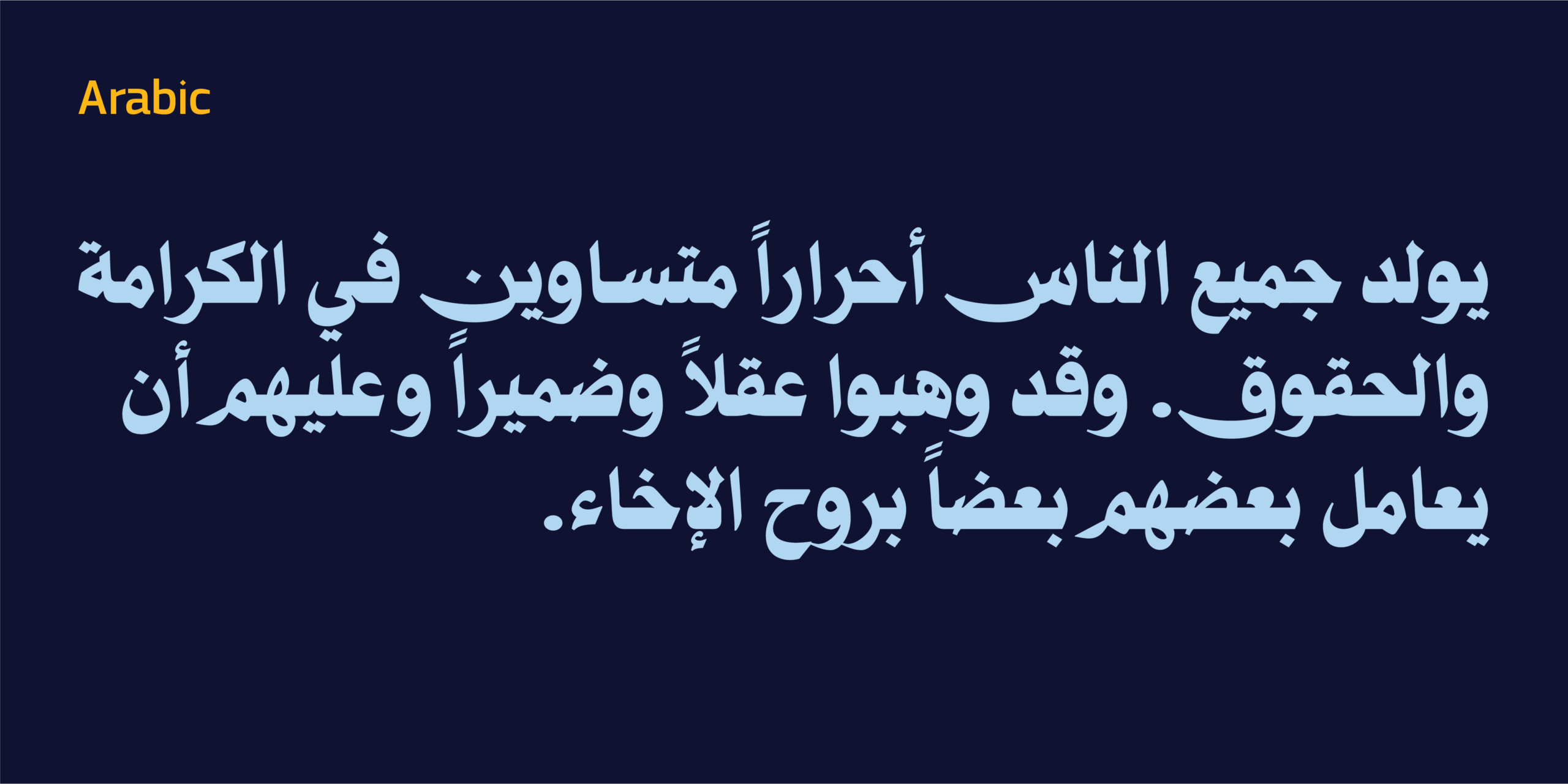
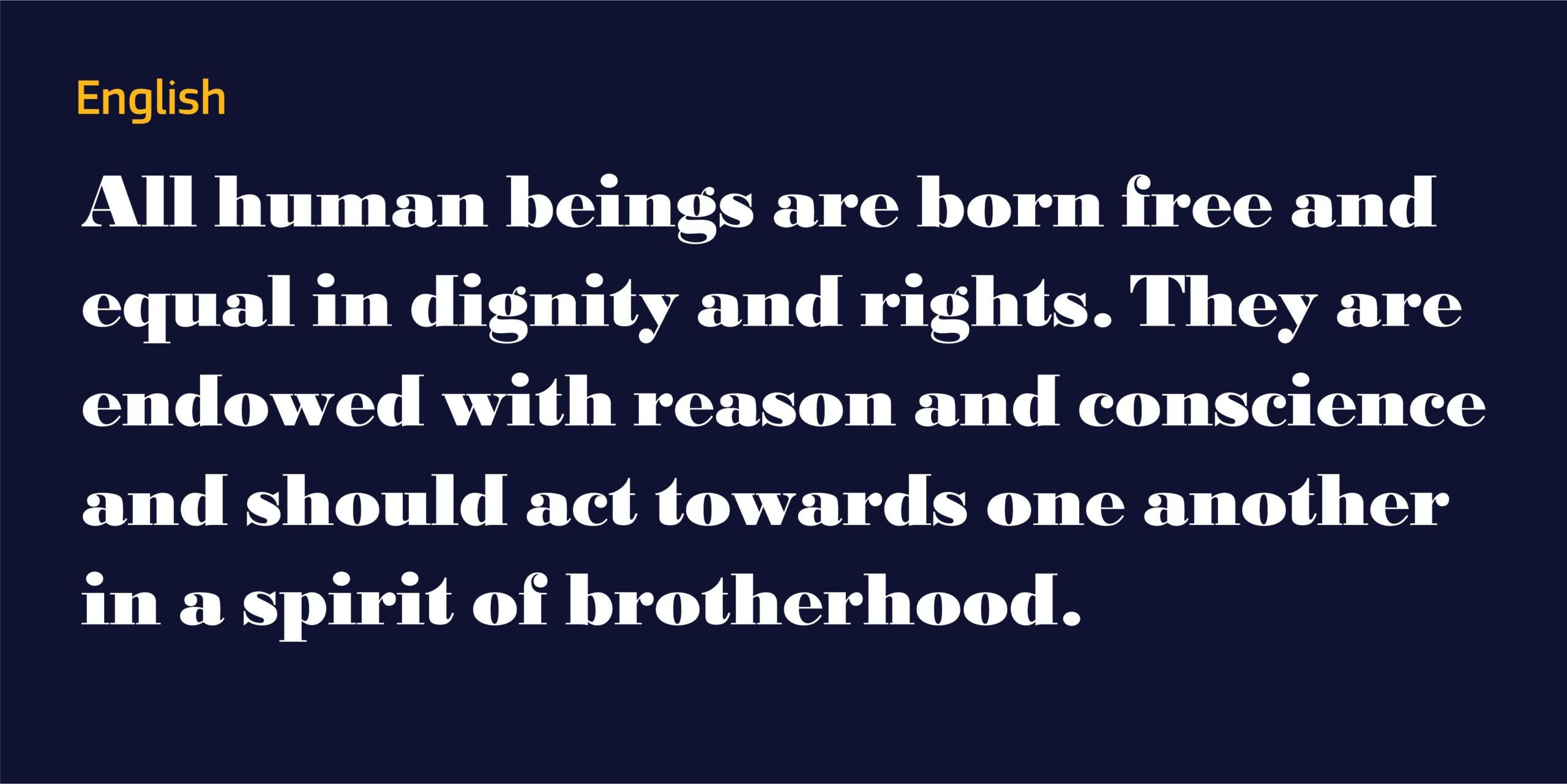
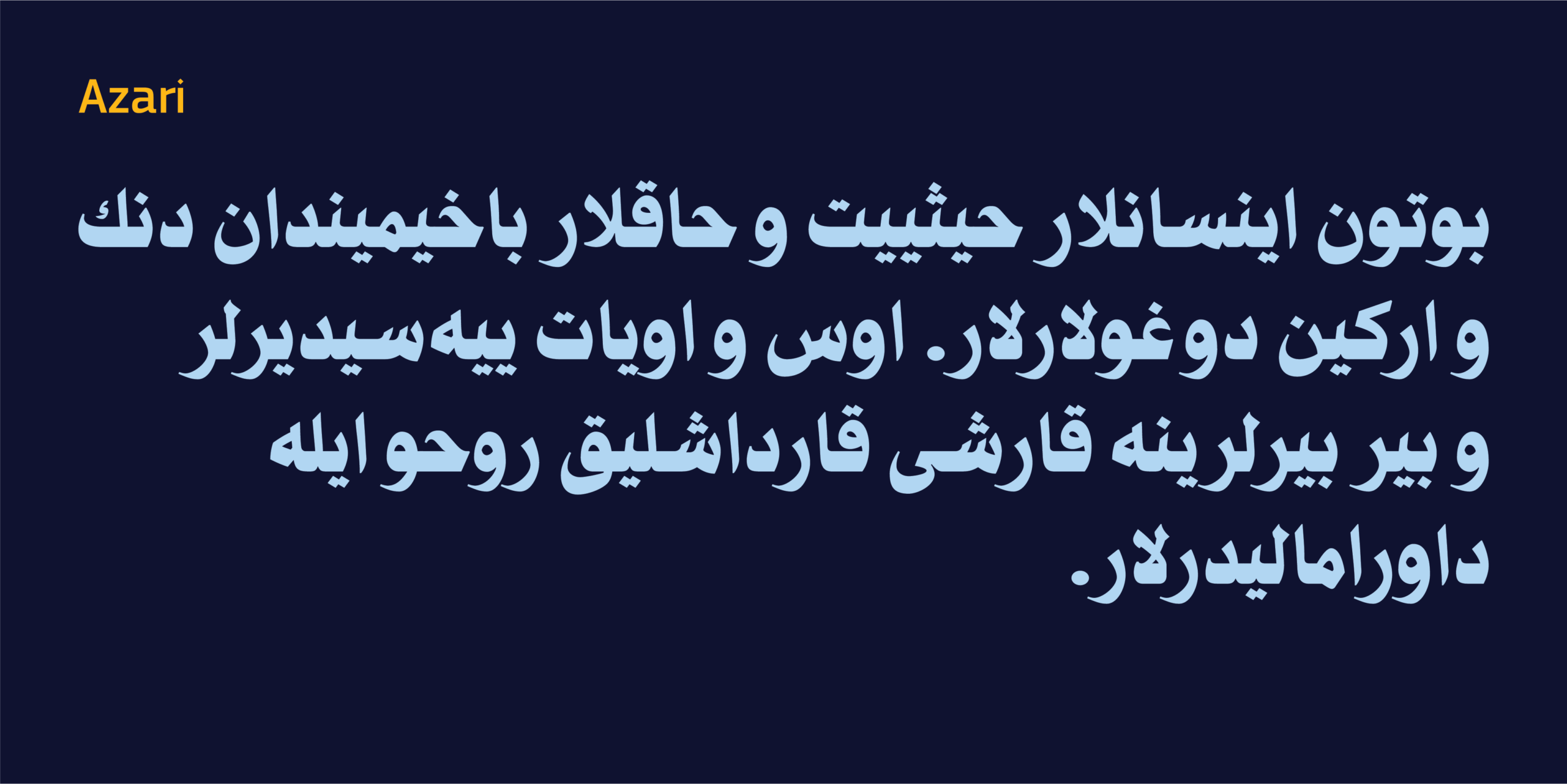
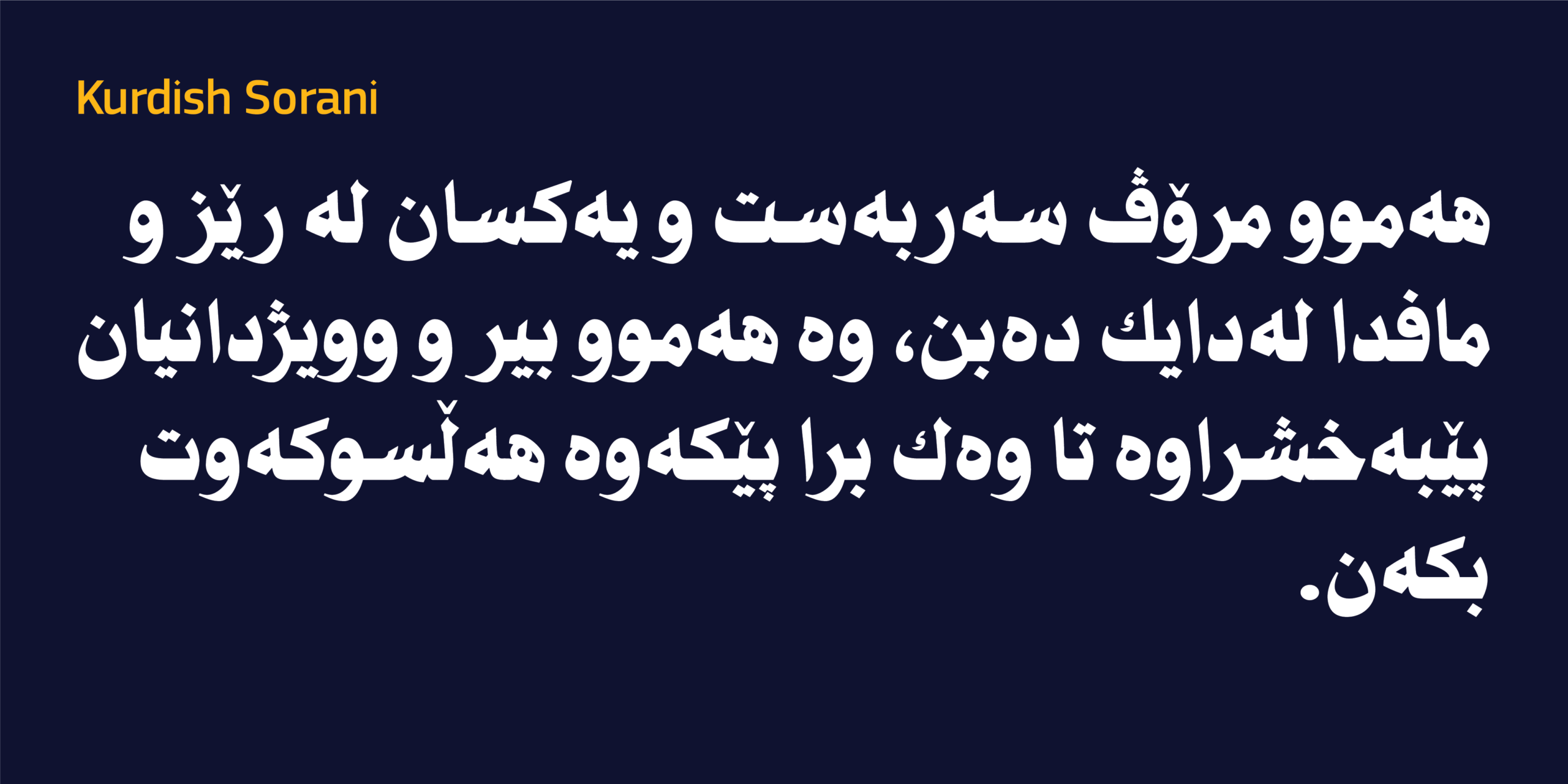
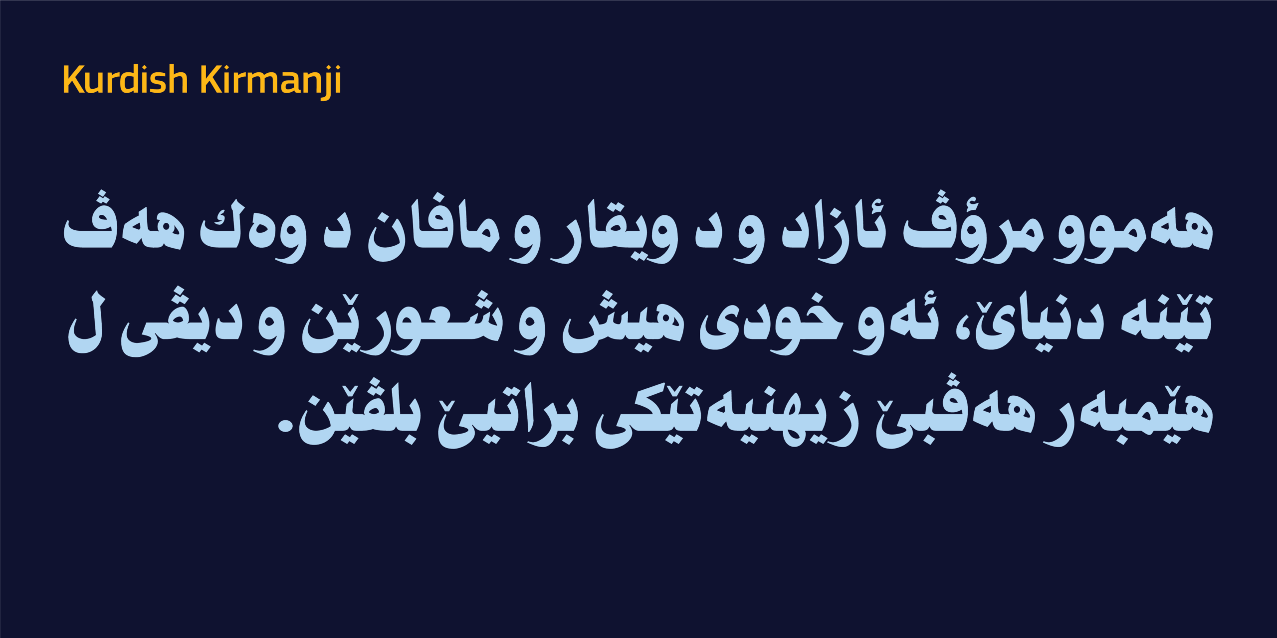
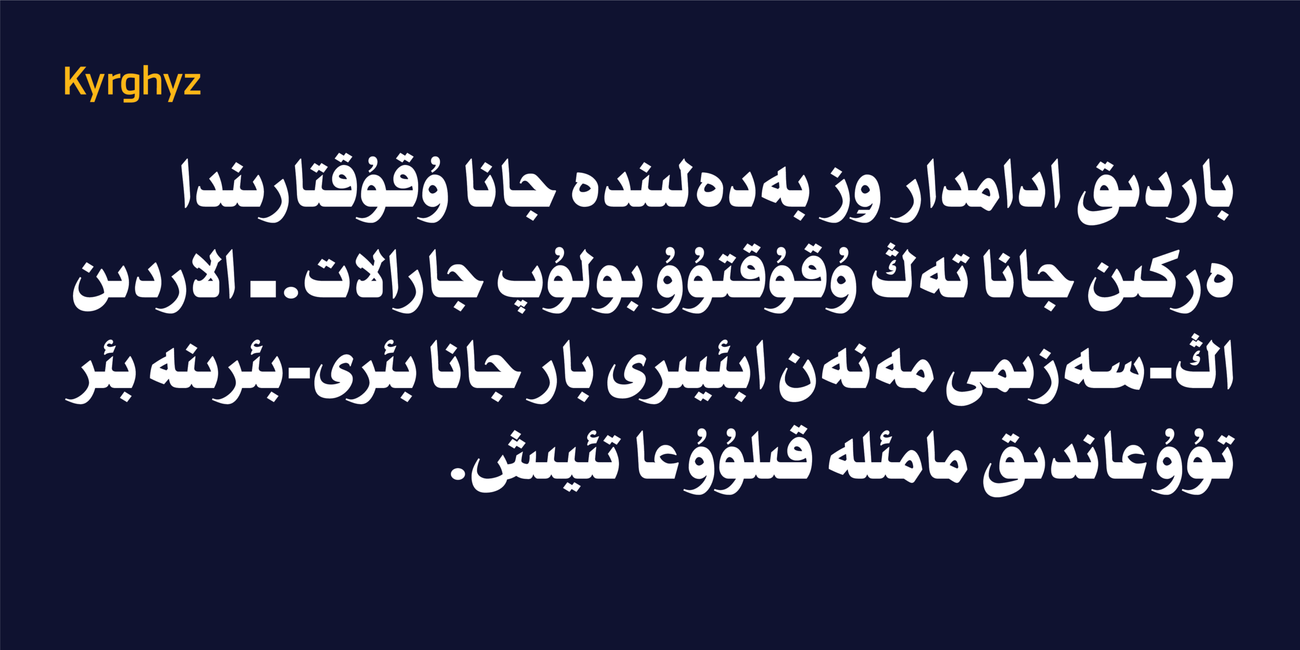
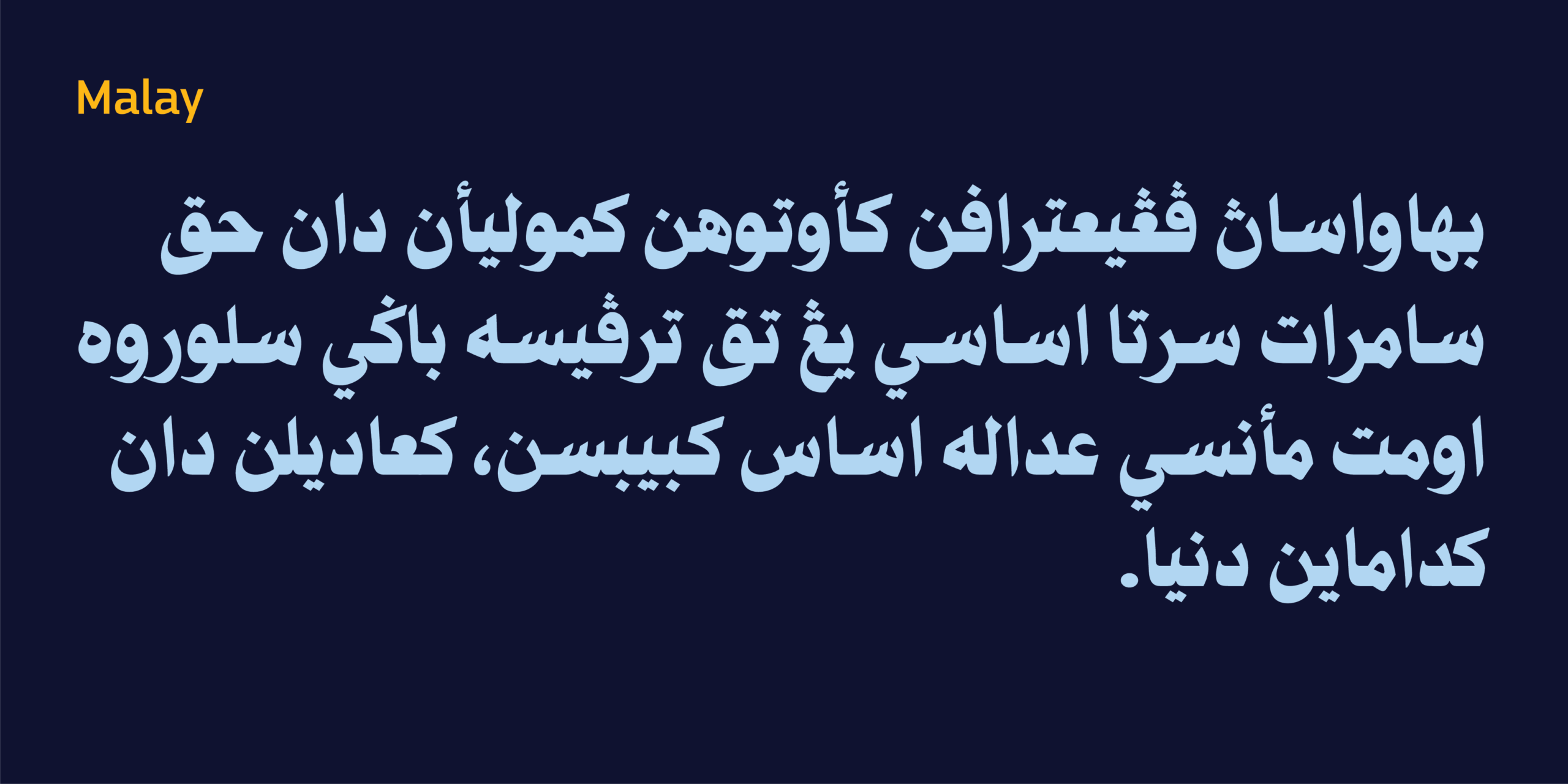
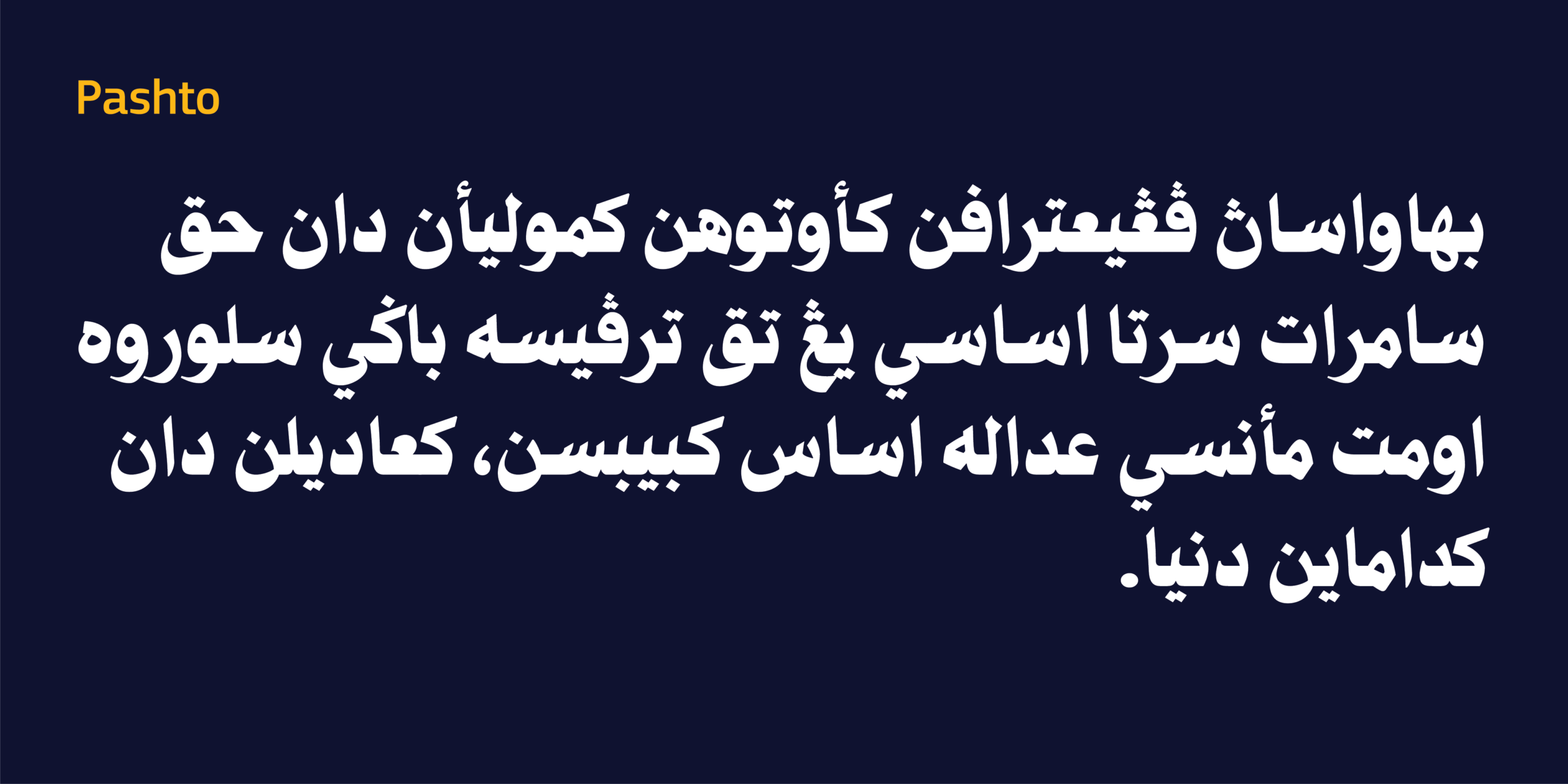
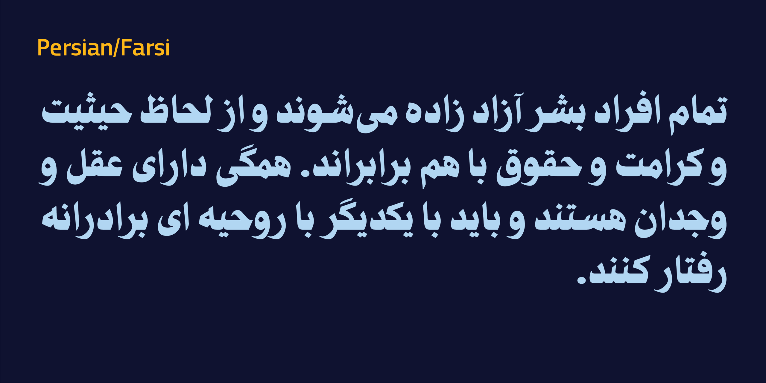
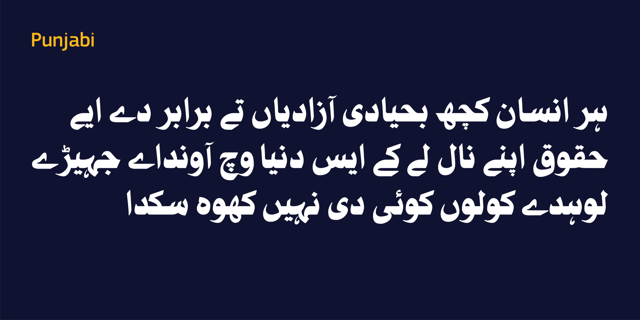
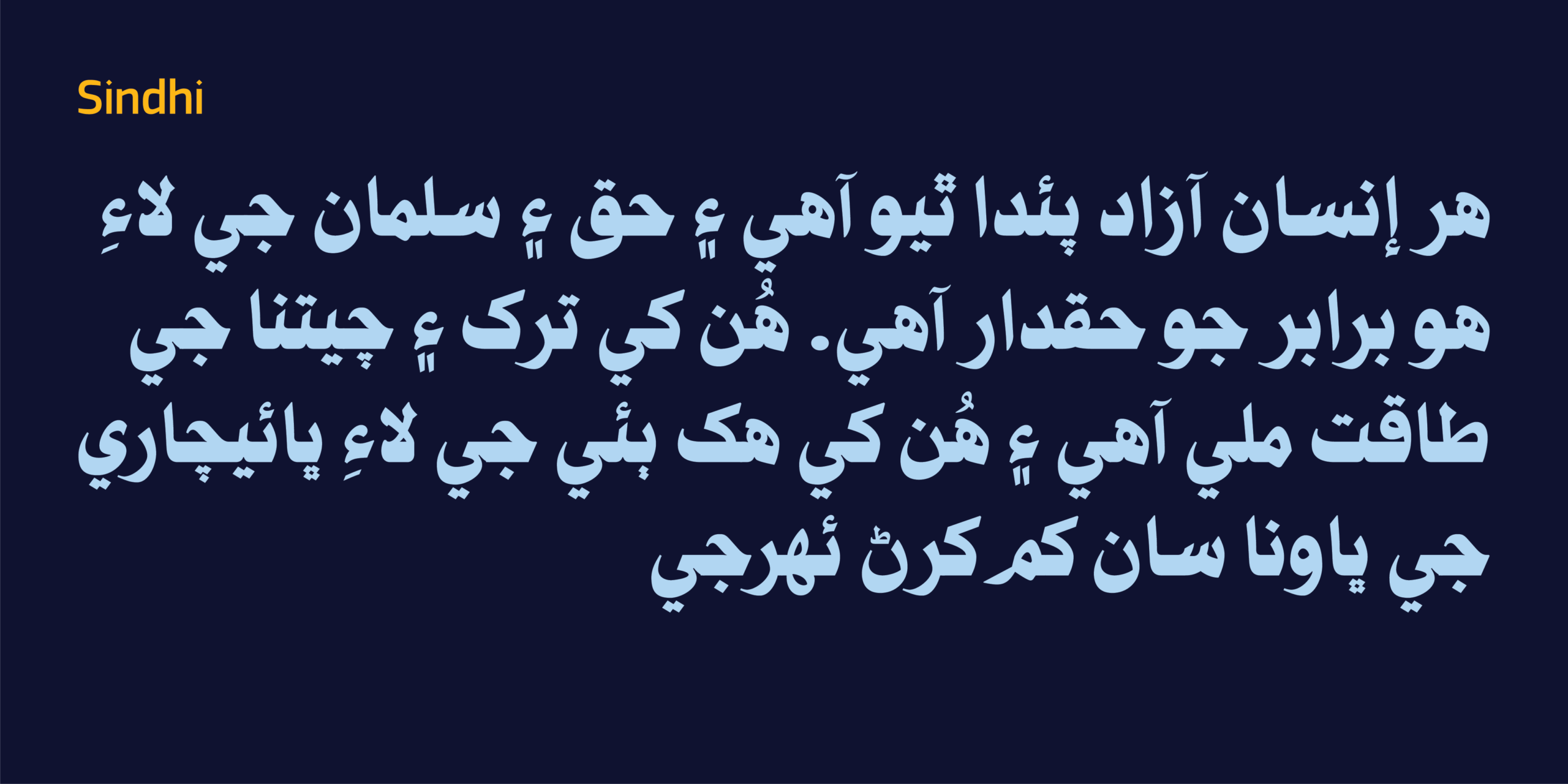
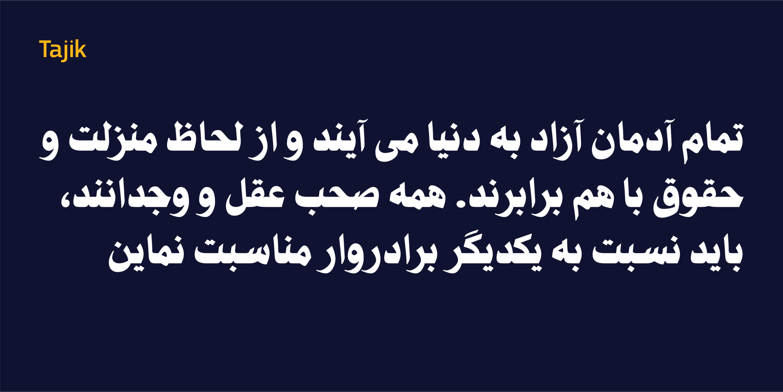
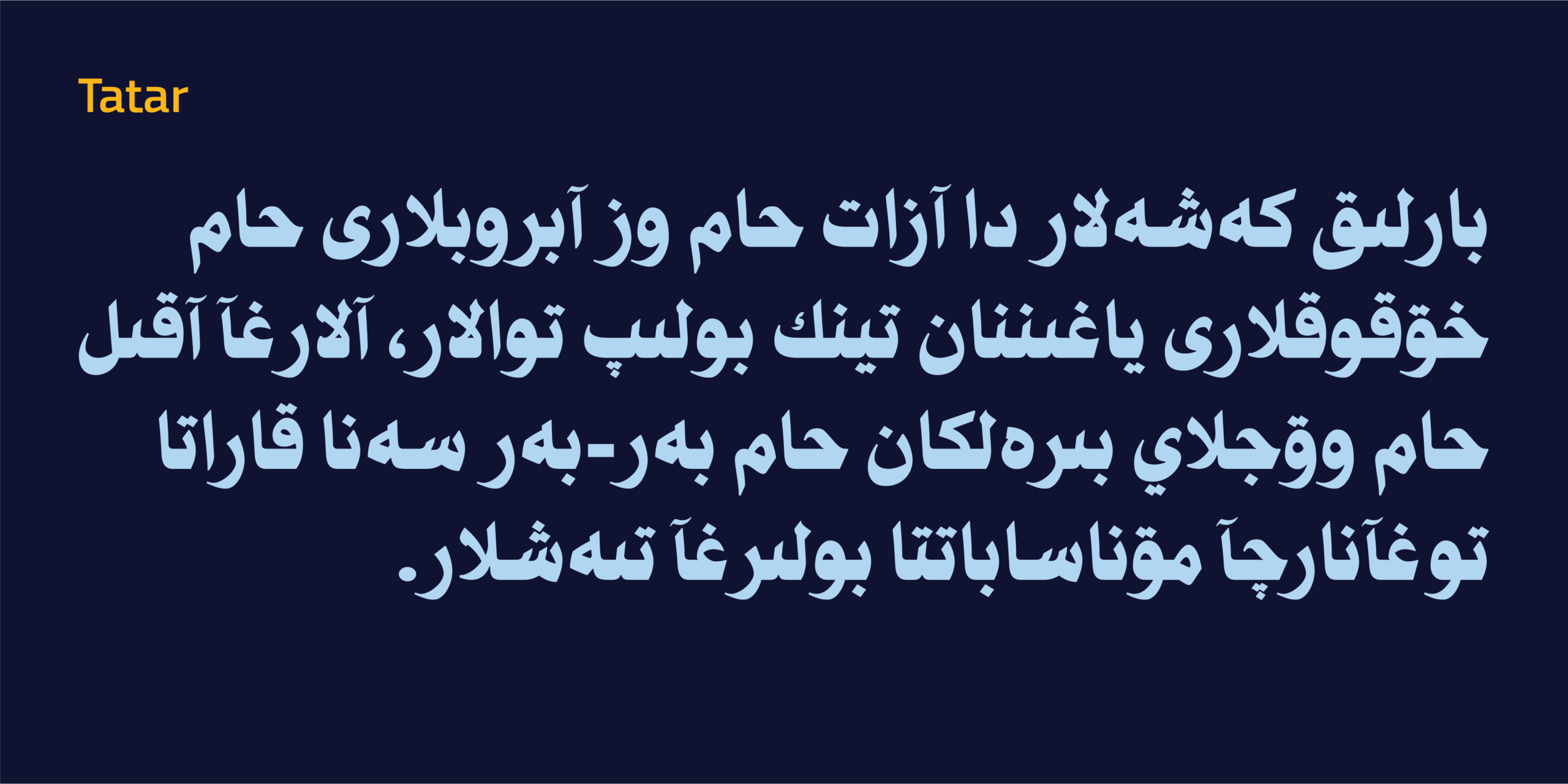
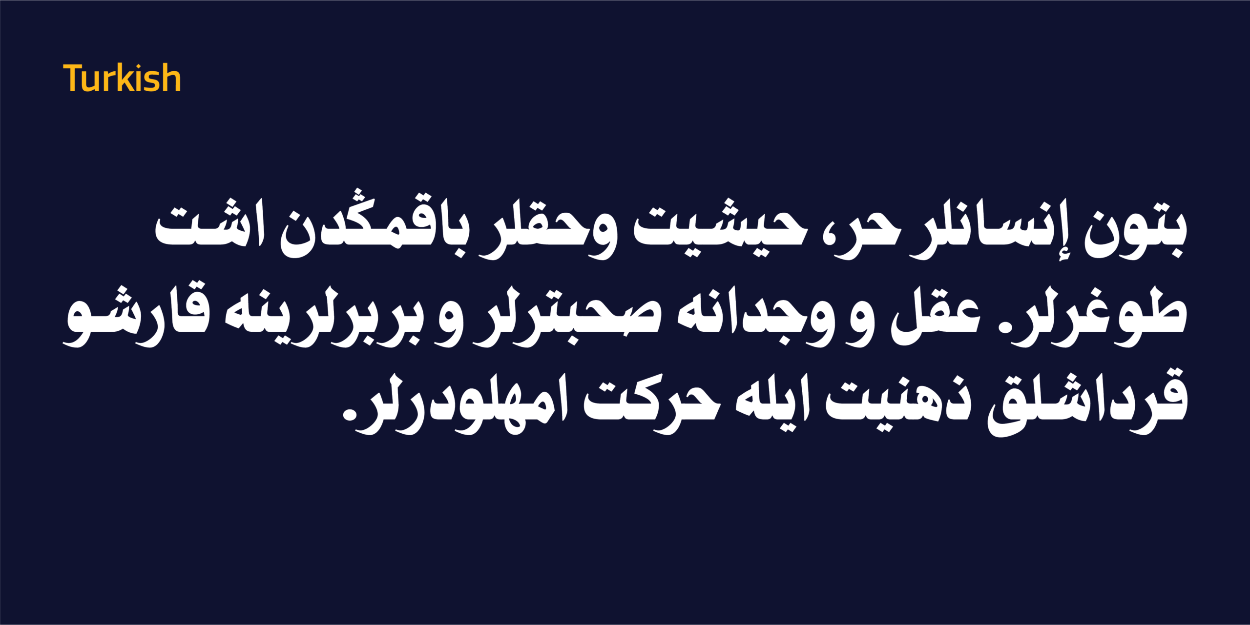
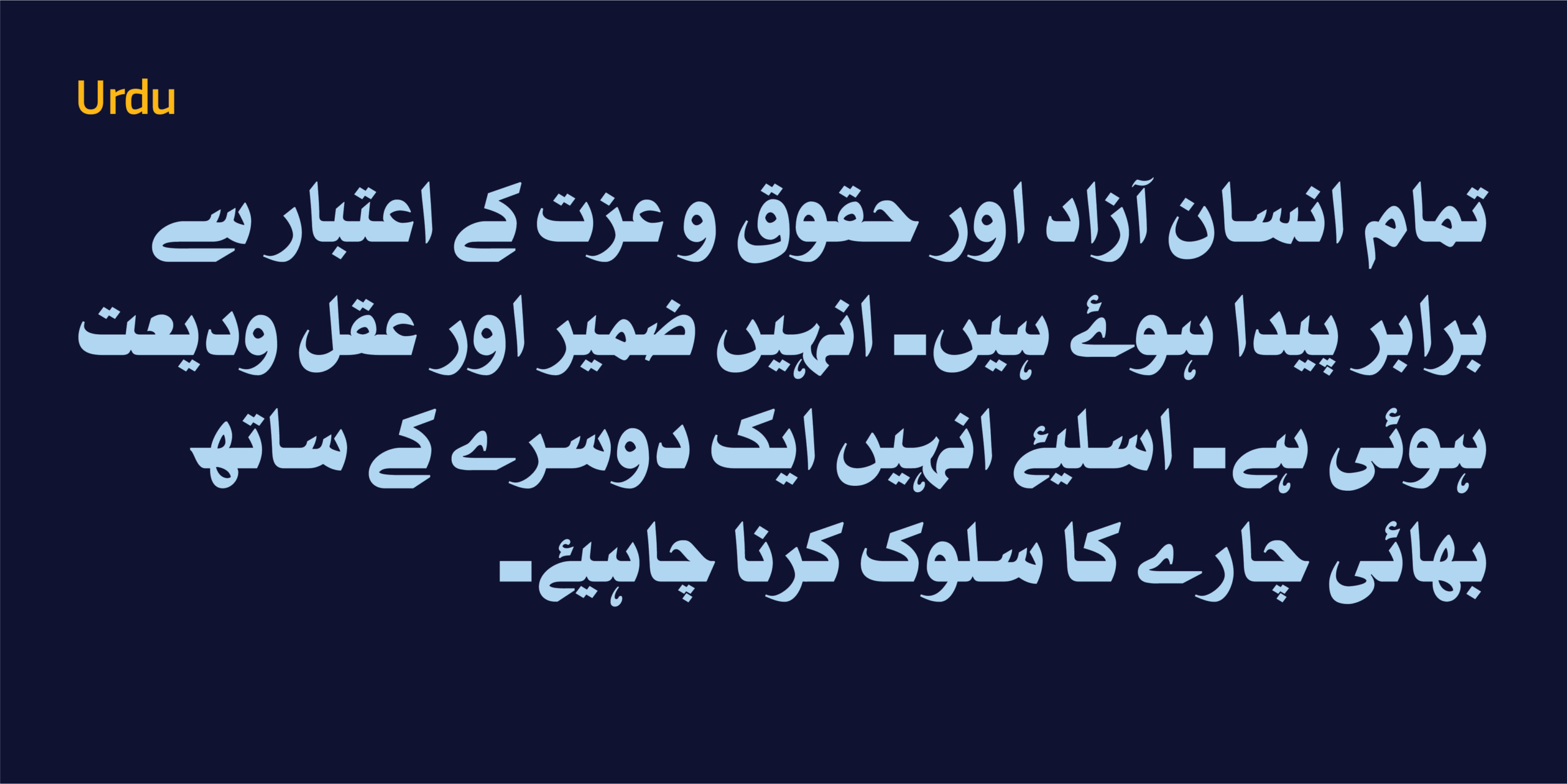
تبلغ قوة الخط الطباعي ذروتها عندما يستطيع أن يعبر حدود اللغة دون أن يفقد هويته. صُمِّم HS Nibras ليدعم العربية، إلى جانب مجموعة واسعة من اللغات التي تُكتب بالحرف العربي، بالإضافة إلى مجموعة لاتينية موسعة تدعم اللغات الأوروبية الغربية. وقد روعي في كل لغة احترام خصائصها الكتابية، مع المحافظة على شخصية الخط وإيقاعه البصري الموحد.
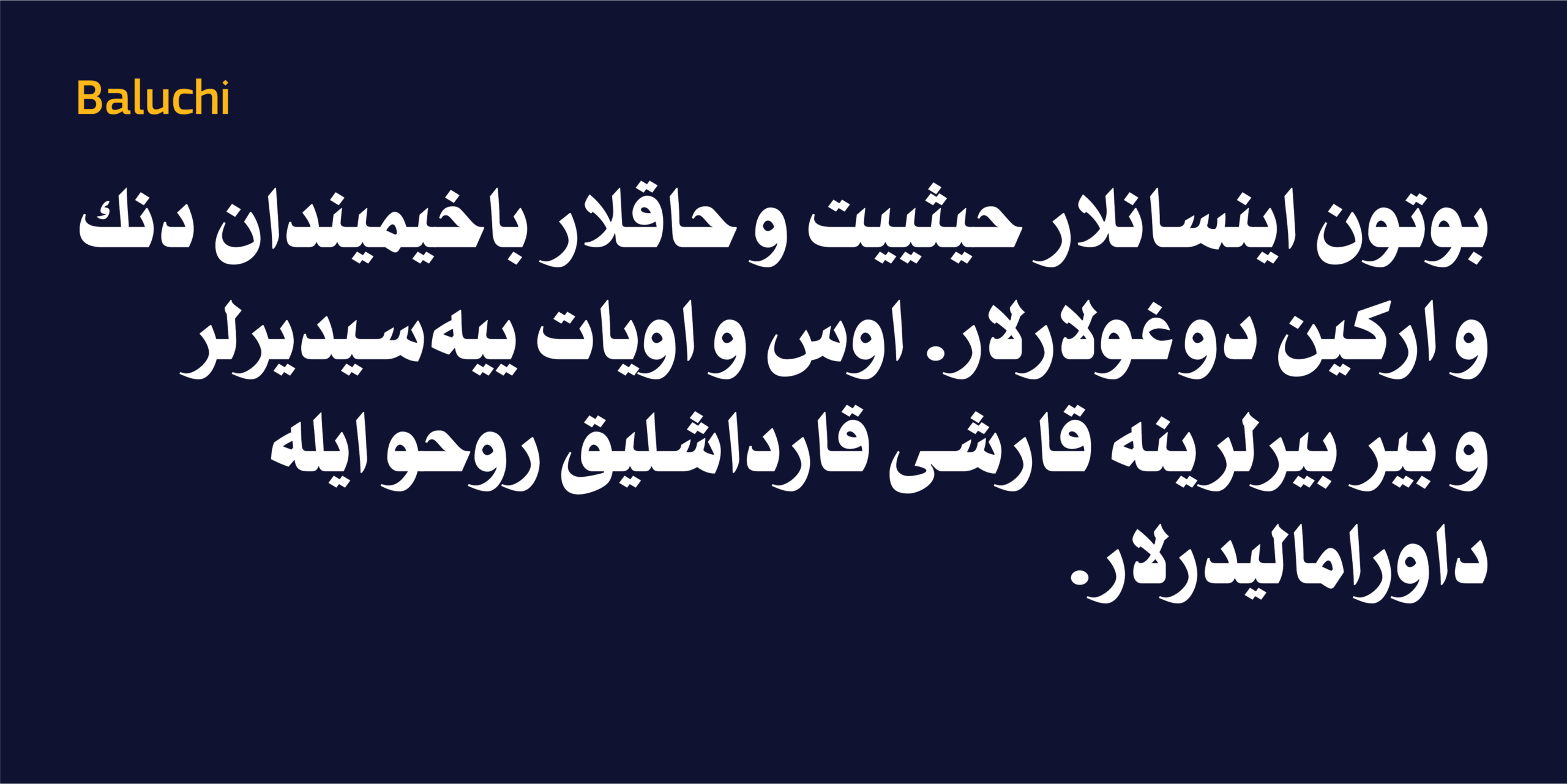
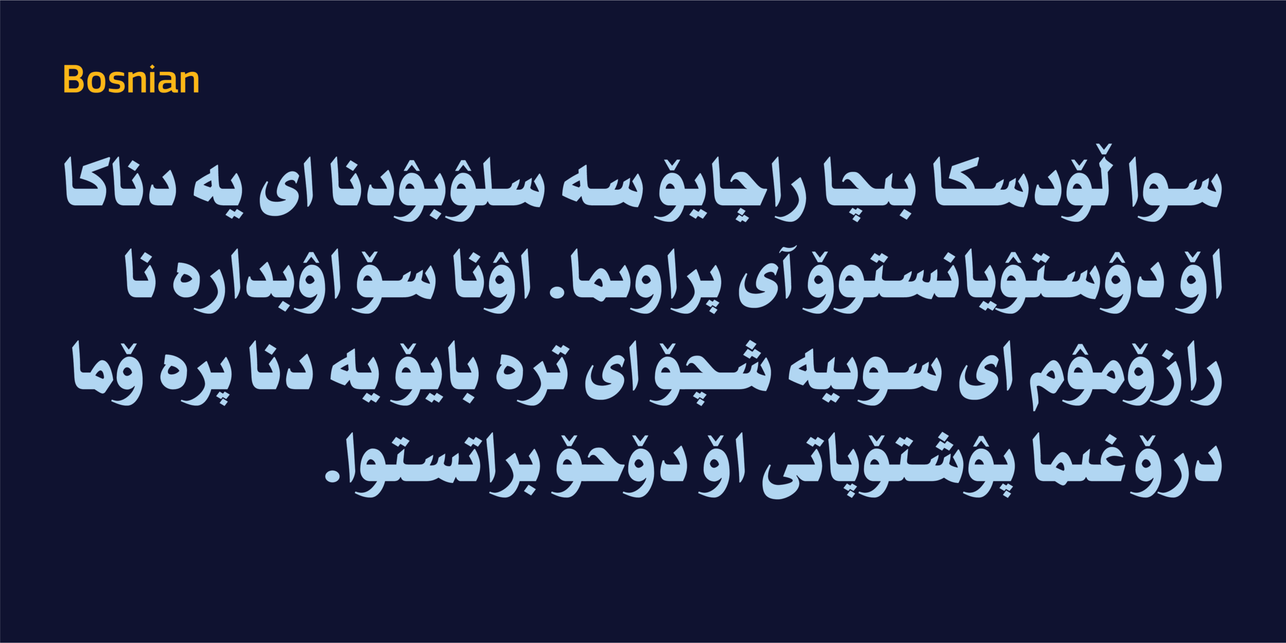
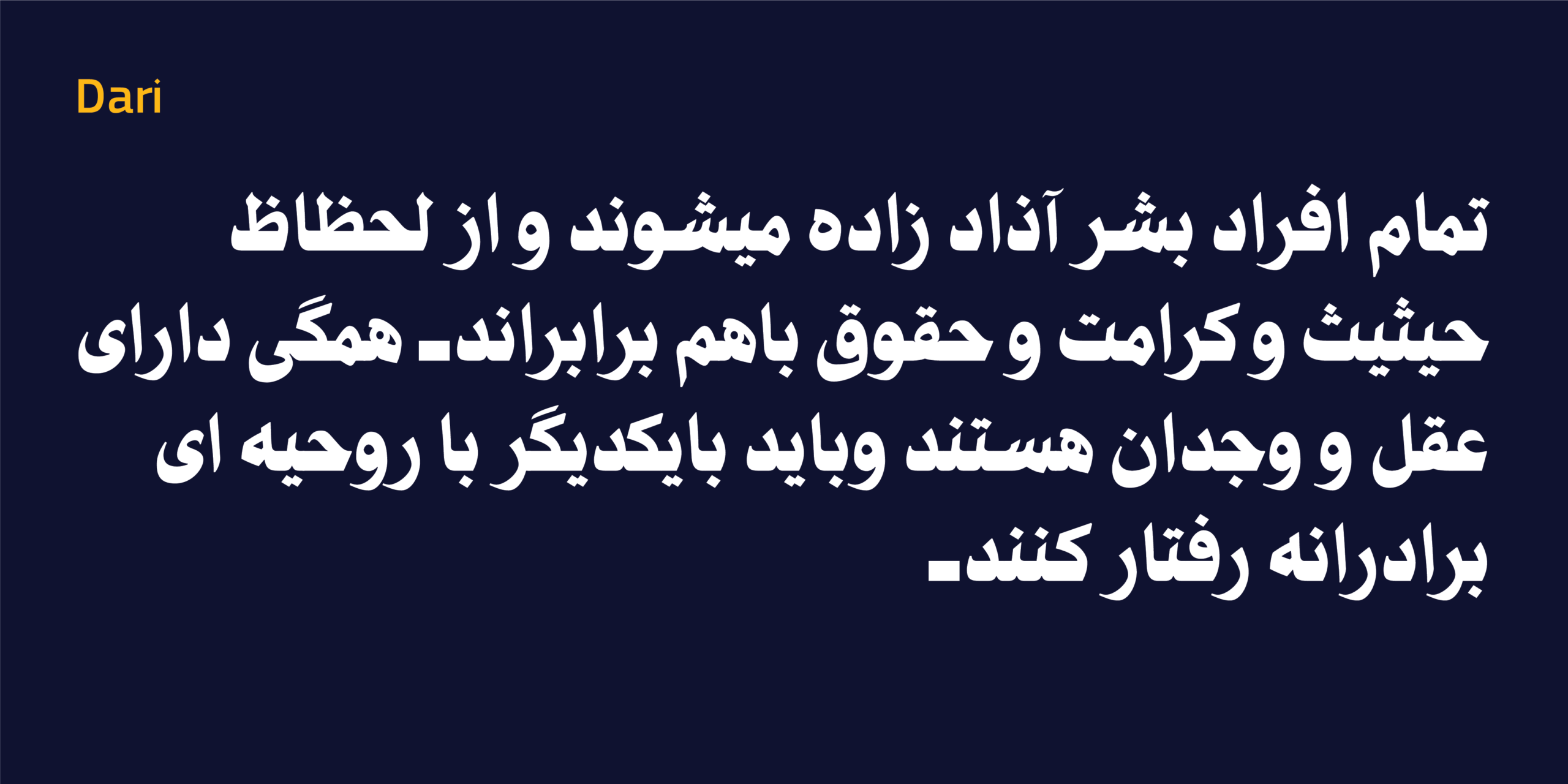
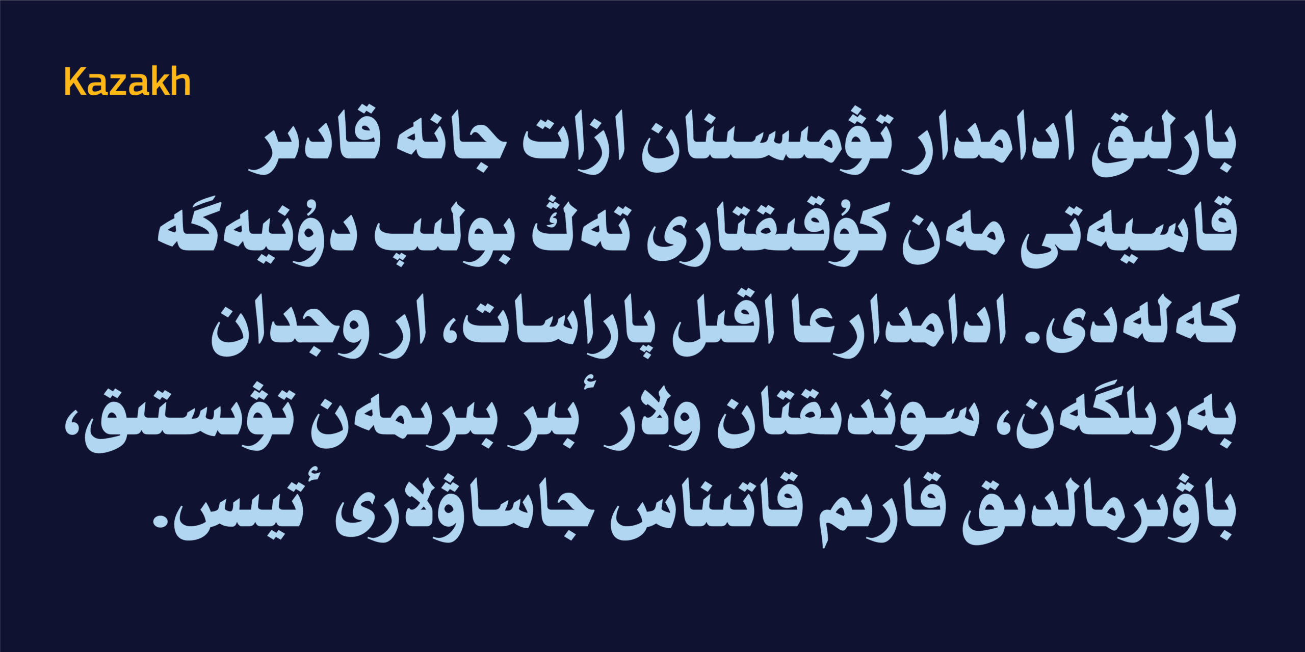
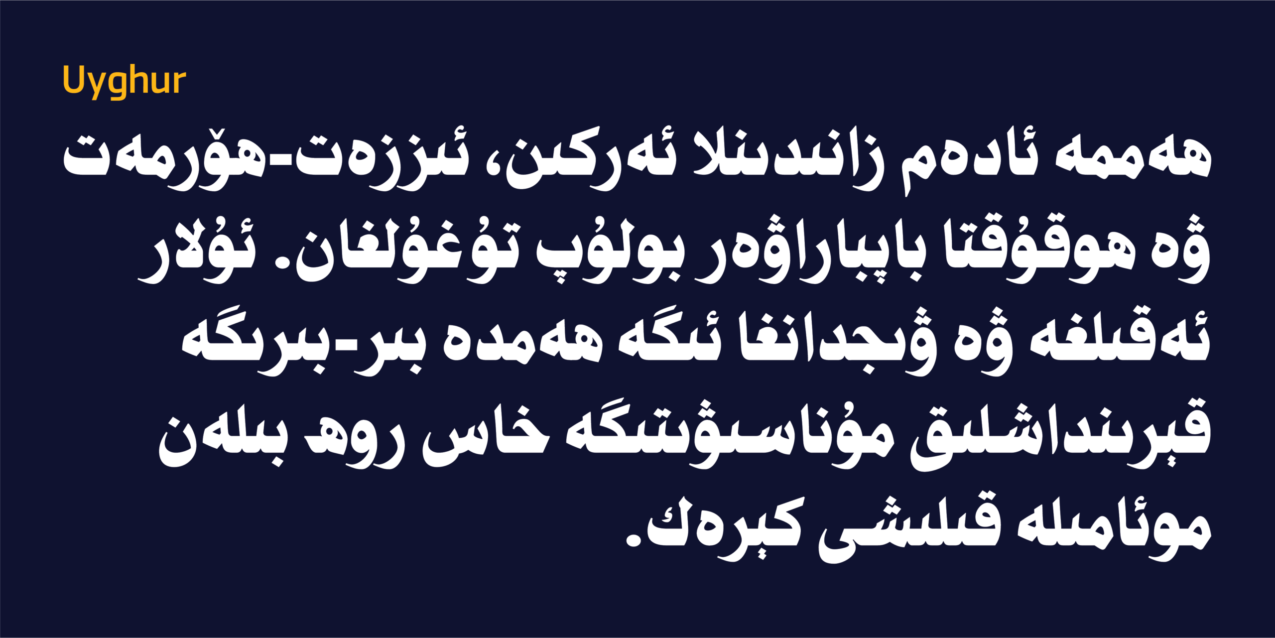
وتعرض اللوحات التالية الكلمات الافتتاحية من المادة الأولى من الإعلان العالمي لحقوق الإنسان بكل لغة يدعمها الخط، لتقدم لمحة عملية عن قدرته على توحيد هذا التنوع اللغوي ضمن هوية طباعية واحدة.
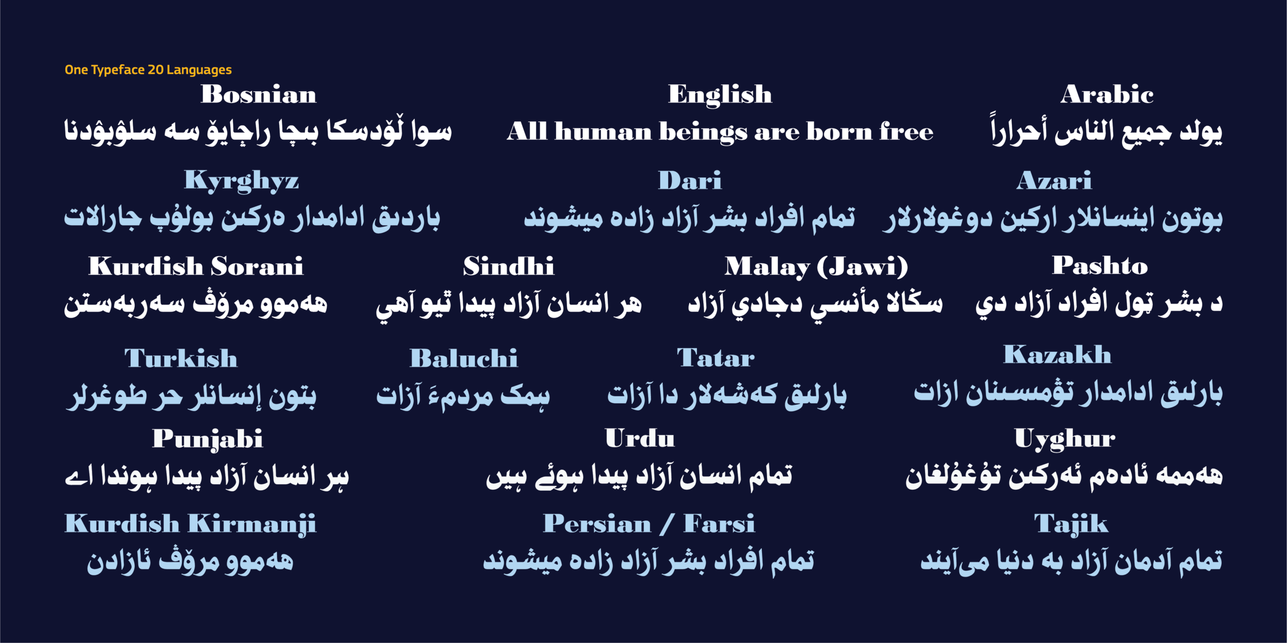
One Typeface. Many Languages.
Typography becomes truly powerful when it crosses linguistic boundaries without losing its identity. HS Nibras was designed to support not only Arabic, but also a broad range of languages written with the Arabic script, together with an extended Latin character set for Western European languages. From Arabic and Persian to Kurdish, Urdu, Uyghur, and many others, each language has been carefully considered to preserve its unique writing conventions while maintaining a consistent visual rhythm across the entire typeface.
The following specimens present the opening words of Article 1 of the Universal Declaration of Human Rights in each supported language, offering a glimpse into the typographic diversity that HS Nibras brings together within a single typeface.
معلومات مختصرة عن الخط الطباعي HS Nibras|
* مصمم الحرف الطباعي |حسن أبو عفش
* تاريخ تصميم الحرف الطباعي|2026 – 2014
* الشركة المنتجة للحرف |HibaStudio
* تنسيق الخط الطباعي|OTF, TTT, woff2 and Varible Font
* لغات الخط الطباعي |العربية واللاتينية الموسعتان
* أوزان الخط الطباعي|Black
* للمزيد من المعلومات في موقع Behance
** لشراء الخط نأمل الاتصال بنا عبر البريد الإلكتروني| hasan@hibastudio.com