


الخط الطباعي “المدى” – جوهر الخط الكوفي الفاطمي
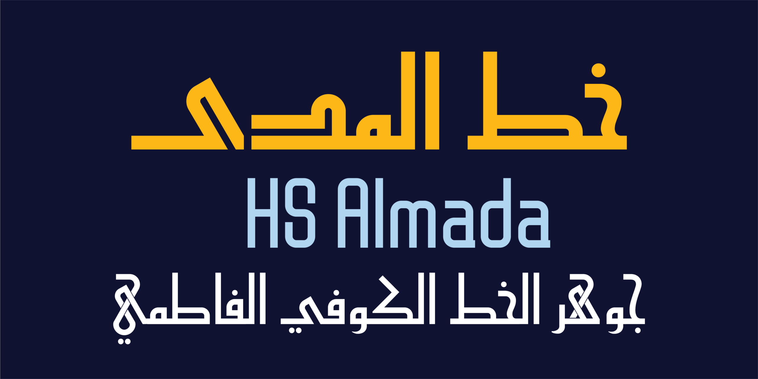
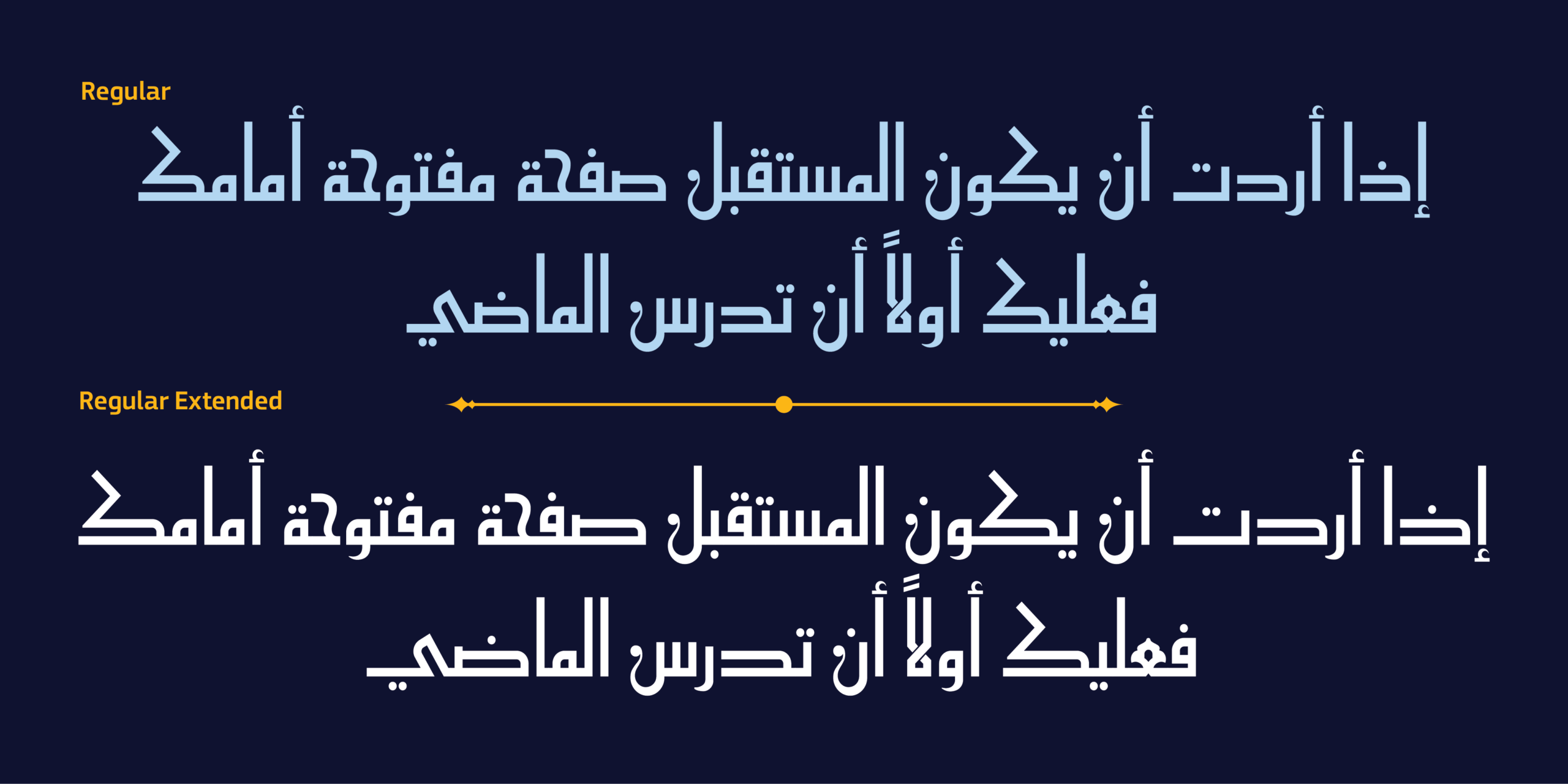
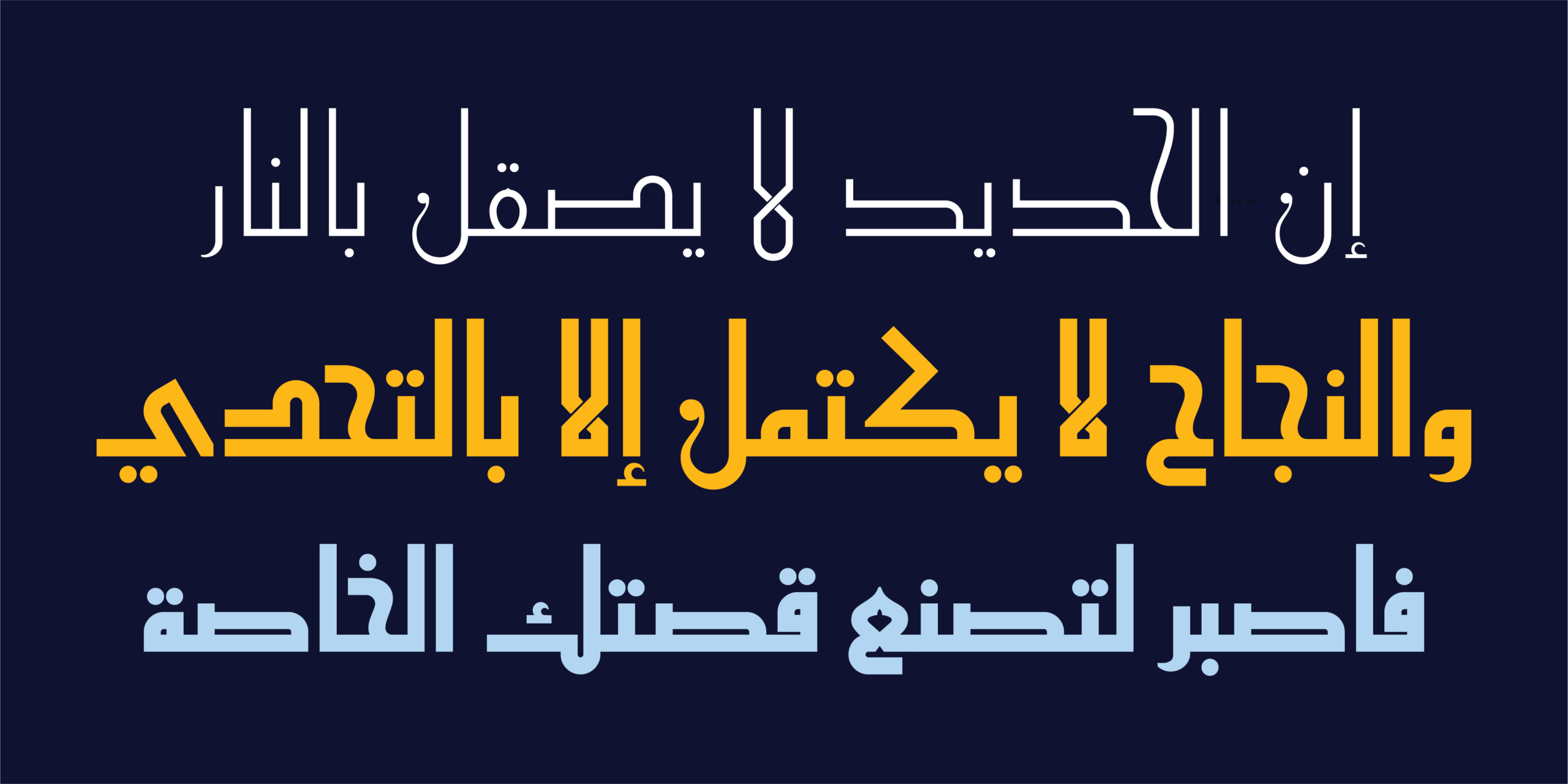
الخط الطباعي “المدى” هو خط عربي متغير معاصر يستلهم جوهر الخط الكوفي الفاطمي، ويعيد تقديمه ضمن نظام طباعي حديث يجمع بين الأصالة التاريخية والدقة المعاصرة. ينطلق تصميم الخط من المبادئ البنائية التي ميّزت الكوفي الفاطمي، حيث التوازن بين الكتل والمساحات، والوضوح الهندسي، والإيقاع البصري المتماسك. ومن خلال إعادة صياغة هذه المبادئ ضمن نظام طباعي حديث، يقدّم الخط الطباعي “المدى” تعبيراً عربياً أكثر صفاءً ومرونة، يلبي احتياجات التصميم المعاصر دون أن يفقد ارتباطه بجذوره.
لم يكن الهدف إعادة إنتاج الشكل التاريخي كما هو، بل الكشف عن جوهره البصري؛ أي الخصائص الأساسية التي منحت الخط الكوفي الفاطمي شخصيته المميزة، ثم تطويرها ضمن رؤية تصميمية معاصرة تحافظ على هويته وتمنحه قابلية أكبر للاستخدام في البيئات الطباعية والرقمية. إن الخط الطباعي “المدى” ليس إعادة إحياء لأسلوب تاريخي، ولا نسخة مبسطة من الكوفي الفاطمي، بل إعادة صياغة معاصرة لجوهره، تكشف عن قوة بنائه وتوازنه وإيقاعه، ضمن لغة بصرية هادئة وواثقة صُممت لتخدم احتياجات المصمم المعاصر.
فلسفة التصميم
يقوم الخط الطباعي “المدى” على قناعة بأن قوة الخط الكوفي الفاطمي لا تكمن في عناصره الزخرفية، بل في بنيته الأساسية وما تحمله من توازن وإيقاع ونظام بصري. ومن هذا المنطلق، جاءت عملية التصميم باعتبارها رحلة تنقية وصقل أكثر من كونها عملية تبسيط أو حذف. ركّزت عملية التطوير على إبراز العلاقات الداخلية بين الحروف، وتحسين النسب، وتوازن الكتل والمساحات، والتحكم الدقيق في المنحنيات والانتقالات، للوصول إلى أشكال أكثر صفاءً وانسجاماً مع الحفاظ على الشخصية الأصيلة للكوفي الفاطمي.
يمثّل الخط مرحلة أكثر تجريداً ونقاءً ضمن مسار تطوير الكوفي الفاطمي، حيث تصبح البنية نفسها هي العنصر التعبيري الرئيسي. وقد روجعت كل حرف بعناية للوصول إلى نظام متجانس يحافظ على روح المرجع التاريخي، مع منحه شخصية مستقلة تناسب الاستخدامات البصرية الحديثة.
بهذا يقف الخط الطباعي “المدى” بين الإرث التاريخي والتصميم الطباعي المعاصر، متجنباً التفاصيل الزخرفية الزائدة، ومركّزاً على جوهر الحرف وشخصيته الأساسية، ليقدّم لغة بصرية أصيلة وراقية وقابلة للاستخدام عبر مختلف المجالات.
التصميم المتغير
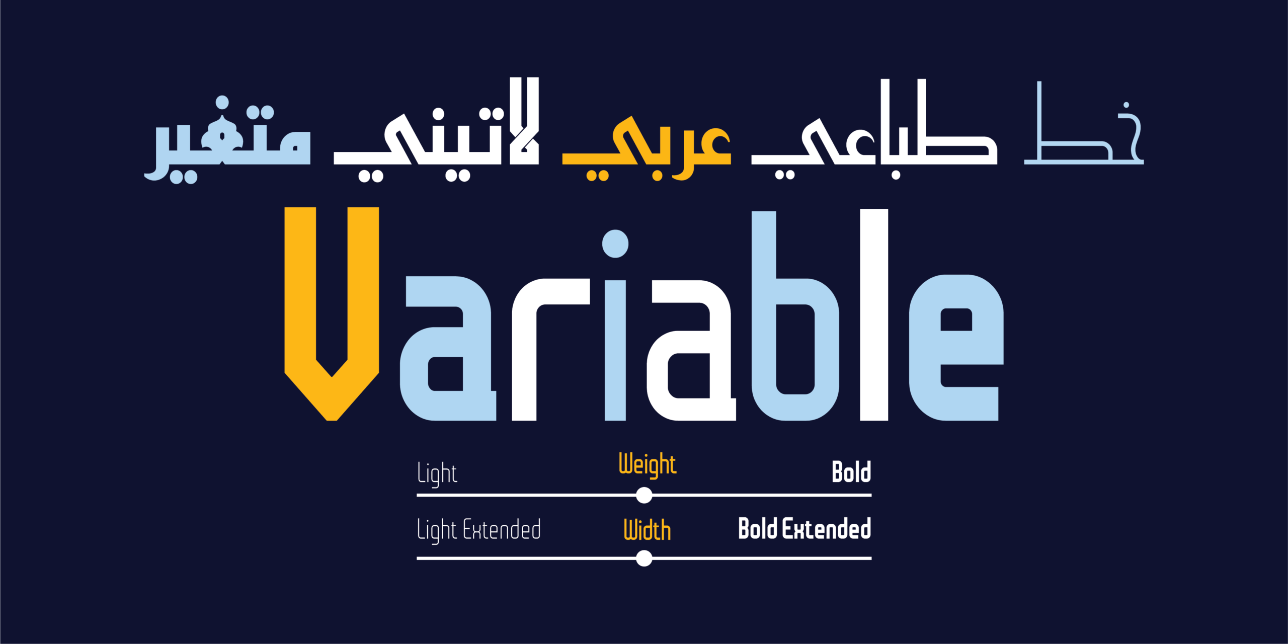
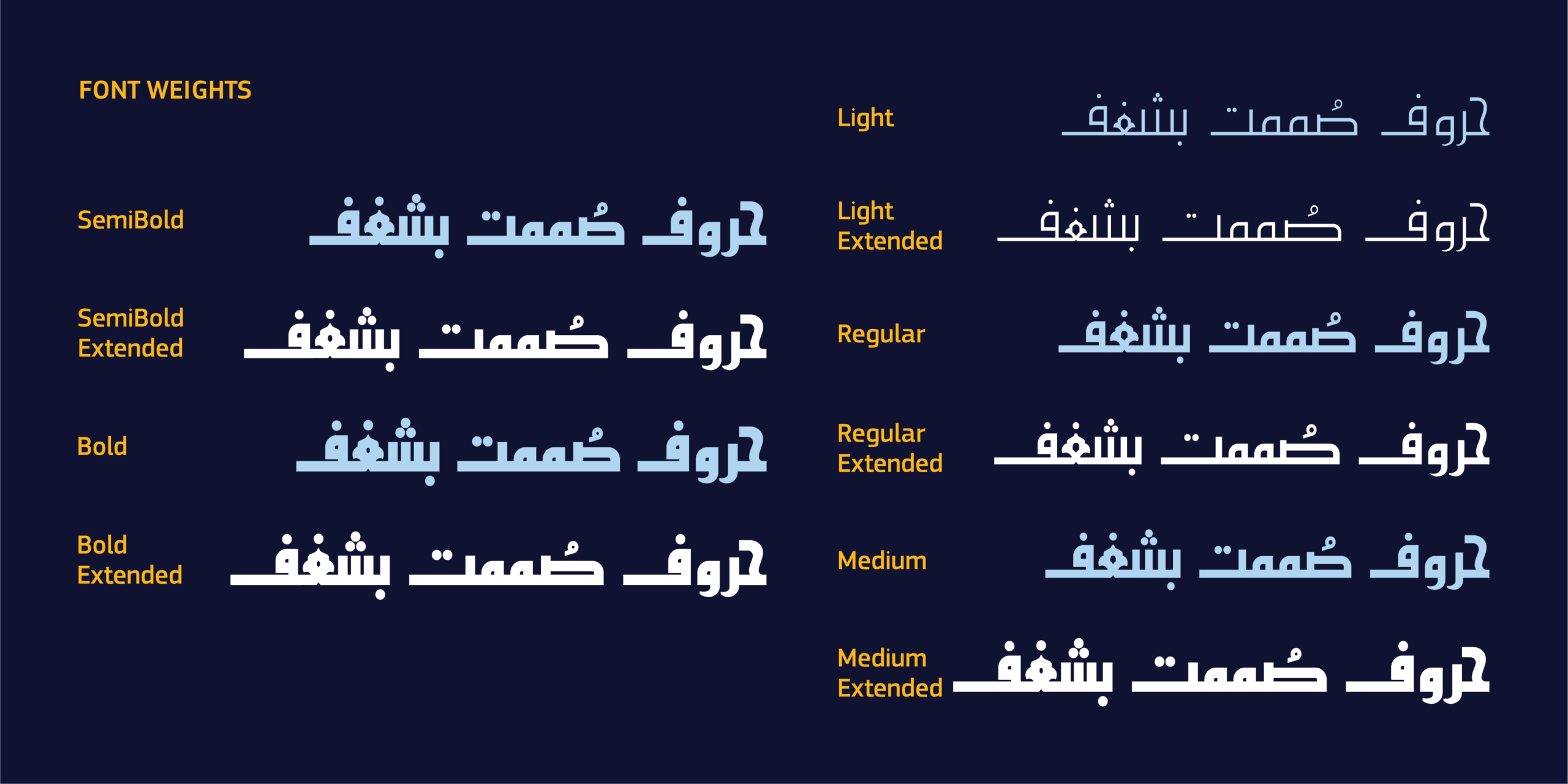
طُوّر الخط الطباعي “المدى” كخط متغير بمحورين مستقلين يمنحان المصمم تحكماً واسعاً في التعبير الطباعي.
- محور الوزن (Weight Axis) يتيح هذا المحور الانتقال بين درجات متعددة من الحضور البصري، بدءاً من الأنماط الأكثر هدوءاً وخفة وصولاً إلى الأنماط القوية المناسبة للعناوين والتكوينات الكبيرة، ما يسمح ببناء تسلسل بصري متكامل داخل المشروع الواحد دون الحاجة إلى الانتقال بين عائلات خطوط مختلفة.
- محور العرض (Width Axis) يقدّم هذا المحور مرونة إضافية للتحكم في كثافة الحروف وإيقاع النص، بما يتيح تكييف الخط مع المساحات المختلفة، سواء في التكوينات التحريرية أو العناوين أو البيئات الرقمية ذات القيود المتغيرة.
الخصائص الفنية
- خط متغير بمحوري الوزن والعرض.
- 10 أوزان ثابتة.
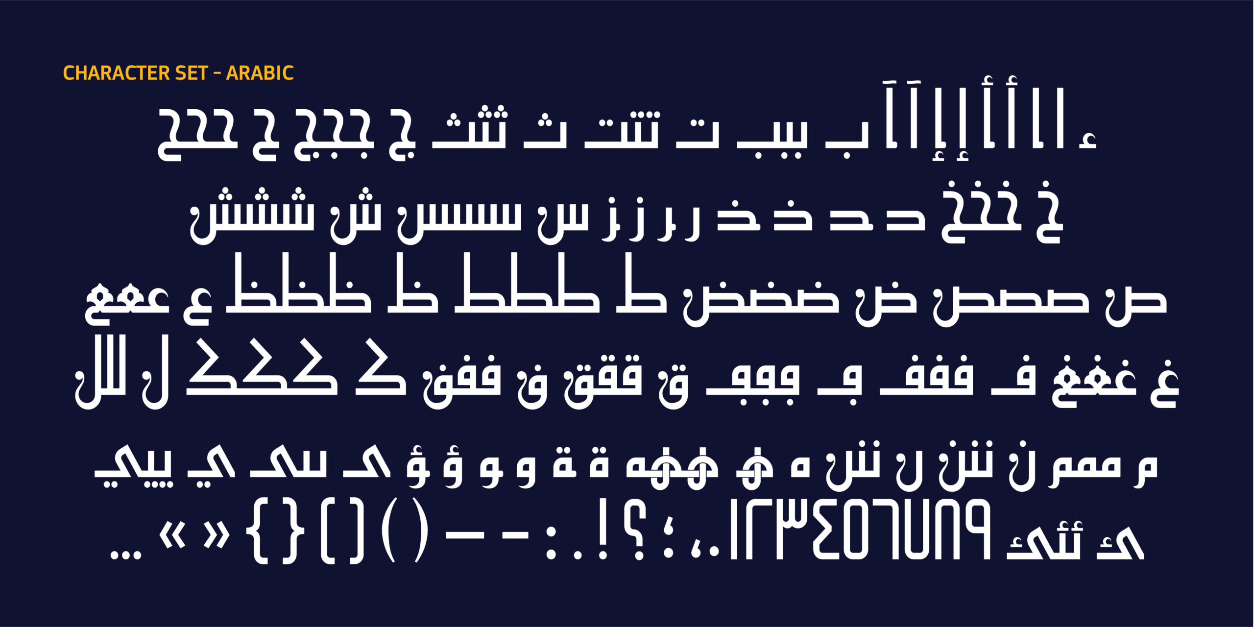
- دعم العربية واللاتينية.
- أكثر من 721 محرفًا.
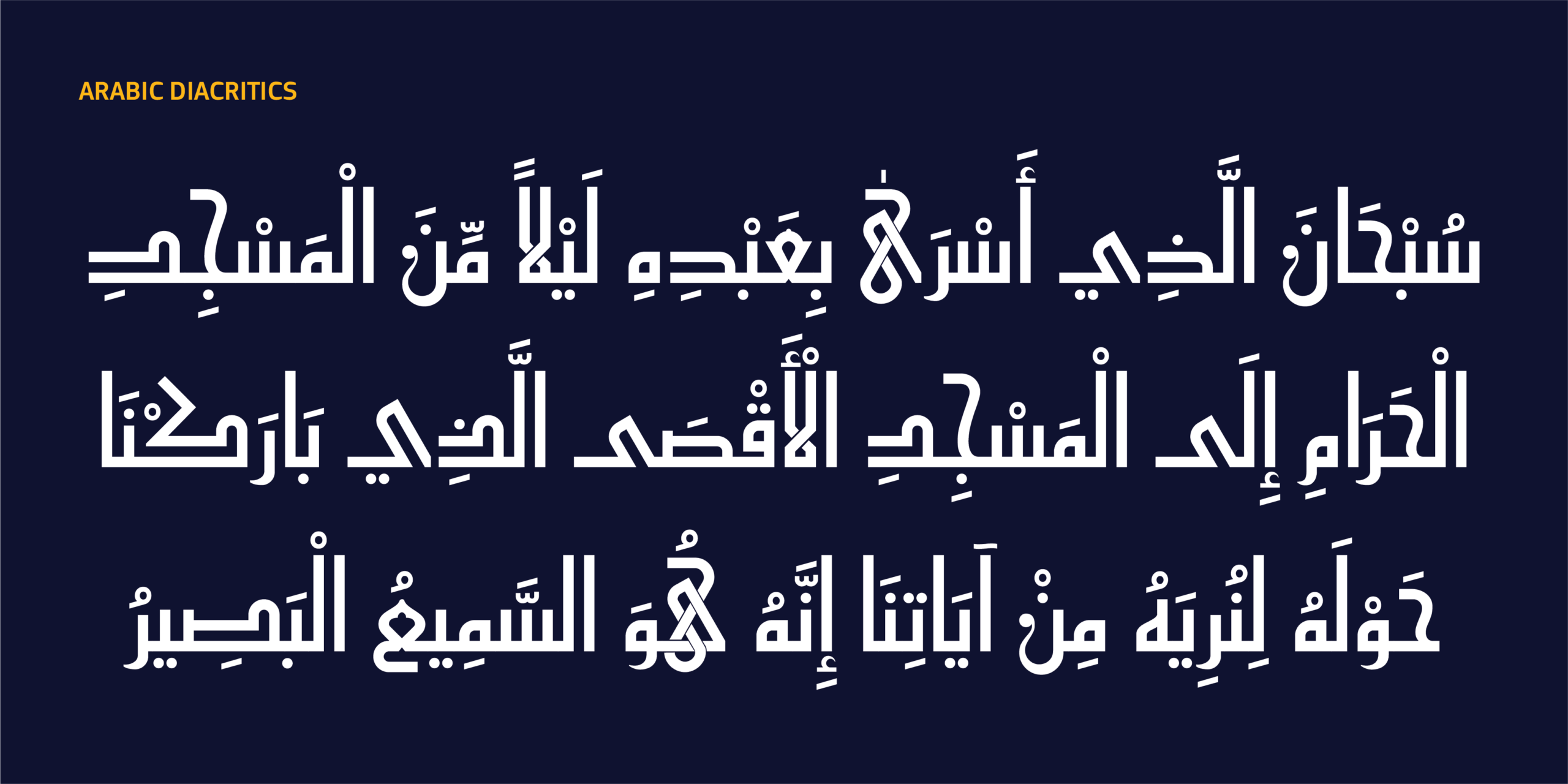
- دعم شامل لتموضع الحركات التشكيلية.
- ميزات OpenType متقدمة:
-
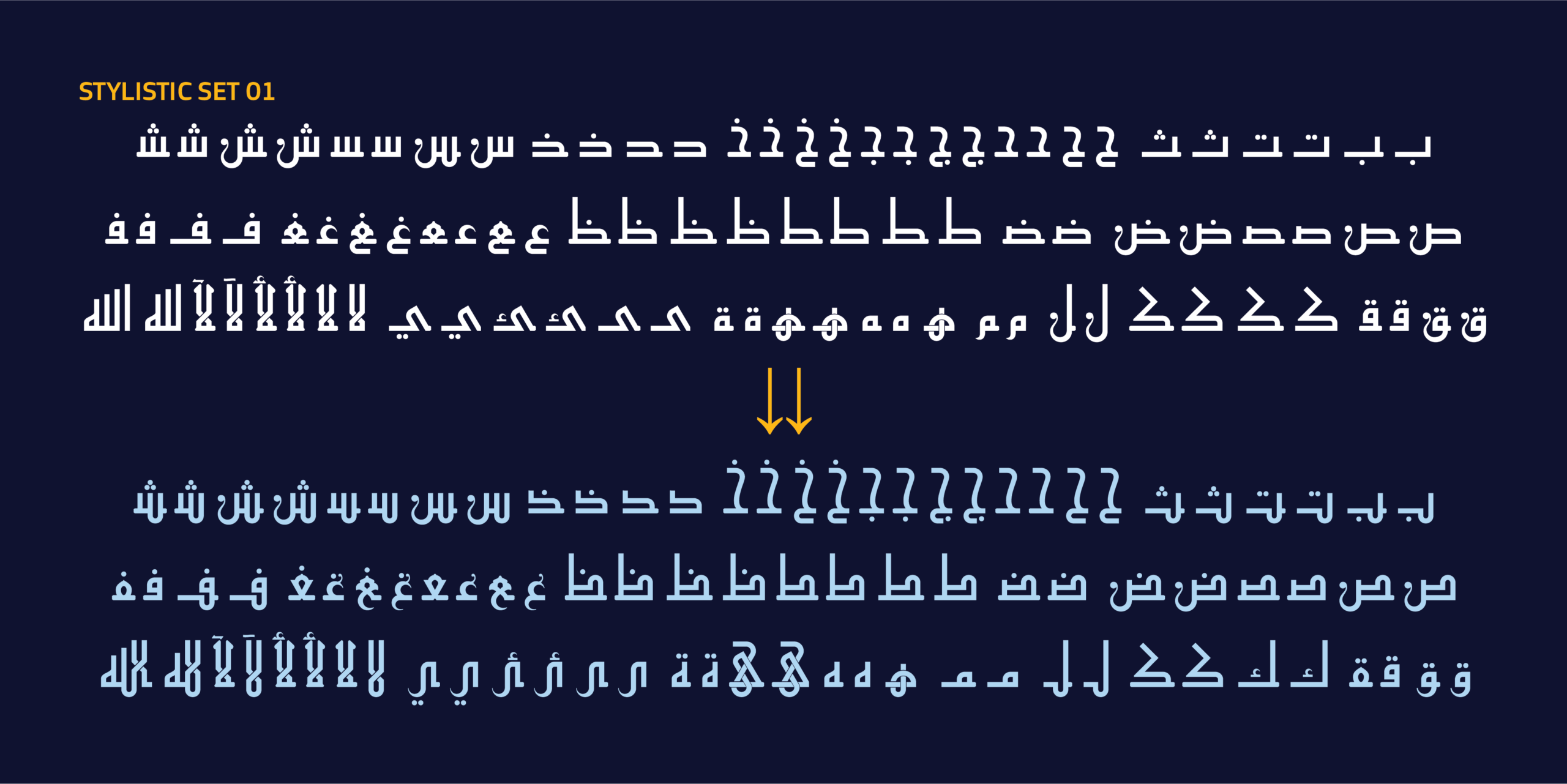
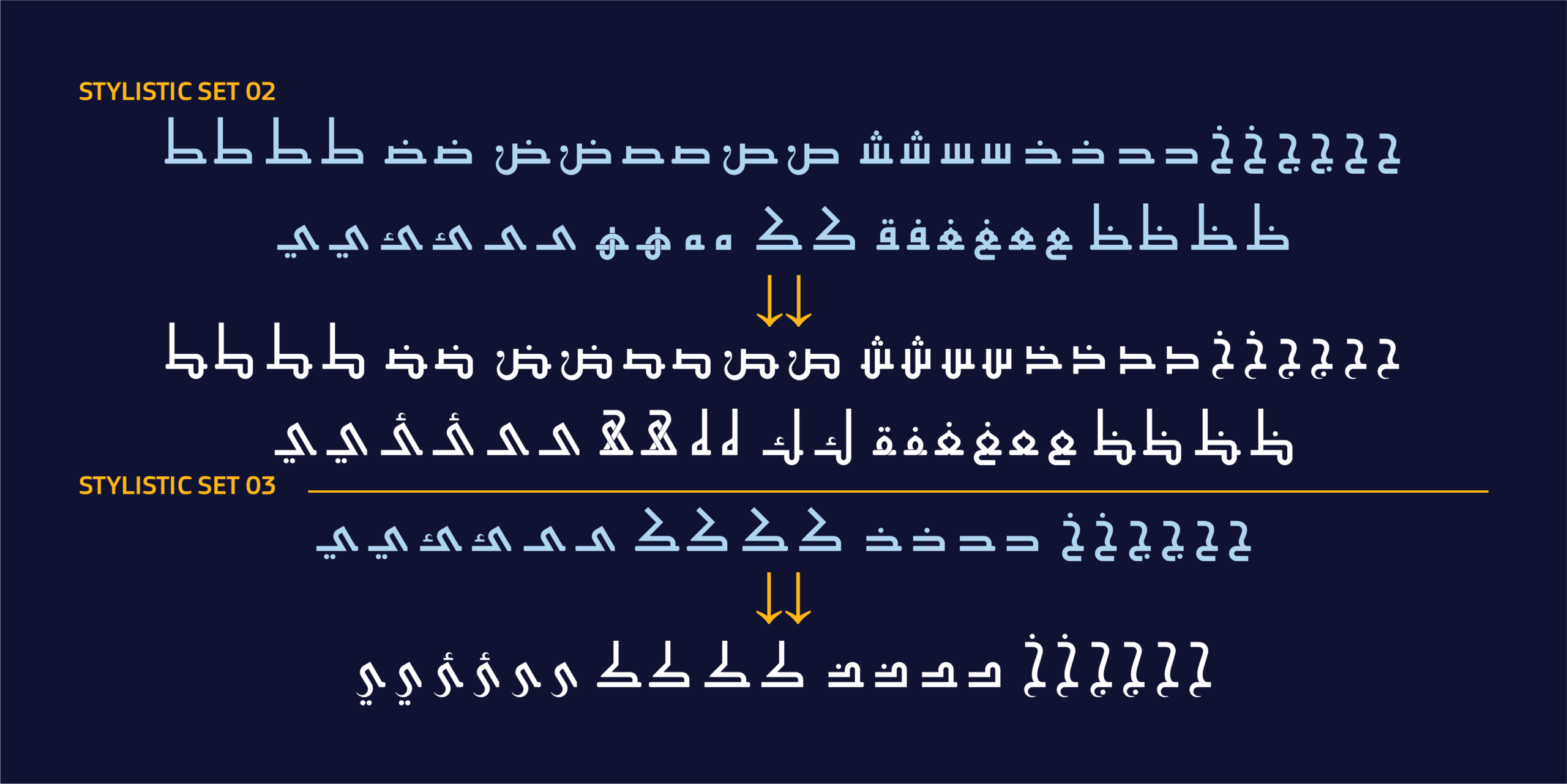
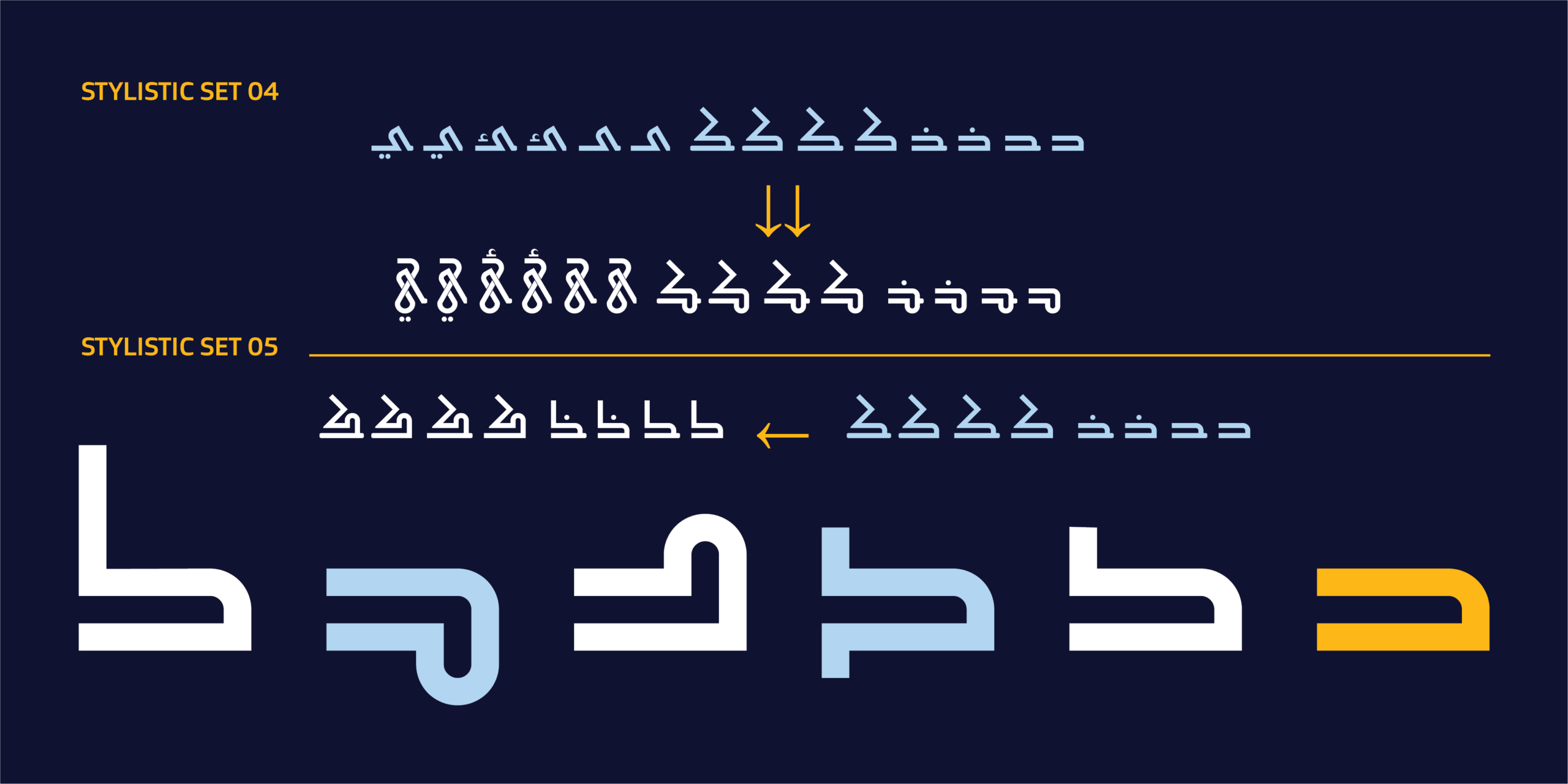
- Stylistic Sets (ss01–ss05)
- Contextual Alternates
- Positional Forms
- Ligatures
- Kerning
- وغيرها.
-
 استعمالات الخط
الهوية البصرية، حيث يمنح العلامات التجارية شخصية عربية معاصرة تجمع بين الأصالة والوضوح؛ التصميم التحريري، للمجلات والكتب والمنشورات الثقافية؛ العناوين الرئيسية والحملات والمواد الإعلانية؛ المنتجات الرقمية كالتطبيقات وواجهات المستخدم والمواقع الإلكترونية؛ والاستخدامات التجارية كالتغليف والإعلان والهوية المؤسسية والأنظمة البصرية.

HS Almada – The Essence of Fatimid Kufic
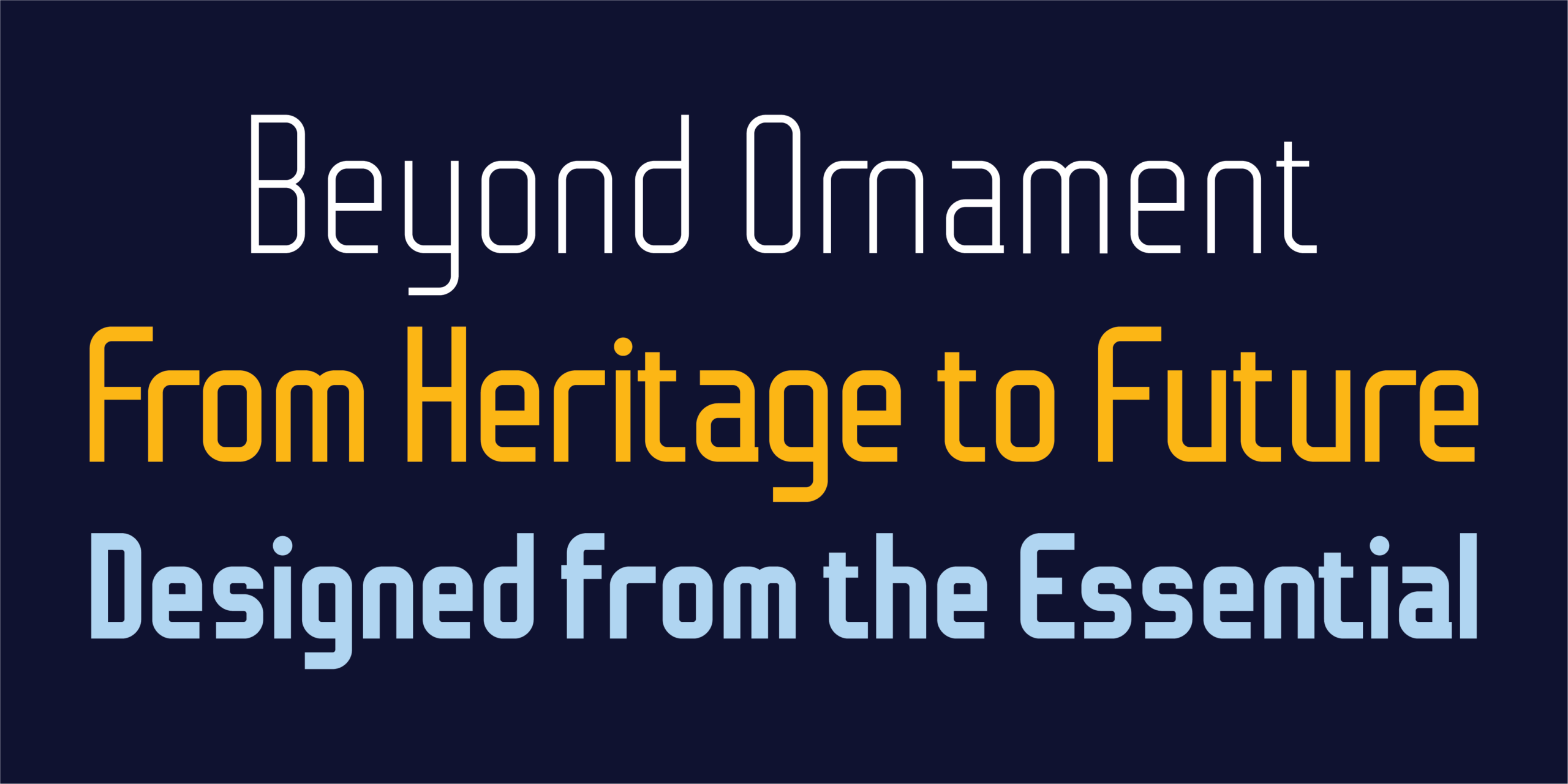
HS Almada is a contemporary variable Arabic typeface that draws on the essence of Fatimid Kufic script, reintroducing it within a modern typographic system that unites historical authenticity with contemporary precision.
The design grows out of the structural principles that defined Fatimid Kufic: balance between mass and space, geometric clarity, and a coherent visual rhythm. By reworking these principles into a modern typographic system, HS Almada offers a clearer, more flexible Arabic expression that meets the needs of contemporary design without losing its connection to its roots.
The goal was never to reproduce the historical form as it stood, but to uncover its visual essence, the core qualities that gave Fatimid Kufic its distinct character, and then develop them within a contemporary design vision that preserves that identity while making it far more usable across print and digital environments.
Almada is neither a revival of a historical style nor a simplified version of Fatimid Kufic. It is a contemporary reformulation of its essence, one that reveals the strength of its construction, its balance, and its rhythm, through a calm and confident visual language built for the needs of today’s designer.
Design Philosophy
HS Almada is built on the conviction that the strength of Fatimid Kufic lies not in its decorative elements but in its underlying structure, in the balance, rhythm, and visual order it carries. With that in mind, the design process became a journey of refinement and distillation rather than one of simplification or subtraction.
Development focused on sharpening the internal relationships between letters, refining proportions, balancing mass and space, and carefully controlling curves and transitions, arriving at forms that are clearer and more harmonious while staying true to the original character of Fatimid Kufic.
The typeface represents a more abstract, more distilled stage in the evolution of Fatimid Kufic, one where structure itself becomes the primary expressive element. Every letter was reviewed carefully to reach a cohesive system that keeps the spirit of the historical reference while giving it an independent character suited to modern visual use.
In this sense, HS Almada stands between historical heritage and contemporary type design. It avoids excess ornamentation and focuses instead on the essential character of the letterform, offering a visual language that is authentic, refined, and adaptable across a wide range of fields.

The Variable Design
HS Almada was developed as a variable font with two independent axes that give the designer wide-ranging control over typographic expression.
Weight Axis This axis moves between multiple degrees of visual presence, from quieter, lighter styles to bold styles suited to headlines and large compositions, allowing a full visual hierarchy to be built within a single project without switching between different type families.
Width Axis This axis adds further flexibility in controlling letter density and text rhythm, allowing the typeface to adapt to different spaces, whether in editorial layouts, headlines, or digital environments with variable constraints.
Specifications
- Dual-axis Variable Font (Weight + Width)
- 10 static instances
- Arabic and Latin support
- More than 721 glyphs
- Comprehensive Arabic diacritics
- Advanced OpenType features including:
- Stylistic Sets (ss01–ss05)
- Contextual Alternates
- Positional Forms
- Ligatures
- Kerning
- and more
Uses
Brand identity, giving brands a contemporary Arabic character that combines authenticity with clarity; editorial design, for magazines, books, and cultural publications; headlines, campaigns, and advertising materials; digital products such as apps, user interfaces, and websites; and commercial applications including packaging, advertising, corporate identity, and visual systems.

معلومات مختصرة عن الخط الطباعي HS Almada|
* مصمم الحرف الطباعي |حسن أبو عفش
* تاريخ تصميم الحرف الطباعي| 2026
* الشركة المنتجة للحرف |HibaStudio
* تنسيق الخط الطباعي|OTF, TTT, woff2 and Varible Font
* لغات الخط الطباعي |العربية واللاتينية
* أوزان الخط الطباعي|Light, Regular, medium, SimiBold, BoldLight Extended, Regular Extended, medium Extended, SimiBold Extended, Bold Extended
* للمزيد من المعلومات في موقع Behance
** لشراء الخط نأمل الاتصال بنا عبر البريد الإلكتروني| hasan@hibastudio.com