

الخط الطباعي “مبسم” – حيث تبتسم الهندسة
الخط الطباعي “مبسم” هو خط عربي متغيّر معاصر يجسد مفهوم البساطة الهندسية بوصفها فلسفة تصميم، لا مجرد أسلوب بصري. فقد صُمم ليقدم أشكالاً واضحة ومتوازنة، تمنح المصمم حرية واسعة في بناء هويات بصرية حديثة وتجارب رقمية تتميز بالاتساق والوضوح. لا يسعى HS Mabsam إلى محاكاة الخطوط التاريخية أو استحضار الزخارف التقليدية، بل يتبنى نهجاً هندسياً معاصراً يجعل من البساطة أساساً للمرونة. وقد صُمم كل منحنى وكل زاوية وكل نسبة بعناية ليقدم خطاً يعمل بانسجام في الهويات البصرية والمنتجات الرقمية ووسائل التواصل البصري الحديثة. هو خط عربي هندسي معاصر، صُمم ليقدم لغة بصرية بسيطة وواضحة تجمع بين الدقة الهندسية والمرونة في الاستخدام. يعتمد الخط على بناء هندسي متوازن، مع عناية خاصة بالعلاقات بين الكتل والمساحات، ليحافظ على وضوح الحروف وتماسكها في مختلف الأحجام والاستخدامات.
النظام المتغيّر
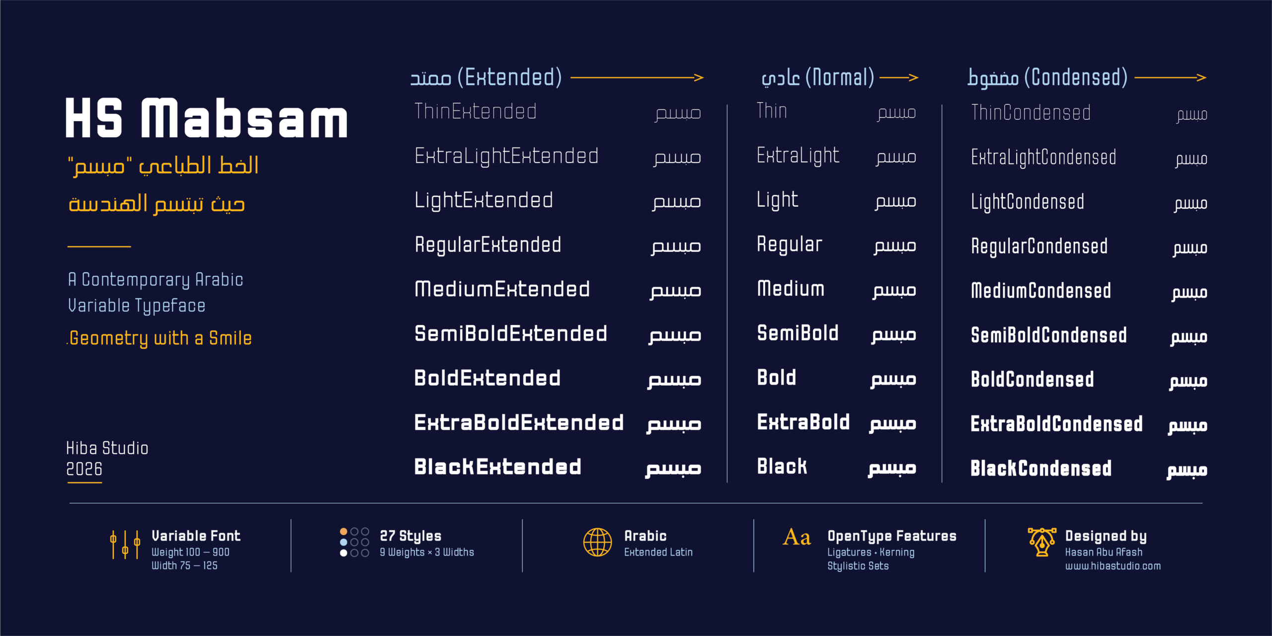
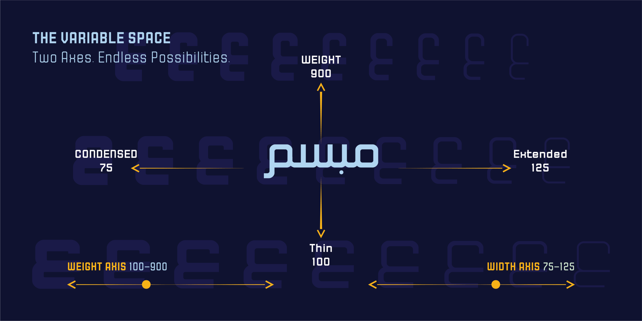
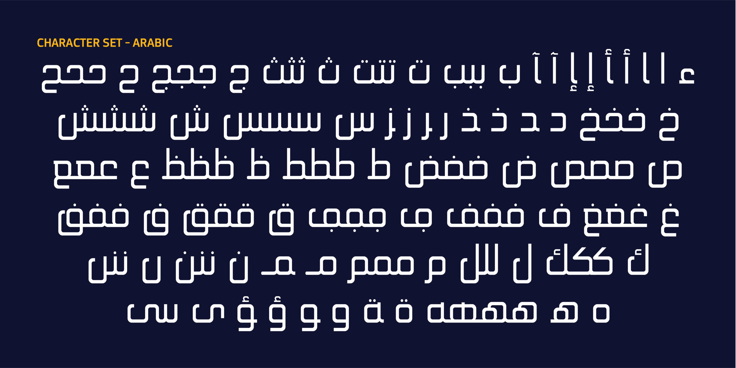
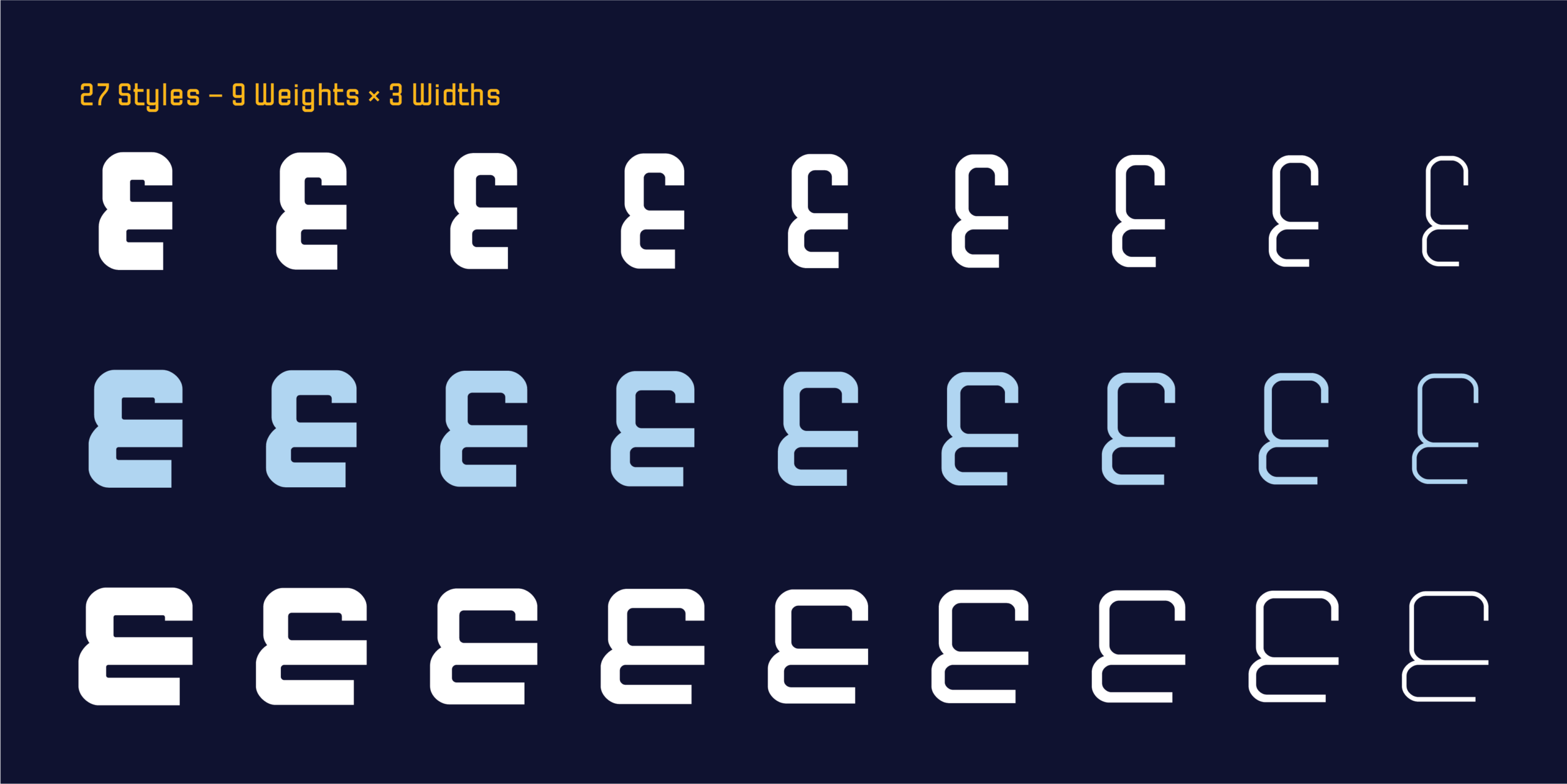
يقوم الخط على نظام متغير بمحوري الوزن (Weight) والعرض (Width)، مما يتيح انتقالاً سلساً بين سبعةٍ وعشرين نمطاً ثابتاً، إضافة إلى عدد غير محدود من القيم الوسيطة. ويمنح هذا النظام مرونة كبيرة في التحكم بكثافة النص واتساعه، مع الحفاظ على شخصية الحروف وإيقاعها البصري عبر جميع الأنماط. يتيح النظام الانتقال بسلاسة من Thin إلى Black، ومن Condensed إلى Extended، وينتج عن ذلك 27 نمطًا ثابتًا تمثل تسع درجات من الوزن عبر ثلاثة عروض مختلفة.
دون زخرفة، بحضور هادئ وواثق
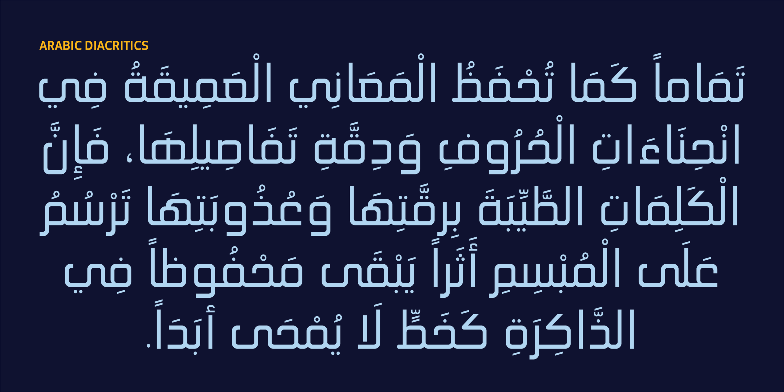
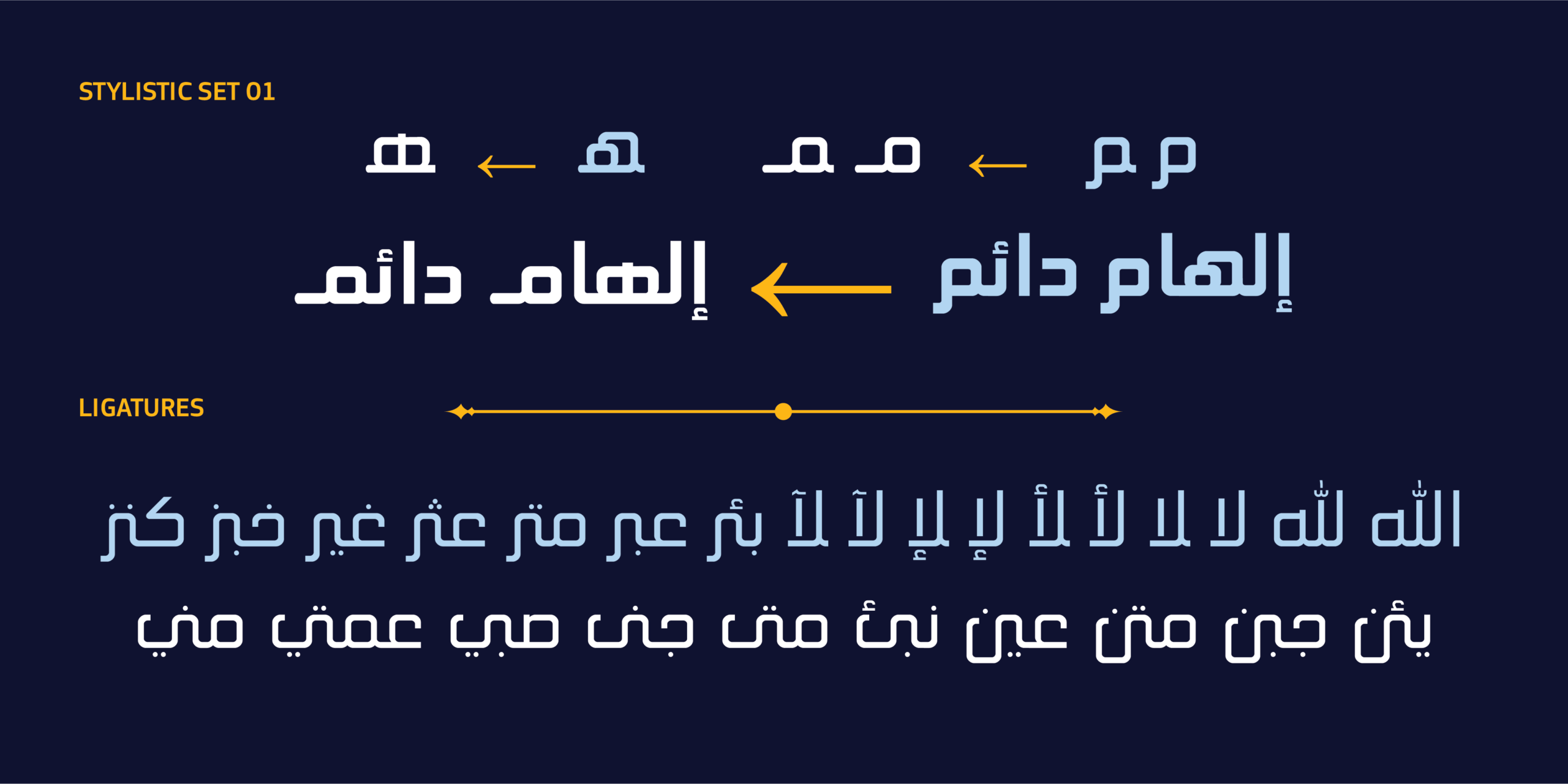
لا يعتمد HS Mabsam على الزخارف أو النهايات التزيينية أو البدائل الشكلية المعقدة، بل يركز على جوهر الحرف نفسه. فكل منحنى، وكل زاوية، وكل نسبة داخل الحرف صُممت بعناية لتخدم الوضوح والاتزان، وتوفر تجربة قراءة مريحة في مختلف الاستخدامات. فهويته لا تأتي من الزخارف أو النهايات التزيينية أو الحروف الممتدة، بل من الشكل الهندسي للحروف، وتوازنها، وإيقاعها البصري. وفي الوقت نفسه، يتضمن الخط مجموعة من المعالجات الطباعية التي توسع إمكاناته دون أن تغيّر طبيعته البسيطة، من بينها تراكيب خاصة لبعض الحروف العربية، وأشكال بديلة مختارة عبر Stylistic Set 01 (ss01) لتحسين بعض المواضع وإتاحة خيارات تصميمية إضافية. وتمنحه بنيته الهندسية حضوراً هادئاً وواثقاً، يجعله خياراً مناسباً للهويات البصرية، والعناوين، والواجهات الرقمية، والتطبيقات، والتغليف، وكل مشروع يحتاج إلى لغة بصرية معاصرة تجمع بين البساطة والدقة. وإلى جانب دعمه الكامل للعربية واللاتينية الممتدة، يقدم HS Mabsam منظومة طباعية متماسكة توازن بين المرونة التقنية والانسجام البصري، ليصبح أداة تصميم متكاملة تلبي احتياجات المصممين في المشاريع الحديثة.
لماذا نظام واحد لا مجموعة خطوط
في عالم أصبحت فيه الهوية البصرية تتحرك بين الشاشات والمنصات والمطبوعات، لم يعد المصمم بحاجة إلى مجموعة من الخطوط المختلفة بقدر حاجته إلى نظام طباعي واحد يستطيع التكيف مع جميع هذه البيئات. لهذا جاء HS Mabsam. فهو لا يقدم مجموعة من الأوزان والعروض فحسب، بل يوفر نظاماً متغيراً متكاملاً يتيح للمصمم الوصول إلى الدرجة الدقيقة التي يحتاجها، سواء في الوزن أو العرض، مع الحفاظ على لغة بصرية واحدة عبر المشروع بأكمله. إنه خط صُمم ليمنحك حرية أكبر، لا تعقيداً أكبر.
فلسفة الخط
لكل خط بداية، وغالباً ما تبدأ بسؤال. أما HS Mabsam فقد بدأ بسؤال بسيط: إلى أي مدى يمكن تبسيط الخط العربي دون أن يفقد شخصيته؟ لم تكن الإجابة في حذف التفاصيل لمجرد الوصول إلى شكل أكثر بساطة، بل في إعادة النظر في كل عنصر داخل الحرف، والإبقاء على ما يخدم القراءة والتوازن والوظيفة فقط. لذلك جاء كل منحنى محسوباً، وكل زاوية مدروسة، وكل نسبة مبنية على انسجام بصري يحافظ على شخصية الخط مهما تغير الوزن أو العرض. لا يعتمد HS Mabsam على الزخارف أو الحلول البصرية الملفتة، بل يبني حضوره من خلال الهندسة والإيقاع والاتساق. فكل نمط، من أكثر العروض ضيقاً إلى أكثرها اتساعاً، يحافظ على اللغة البصرية نفسها، ويمنح المصمم حرية واسعة دون أن يفقد الخط هويته.
والنتيجة هي نظام طباعي معاصر يجمع بين البساطة والمرونة، ويؤدي وظيفته بثقة في الهويات البصرية والواجهات الرقمية والعناوين وكل مساحة تتطلب وضوحاً وأناقة في آن واحد. لم تكن فكرة HS Mabsam البحث عن أشكال جديدة بقدر ما كانت البحث عن أشكال أكثر وضوحاً. ففي التصميم الطباعي، لا تعني البساطة تقليل التفاصيل فحسب، بل تعني معرفة أي التفاصيل تستحق أن تبقى. ومن هذا المبدأ انطلق تصميم HS Mabsam، حيث خضعت كل بنية، وكل منحنى، وكل نسبة إلى مراجعة دقيقة للوصول إلى حروف تتسم بالوضوح والتوازن دون أي عناصر زائدة.
ولأن احتياجات التصميم المعاصر لم تعد ثابتة، صُمم الخط كنظام متغير بمحوري الوزن والعرض، ليمنح المصمم حرية تشكيل النص بما يتناسب مع كل مساحة وكل استخدام، مع الحفاظ على شخصية متجانسة عبر جميع القيم والأوزان. إن HS Mabsam ليس مجرد مجموعة من الأوزان والعروض، بل نظام طباعي متكامل صُمم ليواكب متطلبات الهوية البصرية والمنتجات الرقمية والتطبيقات الحديثة، حيث تصبح المرونة جزءاً من التصميم، ويصبح الوضوح أساساً للتواصل.
انطلقت فكرة HS Mabsam من الرغبة في تطوير خط عربي هندسي بسيط يصلح للاستخدامات التقنية والمعاصرة، ثم تحويله من عائلة ثابتة إلى نظام طباعي متغير يسمح بالتحكم في الوزن والعرض مع الحفاظ على الروح الهندسية الأصلية. تقوم فلسفة Mabsam على أن البساطة لا تعني اختزال الحرف، بل الوصول إلى أوضح صيغة ممكنة له. لذلك يعتمد التصميم على هندسة دقيقة، وتوازن محسوب بين الكتل والفراغات، وإيقاع ثابت يسمح للحروف بأن تعمل كوحدات متناسقة داخل الكلمة والنص. وتظهر هذه الفلسفة أيضًا في معالجة التراكيب والأشكال البديلة؛ فبدل إضافة الزخارف والسواشات، تركز الميزات الطباعية على تحسين العلاقات بين الحروف وتوفير أشكال مناسبة لبعض السياقات، مع الحفاظ على المظهر الهندسي البسيط للخط.
استخدامات الخط
بفضل بنيته الهندسية الدقيقة ونظامه المتغير، يقدم HS Mabsam حلولاً طباعية متعددة تلائم طيفاً واسعاً من التطبيقات المعاصرة. يبرز الخط بحضوره الهادئ والواثق في تصميم الهويات البصرية والعلامات التجارية، حيث يمنح المشاريع لغة عربية واضحة تجمع بين البساطة والدقة دون الحاجة إلى زخرفة أو تفاصيل إضافية. كما يناسب استخدامه في العناوين، والواجهات الرقمية، وتطبيقات الهاتف، والمواقع الإلكترونية، حيث تتيح أوزانه وعروضه المتعددة التحكم الدقيق في كثافة النص واتساعه مع الحفاظ على الوضوح في مختلف الأحجام. ويمثل أيضاً خياراً مناسباً للتغليف، والمواد الإعلانية، والأنظمة البصرية التي تبحث عن تعبير عربي معاصر، بسيط في شكله، ومتماسك في بنيته.
من خلال الجمع بين الدقة الهندسية والمرونة التقنية، يوفر HS Mabsam أداة طباعية متكاملة للمصممين الباحثين عن خط عربي قادر على التكيف مع مختلف السياقات الرقمية والبصرية الحديثة.
الخصائص التقنية
- خط عربي هندسي معاصر
- خط متغيّر (Variable Font)
- محور الوزن: 100–900
- محور العرض: 75–125
- 27 نمطاً ثابتاً (9 أوزان × 3 عروض): Thin → Black، Condensed → Normal → Extended
- يدعم Arabic و Extended Latin
- تراكيب عربية مختارة
- Stylistic Set 01 (ss01): أشكال بديلة مختارة للهاء المتوسطة، وأشكال بديلة للميم النهائية والميم المفردة
- Kerning
- Mark
- Mkmk
- Ccmp
HS Mabsam: Where Geometry Smiles
About the Typeface
HS Mabsam is a contemporary variable Arabic typeface that treats geometric simplicity as a design philosophy, not just a visual style. It was built to offer clear, balanced letterforms that give designers wide freedom to build modern visual identities and digital experiences marked by consistency and clarity. HS Mabsam doesn’t try to echo historical typefaces or revive traditional ornamentation. Instead, it takes a contemporary geometric approach that makes simplicity the foundation of flexibility. Every curve, angle, and proportion was carefully worked out so the typeface functions in harmony across brand identities, digital products, and modern visual communication.
It’s a contemporary geometric Arabic typeface, designed to offer a simple, clear visual language that combines geometric precision with flexibility in use. The design rests on balanced geometric construction, with close attention to the relationship between strokes and counters, keeping letters clear and cohesive across sizes and applications.
The Variable System
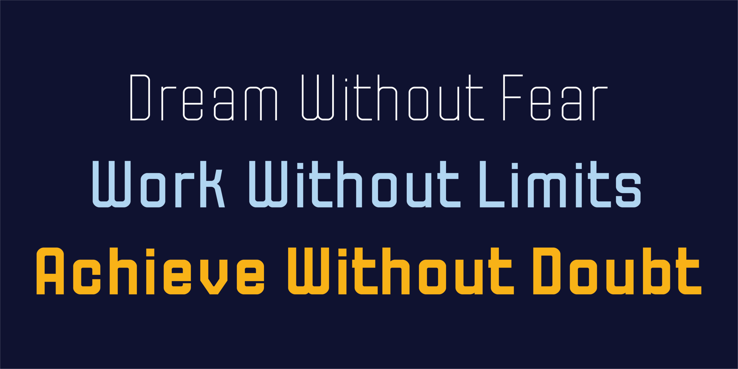
The typeface runs on a variable system with two axes, weight and width, allowing smooth transitions across twenty-seven static styles, plus an unlimited range of intermediate values in between. This system gives designers strong control over how dense or open text feels, while keeping the letters’ character and visual rhythm consistent throughout. The system moves smoothly from Thin to Black, and from Condensed to Extended, producing 27 static styles across nine weights and three widths.
No Ornament, a Quiet, Confident Presence
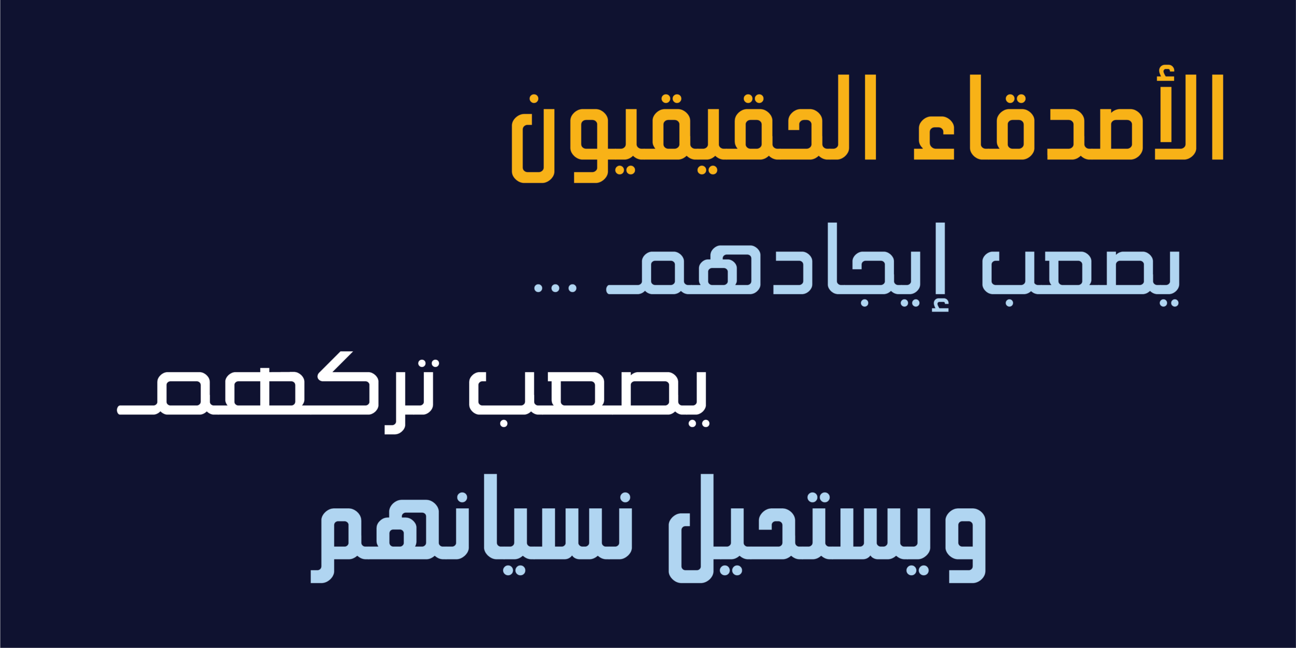
HS Mabsam doesn’t lean on ornamentation, decorative terminals, or elaborate stylistic alternates. It focuses on the essence of the letterform itself. Every curve, angle, and proportion inside each letter was carefully shaped to serve clarity and balance, and to make reading comfortable across every use case. Its identity comes not from ornament, decorative terminals, or extended strokes, but from the geometric shape of the letters, their balance, and their visual rhythm. At the same time, the typeface includes a set of typographic refinements that extend its capabilities without changing its simple nature, including special compositions for certain Arabic letters and select alternates through Stylistic Set 01 (ss01) that improve specific positions and offer additional design options.
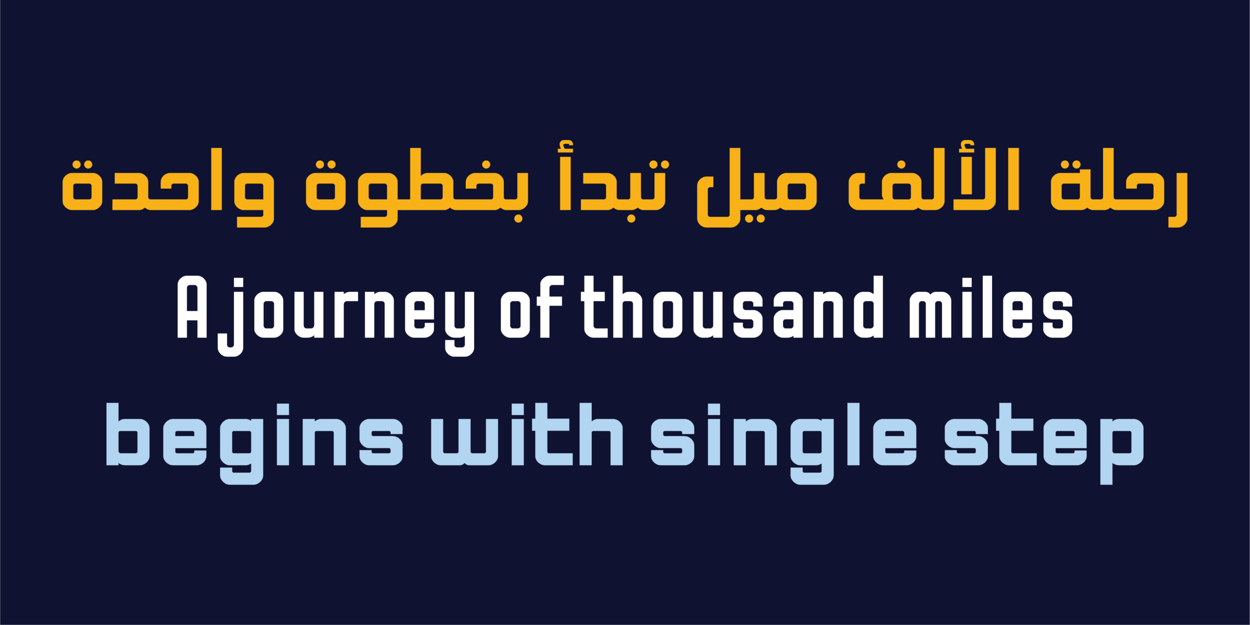
Its geometric structure gives it a calm, confident presence, making it a strong fit for brand identities, headlines, digital interfaces, apps, packaging, and any project that calls for a contemporary visual language combining simplicity and precision. Alongside full support for Arabic and Extended Latin, HS Mabsam offers a cohesive typographic system that balances technical flexibility with visual harmony, becoming a complete design tool for the needs of modern projects.
Why One System Instead of a Collection of Fonts
In a world where visual identity now moves across screens, platforms, and print, designers no longer need a collection of different fonts so much as they need a single typographic system that can adapt across all these environments. That’s where HS Mabsam comes in. It doesn’t just offer a set of weights and widths, it provides a complete variable system that lets designers dial in the exact degree of weight or width they need, while keeping one visual language across the entire project. It’s a typeface built to give you more freedom, not more complexity.
Design Philosophy
Every typeface has a starting point, and it usually begins with a question. HS Mabsam began with a simple one: how far can an Arabic typeface be simplified without losing its character?
The answer wasn’t found by stripping away details just to arrive at a simpler shape. It came from re-examining every element within the letterform and keeping only what serves legibility, balance, and function. That’s why every curve is calculated, every angle considered, and every proportion built on a visual harmony that holds the typeface’s character together no matter how the weight or width changes.
HS Mabsam doesn’t rely on ornament or eye-catching visual tricks. It builds its presence through geometry, rhythm, and consistency. Every style, from the narrowest width to the widest, holds onto the same visual language, giving designers broad freedom without the typeface losing its identity. The result is a contemporary typographic system that combines simplicity with flexibility, and performs with confidence across brand identities, digital interfaces, headlines, and any space that calls for both clarity and elegance.
The idea behind HS Mabsam wasn’t a search for new shapes so much as a search for clearer ones. In type design, simplicity doesn’t just mean fewer details, it means knowing which details deserve to stay. That principle guided the whole design process: every structure, every curve, every proportion went through careful review to arrive at letters defined by clarity and balance, with nothing extra.Because the needs of contemporary design are no longer fixed, the typeface was built as a variable system across weight and width, giving designers the freedom to shape text to fit any space and any use, while keeping a consistent character across every value and weight.
HS Mabsam doesn’t lean on ornament or attention-grabbing visual solutions. Its presence comes from precise construction, harmonious proportions, and balanced visual rhythm. Every style in the family, whether condensed, regular, or extended, belongs to the same design language and performs the same function with a high degree of consistency.
HS Mabsam isn’t just a set of weights and widths, it’s a complete typographic system built to keep pace with the demands of visual identity, digital products, and modern applications, where flexibility becomes part of the design and clarity becomes the basis of communication. The idea for HS Mabsam began with the desire to develop a simple geometric Arabic typeface suited to technical, contemporary use, then to turn it from a static family into a variable typographic system that allows control over weight and width while preserving the original geometric spirit.
Mabsam’s philosophy holds that simplicity doesn’t mean reducing the letterform, it means arriving at its clearest possible form. That’s why the design rests on precise geometry, a calculated balance between strokes and counters, and a steady rhythm that lets letters function as consistent units within words and text. This philosophy also shows up in how compositions and alternate forms are handled. Rather than adding flourishes and swashes, the typographic features focus on improving the relationships between letters and offering suitable forms for certain contexts, while keeping the typeface’s simple geometric appearance intact.
Uses
hanks to its precise geometric structure and variable system, HS Mabsam offers a range of typographic solutions suited to a wide array of contemporary applications. The typeface stands out for its calm, confident presence in brand and identity design, giving projects a clear Arabic voice that combines simplicity and precision without relying on ornament or extra detail. It also works well for headlines, digital interfaces, mobile apps, and websites, where its multiple weights and widths allow precise control over text density and width while maintaining clarity at every size. It’s equally suited to packaging, advertising materials, and visual systems in search of a contemporary Arabic expression, simple in form and cohesive in structure.
By bringing together geometric precision and technical flexibility, HS Mabsam offers a complete typographic tool for designers seeking an Arabic typeface capable of adapting across modern digital and visual contexts.
Technical Specifications
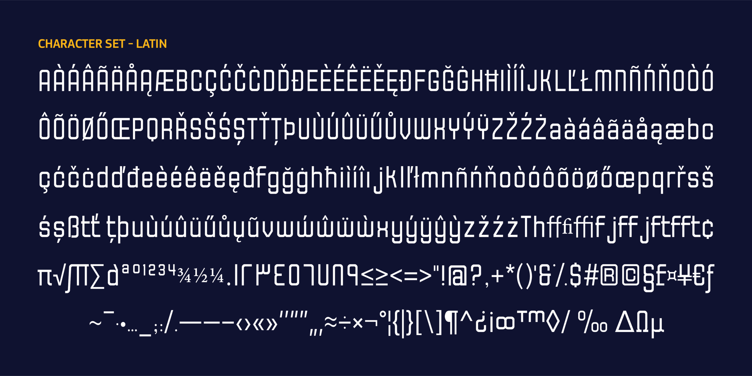
- Contemporary geometric Arabic typeface
- Variable Font
- Weight axis: 100-900
- Width axis: 75-125
- 27 static styles (9 weights x 3 widths): Thin to Black. Condensed to Normal to Extended
- Supports Arabic and Extended Latin
- Select Arabic ligatures
- Stylistic Set 01 (ss01): select alternates for medial heh, and alternates for final meem and isolated meem
- Kerning
- Mark
- Mkmk
- Ccmp

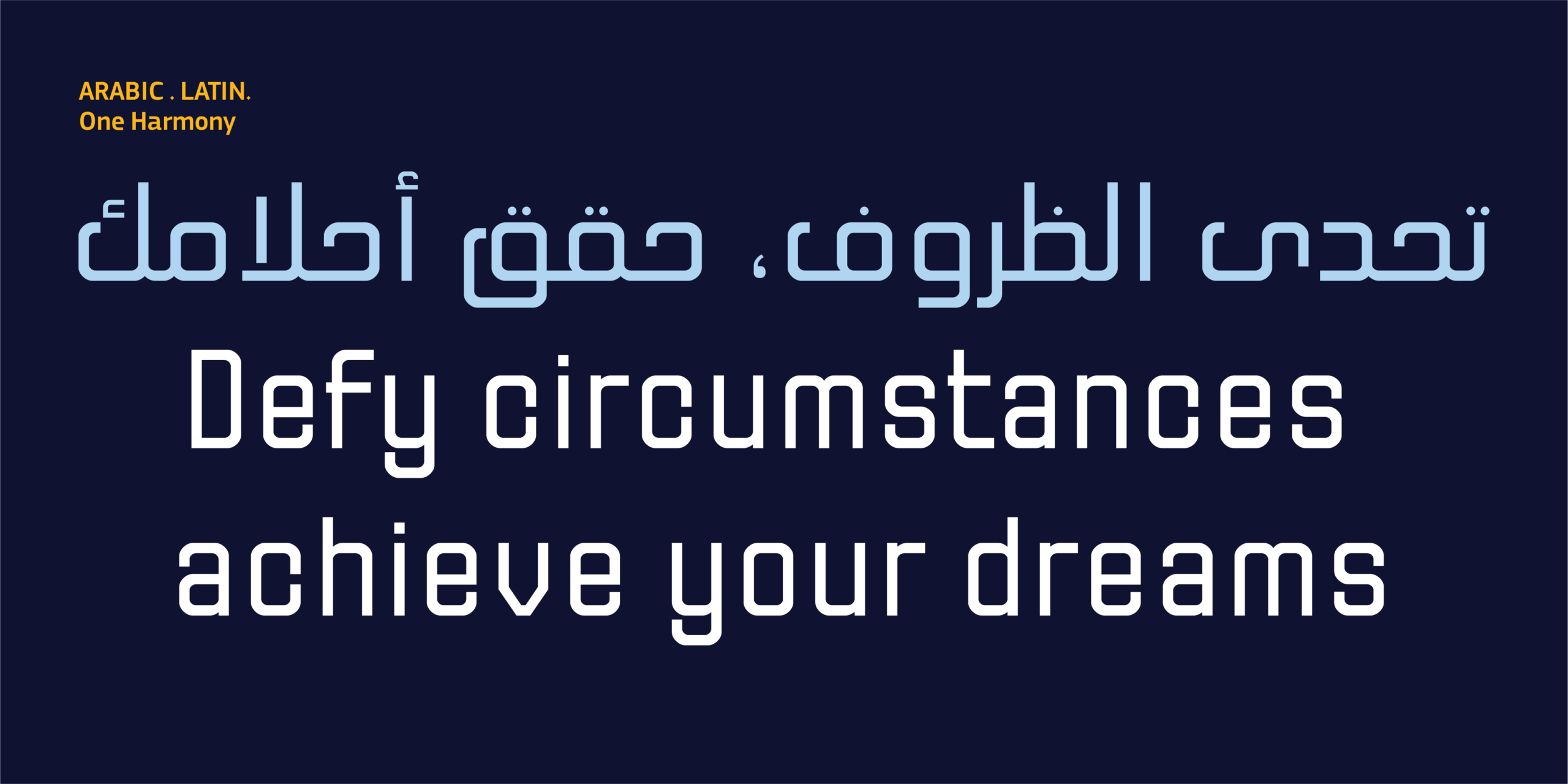
معلومات مختصرة عن الخط الطباعي HS Mabsam|
* مصمم الحرف الطباعي |حسن أبو عفش
* تاريخ تصميم الحرف الطباعي| 2026
* الشركة المنتجة للحرف |HibaStudio
* تنسيق الخط الطباعي|OTF, TTT, woff2 and Varible Font
* لغات الخط الطباعي |العربية واللاتينية
* أوزان الخط الطباعي| Condensed Thin, Condensed ExtraLight, Condensed Light, Condensed Regular, Condensed Medium, Condensed SemiBold, Condensed Bold, Condensed ExtraBold, Condensed Black, Thin, ExtraLight, Light, Regular, Medium, SemiBold, Bold, ExtraBold, Black, Extended Thin, Extended ExtraLight, Extended Light, Extended Regular, Extended Medium, Extended SemiBold, Extended Bold, Extended ExtraBold, Extended Black
* للمزيد من المعلومات في موقع Behance
** لشراء الخط نأمل الاتصال بنا عبر البريد الإلكتروني| hasan@hibastudio.com