

HS Sawsan | حيث تتحدث العربية واللاتينية بنبض واحد
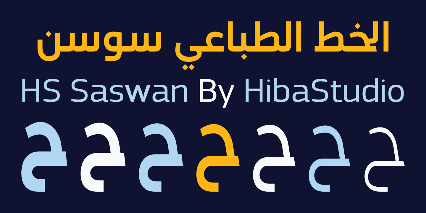
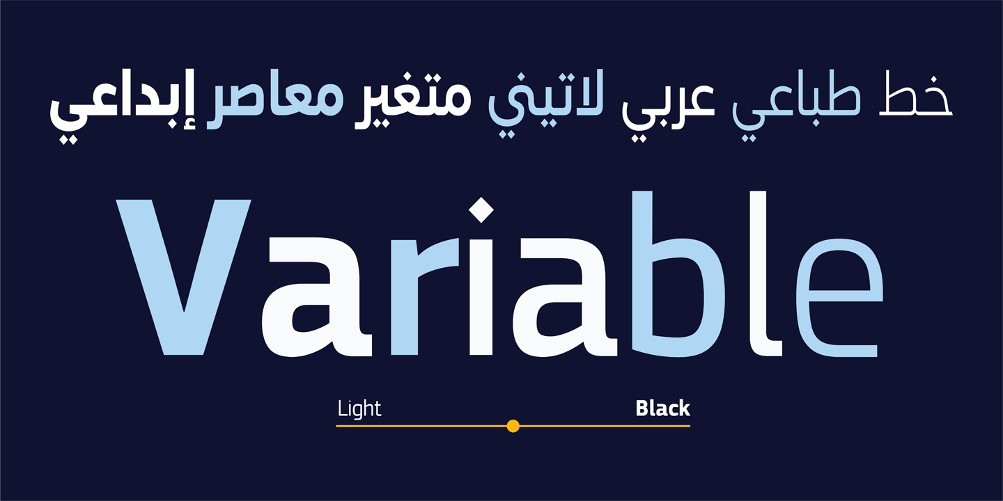
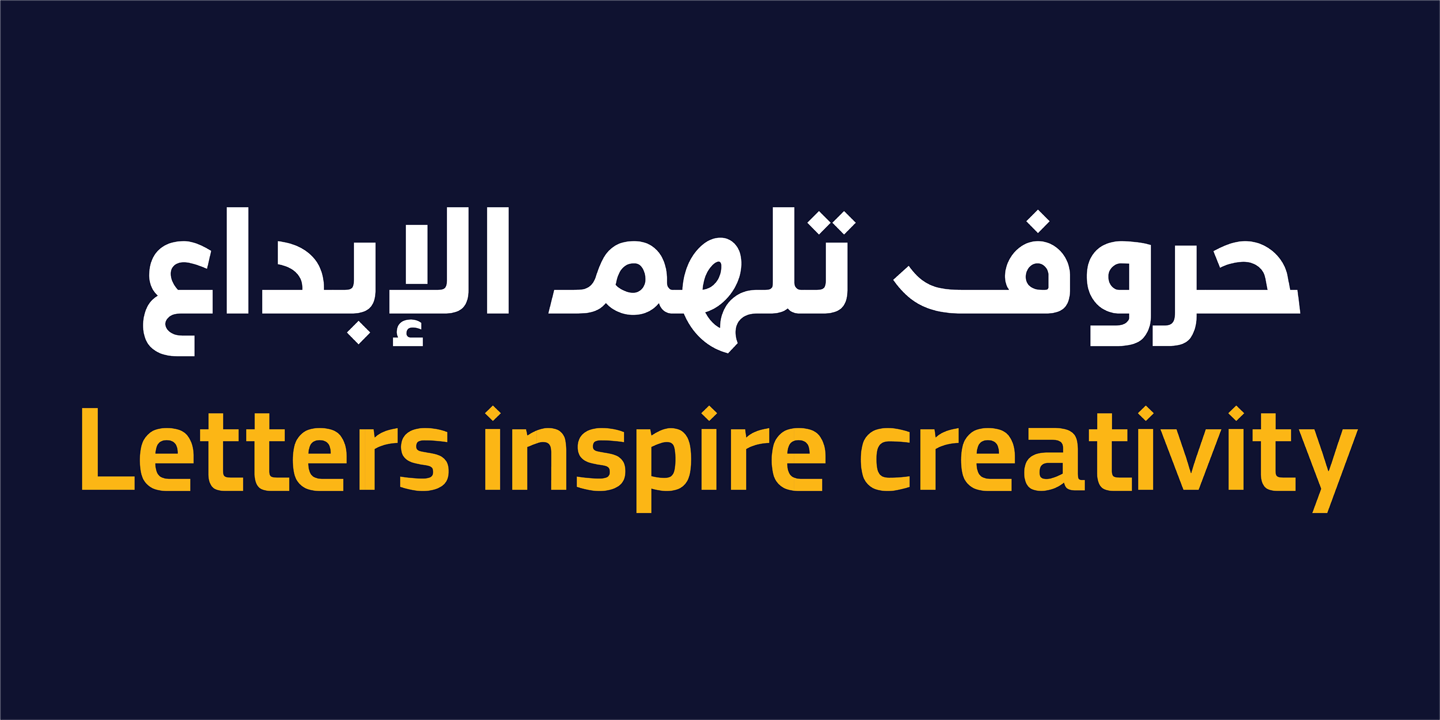
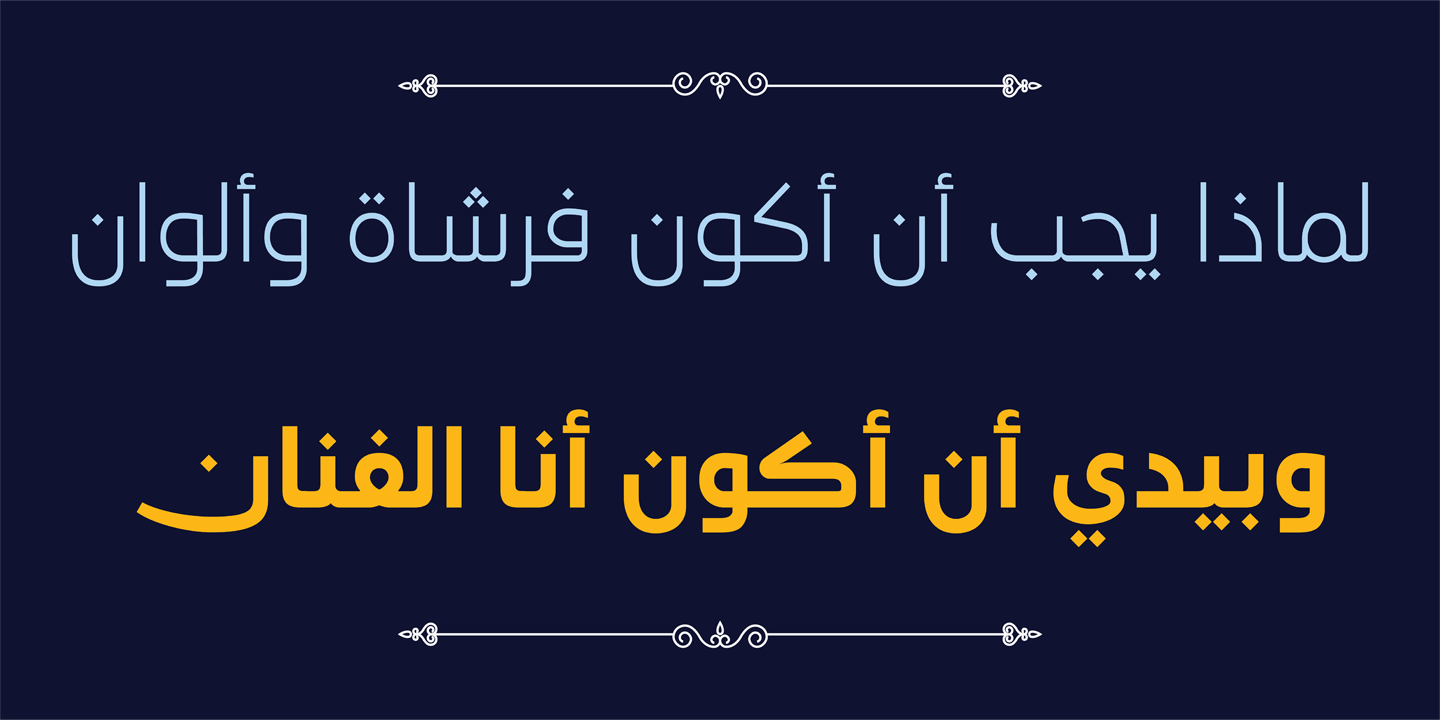
HS Sawsan خط إنساني عربي معاصر يقف في المنطقة النادرة التي يلتقي فيها دفء النسخ بانضباط الكوفي الحديث. ليس مجرد أداة طباعية، بل صوت بصري يحمل ذاكرة الخط العربي وحساسية التصميم المعاصر في آنٍ واحد. تمتد عائلة الخط الطباعي سوسن عبر سبعة أوزان من Light إلى Black، مدعومةً بتقنية Variable Font التي تمنح المصمم حرية الانتقال السلس بين الأوزان وبناء تسلسل بصري حقيقي ومتماسك. وقد بُنيت الحروف اللاتينية بالتوازي مع العربية لتشكّل معها منظومة بصرية واحدة، مما يجعل سوسن خياراً طبيعياً لكل مشروع يحتاج إلى اتساق حقيقي بين اللغتين.
فلسفة التصميم
يقوم HS Sawsan على قناعة واحدة: الخط الطباعي العربي المعاصر لا يختار بين الوضوح الهندسي والدفء الإنساني، بل يجمعهما. استُلهمت بنية حروفه من التقاطع العميق بين خط النسخ وأسلوب الكوفي المعاصر، وأُعيد رسم تفاصيلها بحساسية تحقق انسيابية أكبر وتناسقاً بصرياً ثابتاً عبر مختلف أحجام العرض وبيئاته. الهدف لم يكن خطاً بمفرده، بل نظاماً طباعياً متكاملاً تعمل فيه العربية واللاتينية بانسجام حقيقي، قادراً على الأداء بثبات عبر المطبوعات والشاشات والمنصات الرقمية.
الحرفان في حوار — العربي واللاتيني
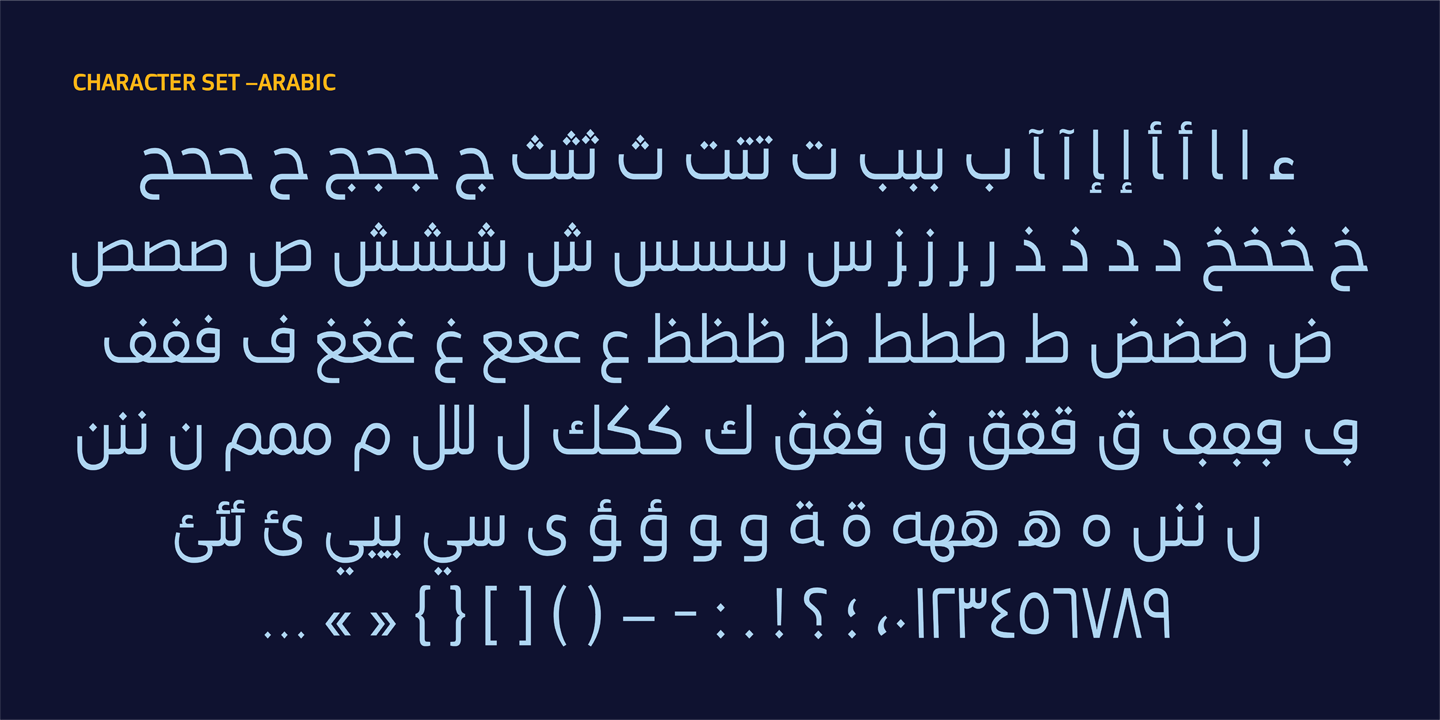
ما يميّز HS Sawsan ليس فقط دعمه للغتين، بل الطريقة التي صُمِّم بها هذا الدعم. لم تُضَف الحروف اللاتينية لاحقاً أو باعتبارها مكملاً ثانوياً، بل صُمِّمت منذ البداية في حوار مباشر مع العربية: تشتركان في القيم البصرية ذاتها: الأوزان، والنسب، وإيقاع الفراغ ” لتظهرا معاً كهوية واحدة لا كلغتين متجاورتين. هذا الانسجام يمنح المصمم أرضية صلبة في المشاريع ثنائية اللغة، سواء في الهوية البصرية أو الواجهات الرقمية أو أنظمة الإشارات، حيث يكون الاتساق البصري بين اللغتين شرطاً لا خياراً.
الخصائص التقنية
- خط متغير (Variable Font) بمحور وزني
- سبعة أوزان: Light, Regular, Medium, SemiBold, Bold, ExtraBold, Black
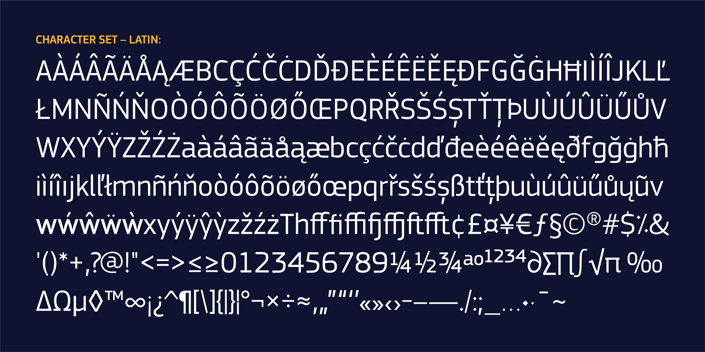
- دعم العربية واللاتينية الموسعة (Extended Latin)
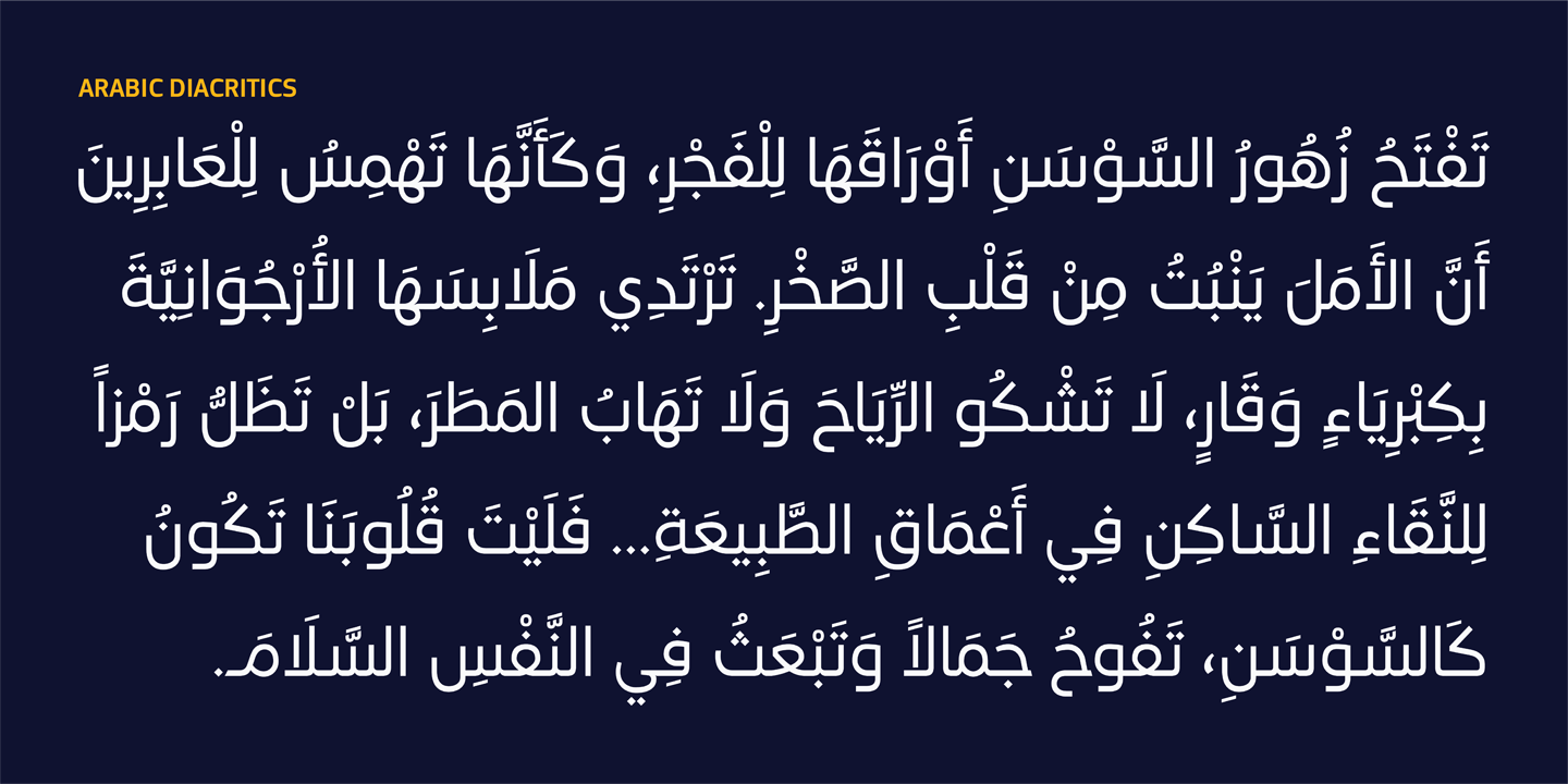
- دعم شامل لعلامات التشكيل العربية
- توافق مع Adobe Illustrator, InDesign, CorelDRAW, Affinity Designer وغيرها
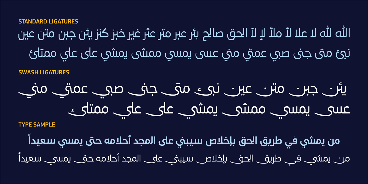
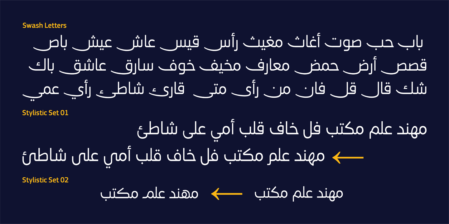
- خصائص OpenType المتقدمة: Ligatures, Swash Ligatures, Swash Alternates, Stylistic Sets (ss01–ss02), Contextual Alternates, Positional Forms, Kerning
- يأتي HS Dream كعائلة متغيرة (Variable Font) تعتمد محور الوزن، مما يمنح المصممين مرونة أكبر في التحكم بالتدرج البصري وتحسين الأداء عبر التطبيقات الرقمية والمطبوعة.
- العلامات التجارية والهوية البصرية
- الشعارات وأنظمة الهوية المؤسسية
- العناوين الرئيسية والإعلانات
- التغليف وتصميم المنتجات
- واجهات التطبيقات والمواقع الإلكترونية
- المواد التسويقية والمحتوى الرقمي
- المشاريع ثنائية اللغة
بفضل توازنه بين الوضوح والشخصية البصرية، يوفر HS Sawsan حلولاً طباعية مرنة للمصممين الذين يبحثون عن خط عربي حديث قادر على تلبية حاجة جميع الوسائط والمنصات.
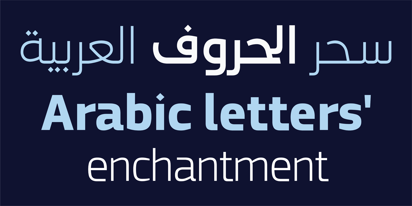
HS Sawsan | Where Arabic and Latin speak with one pulse
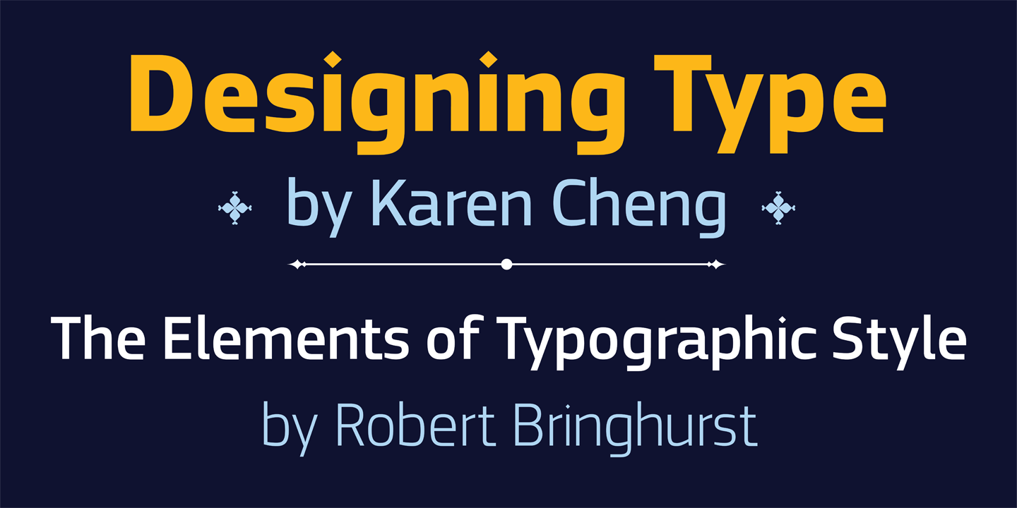
HS Sawsan is a contemporary humanist Arabic typeface that lives in a rare space, where the warmth of Naskh meets the discipline of modern Kufi. It isn’t just a tool for setting type. It’s a visual voice that carries the memory of Arabic letterforms and the sensibility of contemporary design, both at once.
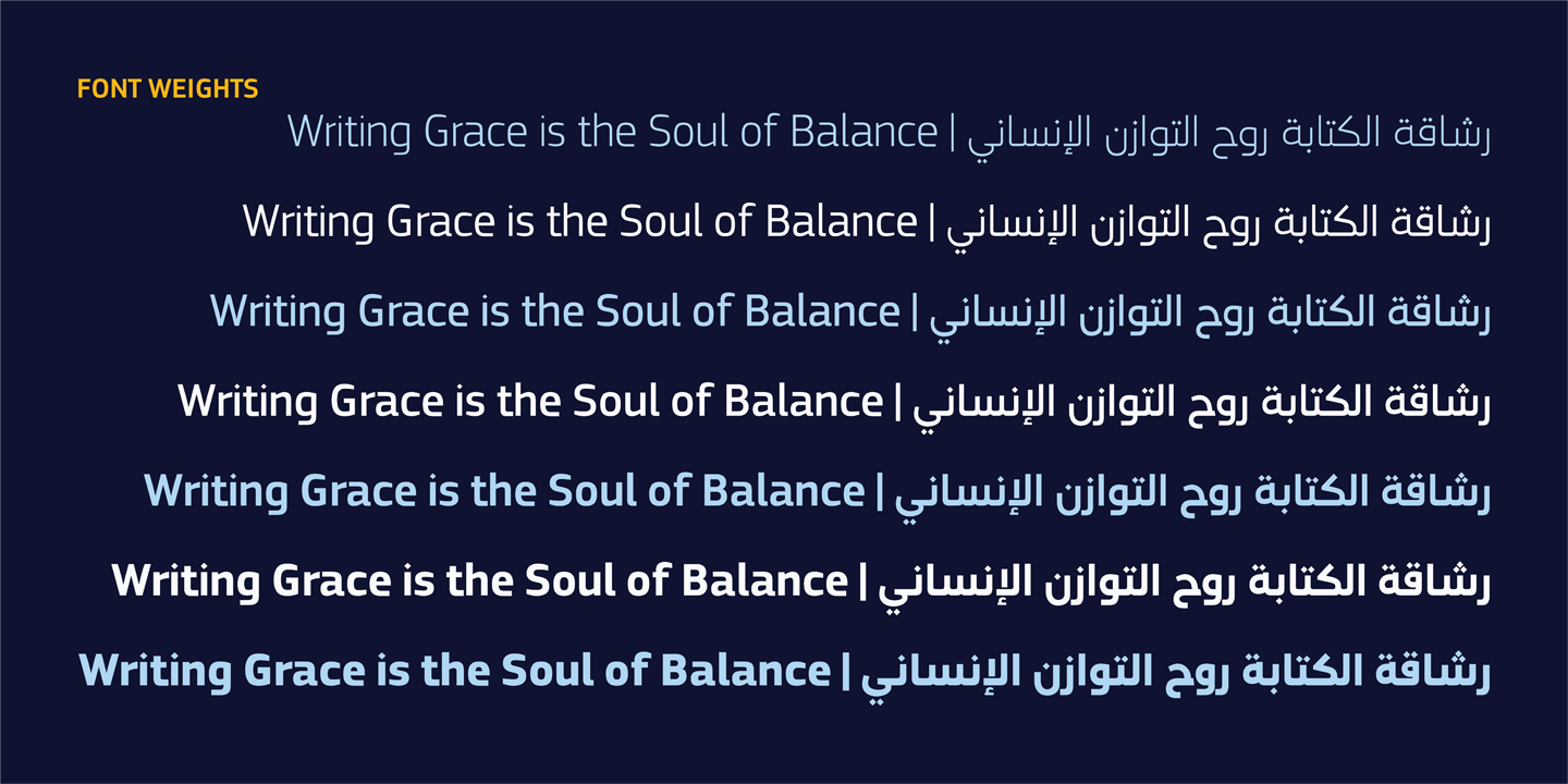
The family spans seven weights from Light to Black, supported by Variable Font technology that gives designers the freedom to move fluidly across the weight range and build real typographic hierarchy. The Latin characters weren’t added as an afterthought. They were drawn alongside the Arabic from the start, forming a single visual system. That makes Sawsan a natural fit for any project where true consistency between the two scripts actually matters.
Design Philosophy
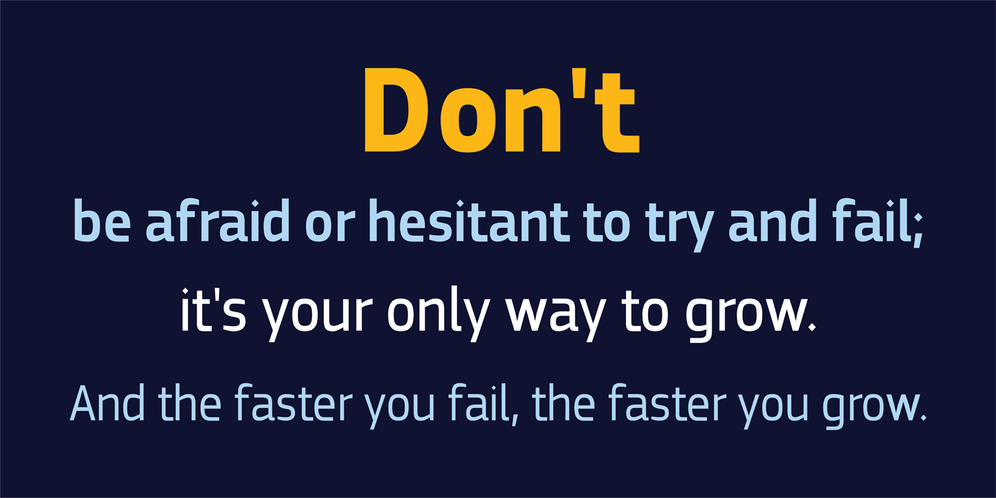
HS Sawsan is built on one belief: a contemporary Arabic typeface doesn’t have to choose between geometric clarity and human warmth. It can hold both. The letterforms draw from the intersection of Naskh and contemporary Kufi, redrawn with a sensitivity that brings greater fluidity and visual consistency across sizes and contexts. The goal was never a standalone typeface. It was a complete typographic system where Arabic and Latin work in genuine harmony, performing consistently across print, screen, and digital platforms.
Two Scripts, One Conversation
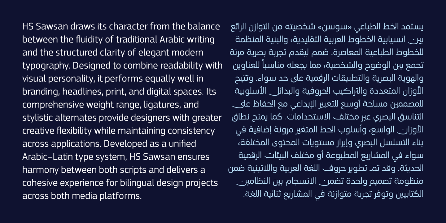
What sets HS Sawsan apart isn’t simply that it supports two scripts. It’s how that support was built. The Latin characters were designed in direct dialogue with the Arabic, sharing the same visual values, the same weight relationships, and the same spatial rhythm. They don’t sit next to each other. They belong to each other.
This gives designers a solid foundation for bilingual projects, whether in brand identity, digital interfaces, or signage systems, where visual consistency between scripts isn’t optional. It’s the whole point.
Technical Features
-
- Variable Font with Weight Axis
- Seven weights: Light, Regular, Medium, SemiBold, Bold, ExtraBold, Black
- Arabic and Extended Latin support
- Full Arabic diacritics support
- Compatible with Adobe Illustrator, InDesign, CorelDRAW, Affinity Designer, and more
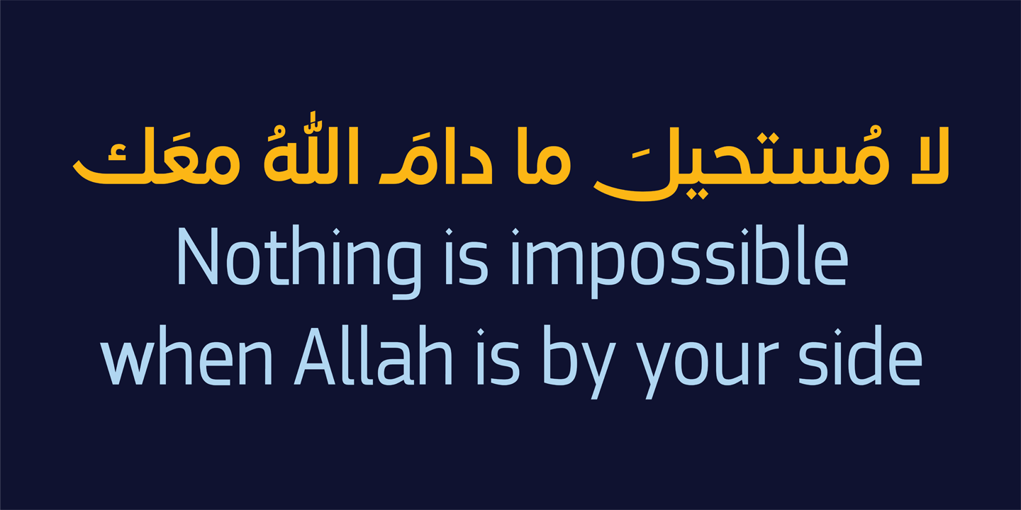
- Advanced OpenType features: Ligatures, Swash Ligatures, Swash Alternates, Stylistic Sets (ss01–ss02), Contextual Alternates, Positional Forms, Kerning
Recommended Uses
HS Dream was designed to deliver a strong contemporary presence while maintaining clarity and versatility across a wide range of applications. It is particularly well suited for:
- Branding and visual identity systems.
- Logos and corporate identity projects.
- Headlines, advertising, and promotional campaigns.
- Packaging and product design.
- Websites and application interfaces.
- Marketing materials and digital content.
- Bilingual Arabic–Latin design projects.
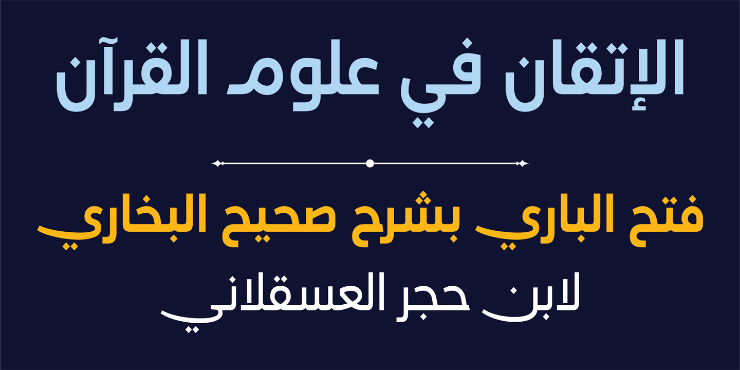
By balancing clarity with a distinctive visual personality, HS Sawsan provides designers with a flexible contemporary Arabic typeface capable of performing effectively across a wide range of media and platforms.
معلومات مختصرة عن الخط الطباعي HS Sawsan|
* مصمم الحرف الطباعي |حسن أبو عفش
* تاريخ تصميم الحرف الطباعي|2026
* الشركة المنتجة للحرف |HibaStudio
* تنسيق الخط الطباعي|OTF, TTT, woff2 and Varible Font
* لغات الخط الطباعي |العربية واللاتينية
* أوزان الخط الطباعي|Light, Regular, Medium, SemiBold, Bold, ExtraBold, Black
* للمزيد من المعلومات في موقع Behance
** لشراء الخط نأمل الاتصال بنا عبر البريد الإلكتروني| hasan@hibastudio.com